Picture a Health Coaching website that looks fantastic and grabs people’s attention. But it doesn’t stop there; it actually helps people make healthier choices. That’s what a well-made website can do for a health coach.
To spark your creativity and show you how incredible a website can be, we’ve put together a list of Best Health Coaching Templates & 10 Best Website Design Examples for Health Coaches.
These websites aren’t just looks good; they’re easy to use and have a clear purpose. Each website showcases the incredible potential that a well-crafted website can offer to health coaches like you.
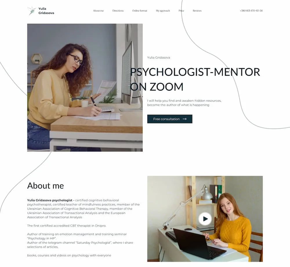
Health Coaching Website Template
10 Best Health Coaching Websites :
 Crowell + Co
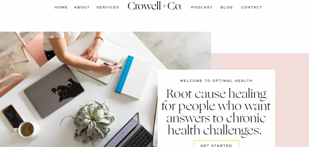
The website Crowell+Co appears to be a health and wellness-focused platform. They provide information, services, and resources to peoples who are seeking for solutions to chronic health challenges.
Let’s take a closer look at the design of this website and highlight five great features:
- Clean and User-Friendly Layout: The website employs a clean and well-organized layout. The navigation menu at the top of the page clearly lists the main sections of the site. The use of a white background with contrasting text ensures readability, and the overall design is aesthetically pleasing and inviting.
- Clear Branding and Messaging: The website effectively communicates its purpose and message. The banner at the top of the page welcomes visitors with the message “WELCOME TO OPTIMAL HEALTH” and a brief description of the services offered.
- Call to Action (CTA) Buttons: The “GET STARTED” button on the homepage is particularly attention-grabbing for visitors to take action. It effectively targets peoples who are frustrated with their health challenges.
- Rich Content Diversity: One of the great features of the website is its wide range of content offerings. It provides blog posts, a podcast section with episode highlights, free downloadable resources, etc.
- Social Media Integration: The website seamlessly integrates social media links. It helps visitor to connect with the brand and stay updated on the latest content and updates. The Instagram section at the bottom of the page shows recent posts and improve the brand’s online presence.
Overall, the design of Cait Crowell’s website effectively combines aesthetics with functionality.
 Wholesome Stef
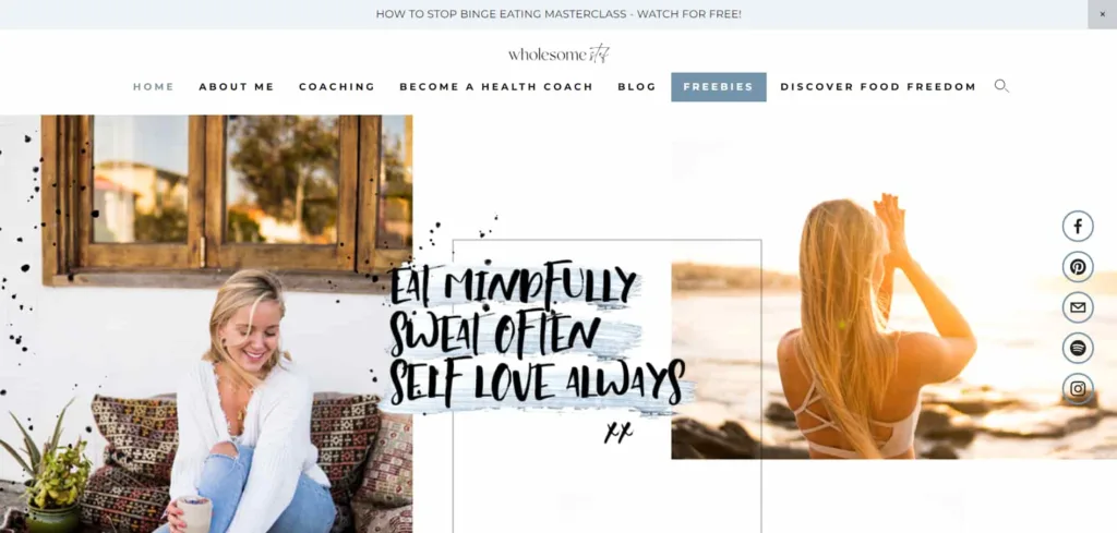
The website Wholesome Stef has a design that is welcoming and easy to use. It includes some really cool features that make it stand out :
- Clear and Engaging Messaging: The home page clearly shows what the website is all about. It focuses on helping women feel strong and confident in their own well-being and loving themselves. Stef’s personal story helps us connect and relate to what she’s been through.
- Concise Navigation: The menu bar at the top is easy to use and helps visitors explore coaching, blog posts, and free resources without any confusion.
- Eye-Catching Call to Action: The attention-grabbing “HOW TO STOP BINGE EATING MASTERCLASS – WATCH FOR FREE!” banner immediately captures visitors’ attention and encourages them to engage with valuable content.
- Freebies and Resources: The website’s commitment to offering free resources and courses is evident. Users can access a wealth of materials to support their well-being journey.
- Community Engagement: The invitation to join the #WhoelsomeTribe and follow along on Instagram builds a sense of community and connection.
 Running with Forks
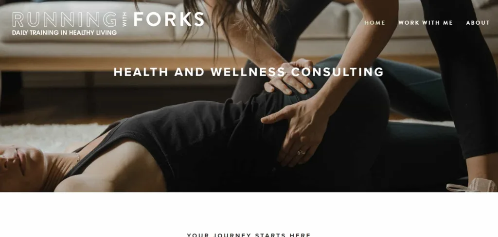
The website Running with Forks highlights a clean and user-friendly design that enhances the visitor’s experience. Here are five great features of this website:
- Clear Navigation: The menu on the website is short and easy to see at the top, so people can find their way around easily. The categories are clear, so visitors can quickly get to the stuff they want to see.
- Engaging Content: The home page does a good job of explaining what the website is for and what it offers in a short and helpful way. It also shows different categories of content, which encourages people to check out more.
- Personalization: The website focuses on making things personal with its fitness and wellness services. It guarantees customized advice and programs, showing that it is dedicated to helping each person on their unique health journey.
- Contact and Interaction: The “Get in Touch” part and the choice to apply to work with the author make it easy for people to collaborate with the author.
- Newsletter Signup: The newsletter signup feature lets people stay connected and get important updates. This shows that the website is dedicated to sharing knowledge and building a community.
 Awaken Harmony
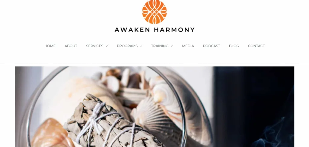
This website Awaken Harmony has a design that is both simple and effective. It matches well with its focus on holistic and spiritual things.
Five standout features are:
- Clean and Intuitive Layout: The website has a neat and easy-to-follow design, so it’s simple to find what you’re looking for.
- Engaging Imagery: The pictures of Carla and calming images make the place feel inviting and cozy, which is attractive to people who seek balance and harmony.
- Compelling Call to Action: The big button that says “Book Your Next Reiki Energy Healing Session Today” is there to get visitors interested and makes it simple for possible clients to take action.
- Testimonials: People’s real-life stories, like Nick Cole’s, make Carla’s services more believable and trustworthy. This helps show that Carla knows what she’s doing and is an expert in her field.
- Contact Information: The clear contact email and copyright notice provide visitors with easy ways to reach out and establish trustworthiness.
Elevate your health coaching journey with a stunning website. Let Debuggers Studio bring your vision to life!
 Honestly Healthy
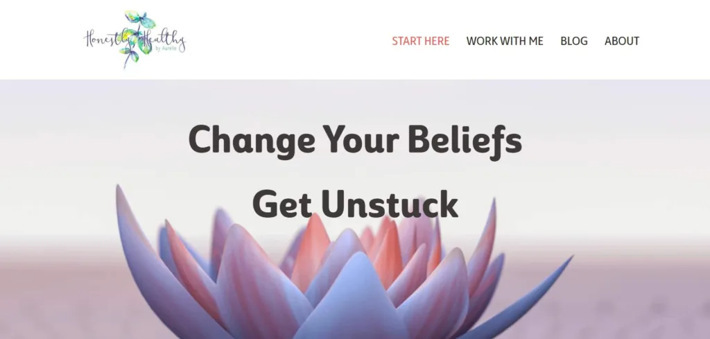
Honestly Healthy websites has an easy-to-use design that has lots of cool features to make it more useful and attractive.
Here are five notable features:
- Clear Navigation: The website has a simple menu at the top that helps visitors find important sections like “Start Here,” “Work with Me,” and “Blog.” It’s easy to navigate and find what you’re looking for.
- Engaging Content: The home page gives a short and simple introduction about the coach’s services, inviting people to learn more. They show trust and connection by including testimonials from clients and a personal introduction.
- Call to Action: The carefully positioned “Book a Free Strategy Call Now” button encourages you to act right away, and the “Get my free Ebook” section gives you useful content in exchange for signing up with your email.
- Informative Blog: The “Latest From The Blog” section keeps visitors engaged with informative articles related to the coach’s expertise.
- Clean Aesthetic: The website maintains a clean and uncluttered design, with a harmonious color scheme and easy-to-read fonts.
 JS Health
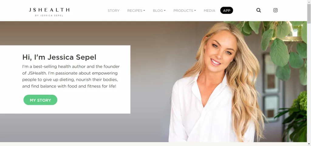
The website JS Health represents a well-crafted design with several standout features:
- Clean and User-Friendly Layout: The website is organized and simple to use, so it’s easy for people looking for health information or products to find what they need.
- Engaging Visuals: The site effectively uses high-quality images of food, Jessica Sepel, and other health-related visuals to engage visitors and create an appealing aesthetic.
- Clear Categorization: The menu at the top puts things into different sections like “Story,” “Recipes,” “Blog,” “Products,” “Media,” and “App.” This makes it really easy for people to find the information they want.
- Prominent Call-to-Actions: The website features prominent call-to-action buttons for key elements like “Explore Our Products,” “JSHEALTH APP,” and “START TODAY”. These buttons are there to encourage people to click on them and do things on the website.
- Author’s Presence: You can see Jessica Sepel’s personal touch all over the website. She has her picture, story, and social media links displayed, which helps us feel like we can trust and connect with her.
 Vona Johnson
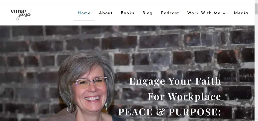
This website is easy to navigate and has a design that looks nice. It helps people with their faith and personal growth.
Here are five great features of the website:
- Clear Navigation: The website has a clear and easy-to-find menu, which helps visitors quickly find the information they want. This includes details about the author, the services she offers, and helpful resources.
- Engaging Content: The home page of the website is interesting and talks about the problems that its intended users face. It also gives a solution to these problems. The page does a good job of showing what the website is for and makes people want to get involved.
- Strong Call to Action: The website includes several calls to action, inviting visitors to learn more, schedule a call, or explore resources. These CTAs are strategically placed to guide visitors towards taking action.
- Author Introduction: Vona’s personal introduction on the homepage adds a human touch, making the website feel welcoming and relatable. It helps build a connection with the audience.
- Resource Highlights: The website highlights important things, like books and podcast, so visitors can easily find useful stuff that matches their interests.
 JO PORTIA MAYARI
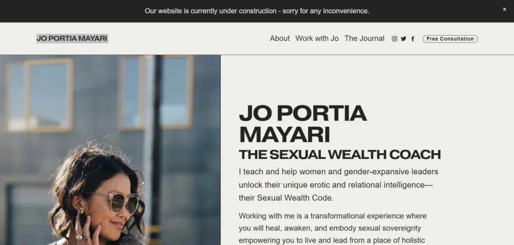
The website of Jo Portia Mayari is thoughtfully designed to engage and inform its audience about sexual wealth and empowerment.
Here are five standout features:
- Clear Branding: The website clearly shows what it’s about and highlights Jo Portia Mayari’s knowledge as a Sexual Wealth Coach right on the homepage. The design and message of the website go well together and match its goals.
- Engaging Content: The content is compelling and informative. It highlights Jo’s approach and the benefits of her coaching.
Testimonials add credibility, and the journal section offers valuable resources on related topics. - Call to Action: The “Book a Chemistry Call” button is a big encouragement for visitors to take action. It gives a direct way for potential clients to connect with Jo Portia.
- Visual Appeal: The website has nice colors and pictures that match the topic, making it look inviting and cozy for people who visit.
- User-Friendly Navigation: The menu is simple and easy to use, so users can easily find different parts of the website. Important information is easy to find without giving visitors too much information.
 Grace Goals & Guts
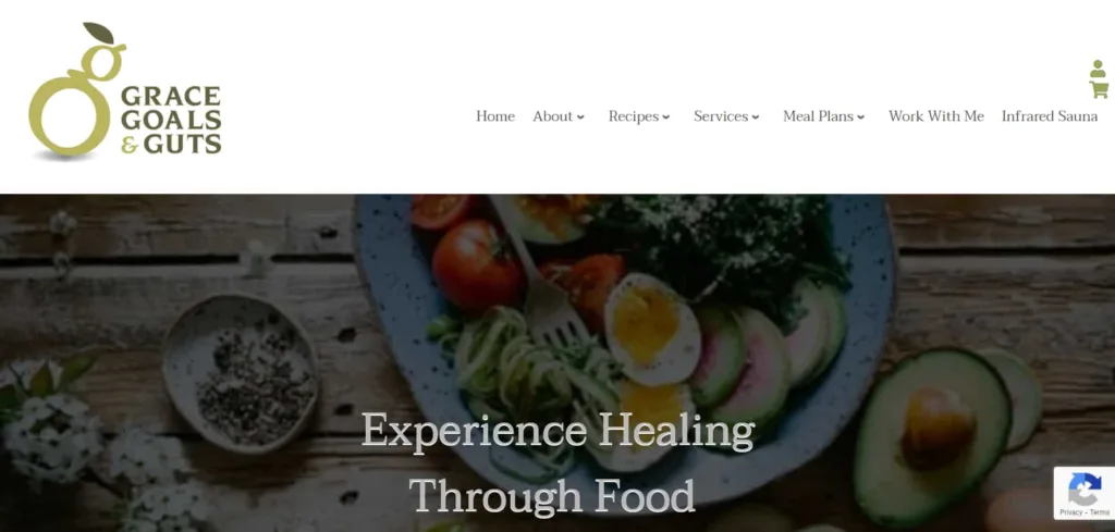
The website “Grace Goals and Guts” showcases an appealing design with several noteworthy features:
- Clear Navigation: The website has a simple menu at the top that makes it easy for people to navigate to important sections like Home, About, Recipes, Services, and more.
- Engaging Visuals: The website has really nice pictures, especially in the “Experience Healing Through Food” section. These pictures make it feel more personal and make you want to try it’s services.
- Focused Call to Action: The home page shows a lot of different health goals that Leslie can help with. This makes it simple for people who visit the site to figure out what they need and take action accordingly.
- Testimonials: Adding a customer testimonial helps show that other people trust and believe in Leslie’s skills and services. This makes her more trustworthy.
- Newsletter Subscription: You can choose to sign up for the newsletter in a smart spot on the website. This gives visitors a helpful resource and helps Leslie build her online group.
 Brad Golphenee
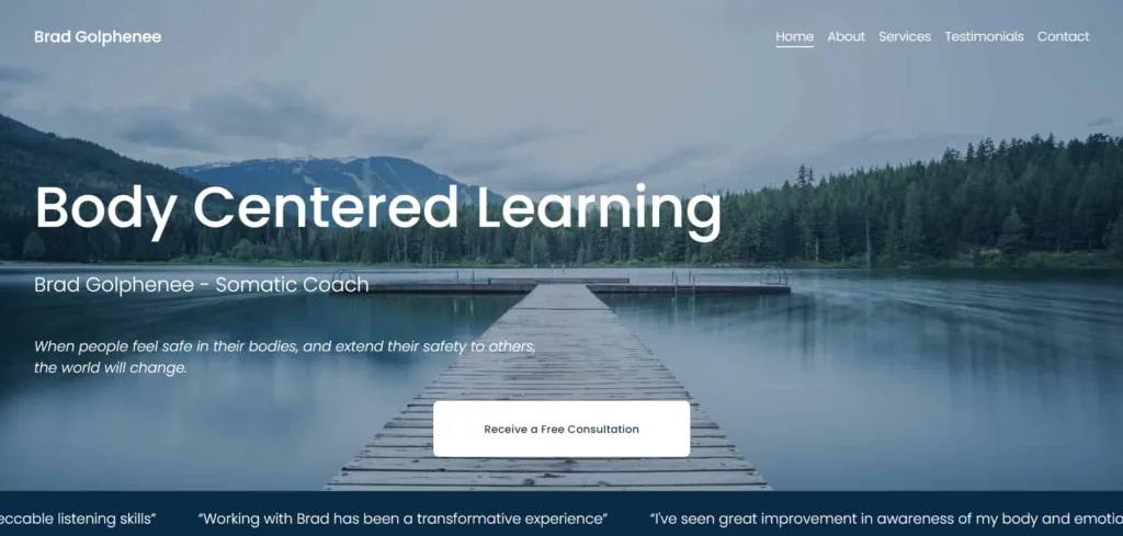
The website for Brad Golphenee, a Somatic Coach, is thoughtfully designed with several noteworthy features:
- Clear Navigation: The website has a straightforward menu with easily accessible tabs for Home, About, Services, Testimonials, and Contact.
- Compelling Tagline: The tagline, “When people feel safe in their bodies, and extend their safety to others, the world will change,” effectively communicates the essence of Somatic Coaching and captures visitors’ attention.
- Testimonials Section: The testimonials from real clients are shown clearly, which helps prove that Brad is a trustworthy coach.
- Informative Content: The website offers detailed explanations of Somatic Coaching and its benefits.
- Contact Information: Brad’s contact details, including a physical address and a “Learn More” link, make it easy for potential clients to reach out and connect.
These 10 Best Health Coaching Website Design Examples serve as inspiring templates for health coaches seeking to establish a powerful online presence. Each design blends aesthetics and functionality . These websites prove that a well-crafted online platform is more than a digital billboard; it’s a dynamic space to educate, inspire, and connect