Your website is like your online storefront. You want it to look great and be easy to use so people want to come in and explore. But there might be some things on your website that you don’t even realize could be pushing customers away.
In this article, we’ll discuss about 13 things you should remove from your website immediately to ensure a seamless user experience.
1. Unclear Homepage Headline
The first thing you should remove from your website is a vague headline. A vague homepage headline can leave visitors confused about your website’s purpose. Make it descriptive and keyword-rich to instantly convey your message and pass the 5-second test.


For example, instead of “Putting Your People First,” a more effective headline could be “Leadership Coaching and Training for Mid-Level Managers.”
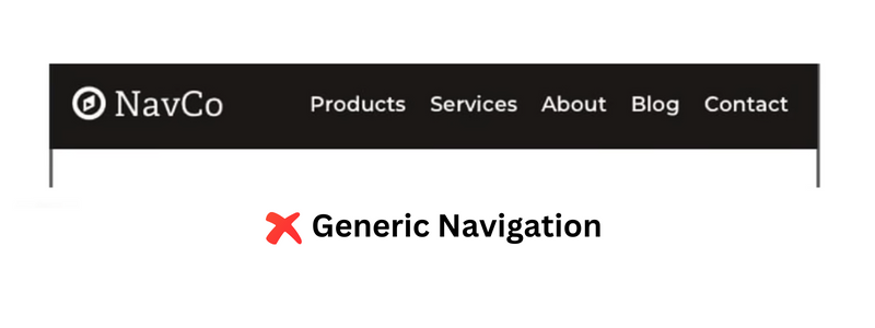
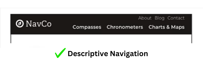
2. Generic Navigation Labels
Next, let’s address your navigation. Generic navigation labels like “Products” or “Support” fail to guide visitors effectively. Opt for specific, descriptive labels to help users find relevant content quickly and improve navigation performance.
If you want to know how your visitors are using your website’s navigation, you can use GA4.
-Simply go to the “exploration tab“
-Click on “path exploration.”
-In the “screen point” section, choose “Page path and screen class”
-Now select your home page.
This will allow you to see how well your navigation is performing.
3. Subheads with Generic Terms
Avoid vague subheadings that add visual noise and provide little value.
Subheadings help to organize information on web pages. But using generic subheads like “Solutions” or “Services” just makes the page confusing and doesn’t grab readers’ attention. Instead, create specific and keyword-rich subheads to make the content easier to read and guide users through the page smoothly.
4. Homepage Slideshow

Homepage slideshows, especially those with numerous slides, often have low click-through rates and fail to engage users effectively. Consider replacing them with a single impactful image or a static message that instantly communicates your value proposition.
5. Stock Photos of People
Stock photos may look polished, but they lack authenticity. Opt for real, authentic images to establish a genuine connection with your audience and build trust.
Real photos create feelings and help people feel connected, making them feel important and understood. Whether it’s a natural picture of your group doing something or a behind-the-scenes look at how you do things, real pictures make the user experience memorable and interesting.
6. Social Media Icons in Header
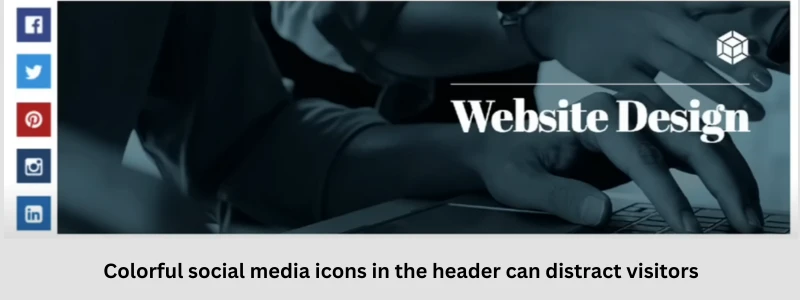
Placing colorful social media icons in the header can distract visitors and encourage them to leave your site. Place them in the footer to minimize distractions and maintain user engagement.
Alternatively, consider using subtle icons or text links instead of prominent buttons.
7. Including Dates on Blog Posts
Dates on blog posts can make content appear outdated. Consider removing dates or including them in other areas to maintain content relevance and longevity. If you want to showcase the date, consider placing it within the meta description or near the author’s byline.
8. Long Paragraphs
Long paragraphs can deter readers. Break up content with bullet lists, subheads, and images to enhance readability and encourage engagement. Use formatting elements like bold, italics, and bullet points to highlight key points and make the content more scannable.
9. Press Releases
Traditional press releases may not be suitable for online content. Instead, create compelling stories that resonate with your audience and convey your message effectively. Focus on storytelling, incorporating visuals, and providing valuable insights to engage readers.
10. PDF Files
PDF files hinder user experience and are less effective for online content. Prioritize HTML-based content for better accessibility, analytics, and search engine optimization. Convert important PDF documents into web-friendly formats or create dedicated HTML pages for the content.
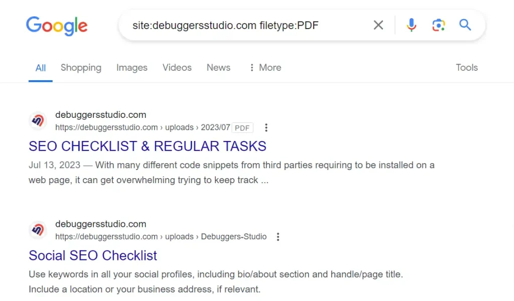
You can use Google to find out how many PDFs are on your website. Just do a search using two special search commands, “site:” and “filetype:”. So the search query will look like this…
“site:debuggersstudio.com filetype:PDF”
11. Testimonials Page
Testimonials are powerful social proof but hiding them on a separate page limits their impact. Incorporate testimonials strategically across your website to build credibility and trust. Place them on relevant product/service pages, landing pages, or within case studies to reinforce your value proposition.
12. Email Links
Contact forms offer numerous advantages over email links, including trackability, reliability, and spam prevention. Prioritize contact forms for better user engagement and lead generation. Customize forms with relevant fields, auto-responses, and confirmation messages to enhance the user experience.
13.Thank You Pages as Dead Ends
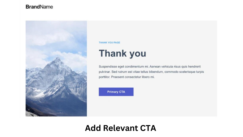
Thank you pages shouldn’t be dead ends. Offer additional content or opportunities for engagement to keep visitors on your site and encourage further interaction. Include relevant calls-to-action, related content recommendations, or subscription options to guide users to the next step in their journey.
In conclusion, optimizing your website involves more than just adding new features—it’s also about knowing what to remove. By implementing these tips, you can create a streamlined and user-friendly website that delivers better results and enhances the overall user experience.
Article You May Find Useful
How to Find and Remove Malware From Websites

