If you’re spending money advertising and sending customers directly to your e-commerce product page, you could be leaving tons of money on the table.
Nearly every test I’ve done comes back the same: sending visitors to a landing page instead of a standard product description page improves conversion rates by at least 25%.
I’ve even seen a properly built landing page, double the conversion rate. There are 11 key elements to creating the perfect eCommerce landing page. In this article I’ll show you what they are.
As a business developer, I’ve helped a lot of businesses to achieve their goals. Through it all, I’ve learned tons about building effective landing pages, and I’m excited to share those insights with you.
3 States of Potential Customer
If you’ve come across the terms “transactional analysis” or “transactional psychology,” you might already be aware of the three states potential customers can be in when they visit your website: child, adult, and parent.
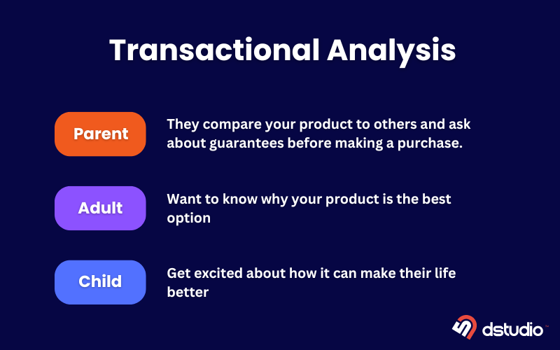
1. The excited child: These visitors see your product and get excited about how it can make their life better. They’re like a kid who circles all the cool toys in a Christmas catalog.
2. The logical adult: These visitors are practical and want to know why your product is the best option. They need facts and numbers to back up their excitement, such as a good price.
3. The skeptical parent: These visitors are careful and want to avoid making any mistakes. They compare your product to others and ask about guarantees before making a purchase.
11 Key Elements for Creating A Perfect eCommerce Landing Page
Now that I’ve given you a brief introduction to transactional psychology, which is technically known as transactional analysis, we are going to move on to the main topic.
Alright, let’s get started!
1. Header or Hero Section
The first impression is key on an eCommerce landing page, and that’s where the header or hero section comes in. This prime spot typically features a hero image of your product, a clear and compelling headline that grabs attention, and highlights the benefits you offer. Social proof, like star ratings from satisfied customers, can also be incorporated here to build trust.
For instance, a teeth whitening company might showcase a dazzling smile in their hero image, boast a headline like “Get a Brighter Smile for Summer!“, and display star ratings alongside a call to action to “Shop Now.” This combines strong visuals with a benefit-driven message and social proof to nudge visitors towards a purchase.
2. Benefits Section
The benefits section is your golden opportunity to turn viewers into buyers. Here’s how: Craft clear, concise bullet points highlighting the key advantages of your product. Don’t get bogged down in lengthy explanations. Instead, focus on the “what” and “why” of each benefit.
Let’s take a look at how different landing pages use benefits to target their audience. Some highlight specific product features that address customer pain points.
For example, a teeth whitener might showcase benefits like “gentle on sensitive teeth” and “removes stains quickly.” This approach builds excitement by demonstrating how the product solves a problem.
Some other landing pages focuses on the target audience’s lifestyle or identity. Imagine a men’s soap that uses benefits like “stay fresh all day” and “made with natural ingredients.” This taps into the target audience’s desire for a product that caters specifically to their needs.
Also, some brands leverage the benefits section to tell their story and establish their brand identity. A hair care company might emphasize its inclusive message (“beautiful hair for all“) and focus on customization (“find your perfect formula“) to differentiate itself from competitors. The choice is yours – benefits can highlight features or craft a unique brand image.
3. Featured Review
Let’s build trust with social proof! Feature reviews are a fantastic way to showcase positive mentions of your product, both in the press and from individual customers. Include quotes from glowing reviews and consider adding a headshot of the reviewer for an extra punch of credibility.

This section essentially tells visitors: “Hey, other people love this product and had a great experience, you should too!”
Imagine a landing page for a new coffee brand. They might feature a quote from a renowned health magazine alongside a customer testimonial that says, “This is the smoothest cup of coffee I’ve ever had, and it doesn’t give me the jitters!”
By showcasing these curated reviews, you’re not just listing every comment you’ve ever received, you’re strategically highlighting impactful endorsements that resonate with your target audience.
4. How It Works
The next key section on your landing page is the how it works section. This is your prime opportunity to convince potential customers why they absolutely need your product in their lives.
Here’s the approach: if your product boasts a simple and user-friendly setup, showcase this with clear and concise instructions. Think laundry detergent strips – a quick explanation like “remove a strip, toss it in the washer, add clothes” can be incredibly persuasive.
However, if your product requires a bit more explanation, shift your focus to elaborating on the benefits it provides.
For example, a subscription box service might highlight how it simplifies your life by offering curated selections based on your preferences. Imagine: choose a plan, pick products you’ll love, and enjoy a hassle-free shopping experience delivered right to your door.
5. Make an Offer
After capturing your audience’s attention with product information, it’s time to make the conversion easy.
The key is to build excitement by highlighting the benefits. Landing pages should showcase how the product solves a problem or enhances the customer’s life. Once the visitor is engaged and understands the value proposition, a prominent call to action to “buy now” appears.
This doesn’t mean hiding the purchase option; instead, it’s strategically placed after building desire. Think of it as rearranging the elements on a product description page.
By prioritizing benefits over immediate purchase, you ensure potential customers are fully convinced before they commit to buying.
6. Reviews
The next section on the perfect eCommerce landing page is going to be the rest of your reviews.
As you continue scrolling, you’ll encounter a section dedicated to showcasing even more social proof beyond the press mentions or highlighted customer reviews you might have seen earlier. This is where potential customers can dive deeper and explore a wider range of positive reviews.
Imagine a landing page where visitors can browse through numerous customer testimonials. Some landing pages will show a lot of reviews, while others might pick just a few really good ones. Regardless of the approach, this section serves a crucial purpose: building trust and boosting buying confidence by demonstrating the positive experiences of real people who’ve used your products.
7. Frequently Asked Questions
Don’t underestimate the power of a Frequently Asked Questions (FAQ) section! Your landing page might address the key benefits, the “why” behind your product, and showcase glowing testimonials, but there will always be unique questions.
For example, a company selling mushroom-based coffee might get questions like “What is mushroom-based coffee?” or “Does this taste like mushrooms?” These are the ideal inquiries for your FAQ section.
By incorporating questions you commonly see in ad comments or receive from customer service, you can proactively address potential objections. Think of FAQs as a way to bust those lingering doubts that might stop someone from clicking “buy.”
The goal is to eliminate friction and build confidence, ultimately guiding visitors smoothly towards a purchase.
8. Competitive Comparison Section
The next step is to highlight why your product reigns supreme. Here, you’ll create a section comparing your offering to similar products.
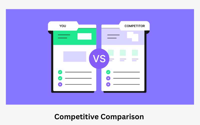
Focus on showcasing your strengths. Demonstrate how your product excels in key areas potential customers might care about. However, be fair to the competition. Acknowledge that they might have some features you don’t. This builds trust and establishes you as a reliable source of information, rather than someone desperate to make a sale.
Think of it as a friendly rivalry, not a knock-down, drag-out fight. You want to win over customers, not alienate them.
9. Risk Reversal
Many potential customers are hesitant to buy online because they’re unsure if the product will meet their expectations. This is where risk reversal, like money-back guarantees, come in. They act as the “critical parent” in the child-adult-parent selling model.

By offering a money-back guarantee, easy returns, or a lifetime warranty, you alleviate the customer’s fear of losing money if they’re not satisfied. This builds trust and significantly increases the chance of them completing the purchase.
10. Additional CTAs
Landing pages shouldn’t rely solely on a single “Buy Now” button. Consider including additional calls to action throughout the page, like sprinkling “Shop Now” buttons at key points.
This way, even if visitors don’t engage with the initial offer, they can still be directed back to the product page with a convenient click. The goal is to remove any obstacles to a purchase.
By placing these extra calls to action, you’re essentially saying “Ready to buy? Click here!” wherever they are in their journey on the landing page.
11. Footer
Having a cluttered footer with lots of links might be fine for your homepage or regular browsing pages, but it can really hurt your chances of making a sale on landing pages. Remember, you’ve put effort into driving people to this specific product or offer. The last thing you want is to distract them with a navigation menu full of links.
On landing pages, it’s best to keep the footer simple. Only include important links like shipping information and privacy policy.
Every extra link, even social media, could be a way for someone to leave your page and not make a purchase, especially if you paid $3 or $4 for a click. By keeping your landing page footer clean and focused, you will reduce distractions and increase your chances of turning visitors into customers.
Landing Page Vs Sales Page
Landing pages and sales pages are both important tools for marketing online, but they have different purposes:
Landing Page: This is a page that captures leads by offering something valuable in exchange for contact information. It is designed to get visitors to take a specific action, like signing up for an email list or downloading a free ebook.
Sales Page: This page acts as a digital salesperson, trying to convince visitors to buy a product or service. It provides more details and persuades customers by showcasing features and benefits, addressing concerns, and including a clear call to action to make a purchase.
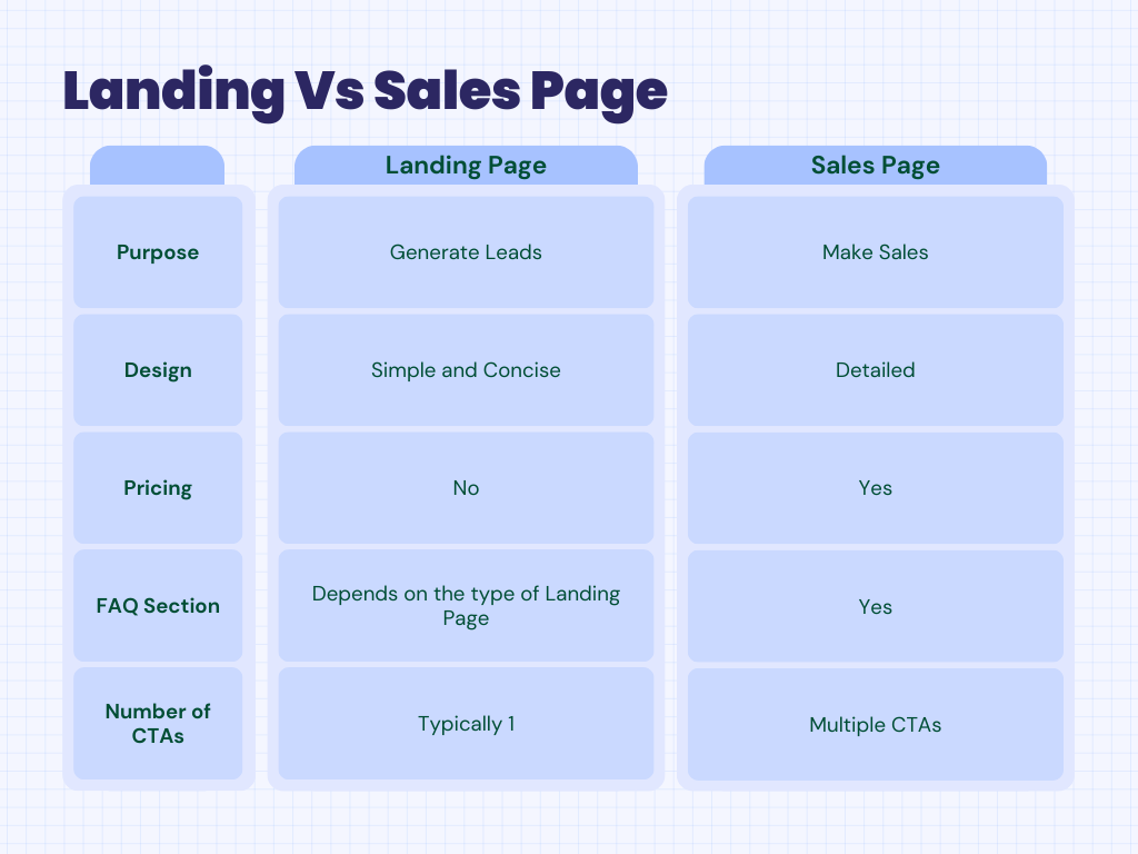
In short, landing pages capture interest, sales pages close deals.
