First Rule of Email Signup Forms: Be Concise!
Say goodbye to those long signup forms.. Today’s savvy subscribers crave a smooth, frictionless experience. Dive into 13 best practices that’ll turn your newsletter signup from into a lead magnet!
Types of Email Signup Forms
There are three main types of email signup forms:
Popup Forms: Popup forms are email signup forms that appear in a pop-up window on a website. They are designed to capture the visitor’s attention and encourage them to sign up for an email list.
Popup forms can be triggered based on various actions such as when a visitor enters the site, scrolls down a certain percentage, or tries to exit the page.
Embedded Forms: Embedded forms are integrated directly into a webpage’s content. They are typically placed within the body of a webpage, such as at the bottom of a blog post or in the sidebar of a website.
Embedded forms blend seamlessly with the rest of the webpage and provide visitors with an easy way to subscribe to an email list without interrupting their browsing experience.
Landing Page Forms: Landing page forms are standalone web pages created specifically for capturing leads or signups. These forms are often used in marketing campaigns where visitors are directed to a landing page from an advertisement, social media post, or email campaign.
13 Best Practices to Optimize Newsletter Signup Forms
Here are 13 best practices for optimizing your email signup forms :
1. Craft a Clear Value Proposition :
The most effective newsletters have a clear offer that stands out. When you ask people to sign up, make sure your promise is easy to understand. Your offer should attract potential subscribers.
For instance, Burberry entices people to sign up for their newsletter by offering access to exclusive events, limited edition products, new collaborations, and expert services. This works because their target audience wants to stay informed.

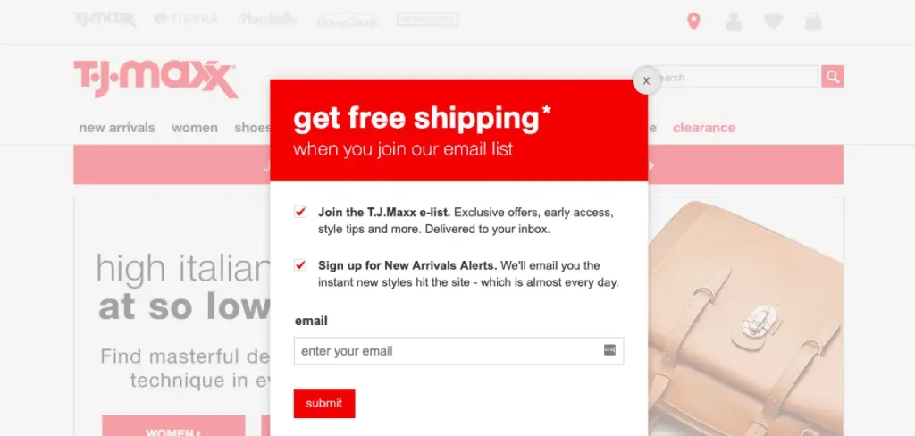
On the other hand, T.J. Maxx focuses on free shipping as their unique selling point (USP). Their customers are more interested in saving money and getting a good deal.
When you create your own signup form, consider what your audience desires and how your newsletter provides value. Once you determine your unique selling point, make it crystal clear and emphasize how it benefits the reader.
2. Simplify Form Fields :
Using fewer form fields makes signing up easier and faster. Visitors don’t have to provide unnecessary information. This can lead to more people signing up. The signup forms that are most successful usually only ask for the user’s email address, as this is all you need to contact them.
If necessary for your business, you can include other fields, but it’s best to use as few as possible or make them optional.
This example from The Hustle demonstrates a simple signup form that consists of only one field.

3. Enhance Your Call-to-Action :
The CTA button is a small but important part of the form that encourages customers to join your list. It plays a big role in increasing conversion rates.
Here are some tips on how to optimize your call to action (CTA) :
1. Focus on the benefit: Make it clear what users will gain by signing up for your newsletter. Instead of: “Subscribe Now,” use: “Get Exclusive Discounts!” or “Insider Tips Delivered Weekly!”
2. Action-oriented language: Use strong verbs that tell users exactly what to do.
Examples: “Join Today,” “Sign Up Now,” “Get Started.”
3. Stand out visually: Use contrasting colors, clear fonts, and a button design that grabs attention.
5. Placement matters: Put your CTA where users expect to find it, often after valuable content or at the end of a blog post. Don’t overwhelm users with multiple CTAs.
6. A/B test different CTAs: Try out variations of your CTA wording, color, and placement to see what resonates best with your audience.
7. Urgency and scarcity: Consider adding a sense of urgency or exclusivity to your CTA.
Example: “Limited Spots Available – Sign Up Now!” (Use sparingly)
4. Ensure Form Visibility :
The placement of your signup form is a crucial factor in determining how successful your signups will be. If people can’t see your form, they won’t convert, so it’s important to make sure it is in a noticeable position on your page.
To increase your chances of getting signups, you can also include your signup form in multiple locations on your website.
Some common places to put your signup form are:
– At the top of your page
– On your “About” page
– In a sidebar
– Integrated into or placed after a blog post
– At the bottom of your page
– On a dedicated signup page
– As a bar that stays visible as the user scrolls
Using pop-ups can help make your signup forms more visible. Pop-ups show the form in front of the content the reader is looking at, making it hard to miss. The reader has to either sign up or close the form to continue viewing the content.
You can set up automated triggers to control when the pop-up appears on the user’s screen.
– Time: The pop-up shows after the visitor has been on your page for a certain amount of time.
– Scroll depth: The pop-up shows when the visitor reaches a specific point on your page.
– Exit intent: The pop-up shows when the visitor is about to leave your page.
However, it’s important to be mindful that pop-ups can be intrusive and disrupt the visitor’s viewing experience. Configure your pop-up to appear at a point where the visitor has already gained value from your page, increasing the likelihood of them signing up.
5. Incorporate Social Proof :
Humans are social creatures. Just like how we prefer to go to a restaurant that is busy with other customers, we are also more inclined to join newsletters that many other people already enjoy.
You can use this natural tendency to your advantage by including social proof on your signup form.
One clever way to show social proof is by highlighting the number of people who have already joined your newsletter.

Image : The Hustle
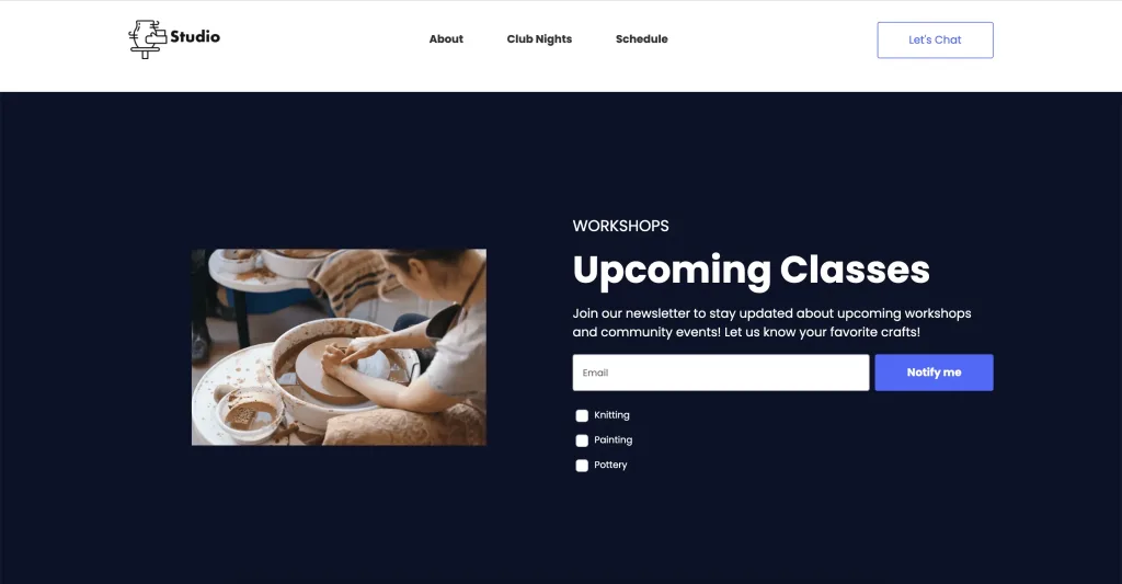
6. Offer Interest Selection :
If you have more than one newsletter, include a choice on your signup form so that people can choose which newsletters to subscribe to. This allows people to sign up for multiple newsletters at the same time, increasing the number of subscribers for each.
7. Provide Incentives :
Offering incentives is an easy approach to add value and convince people to subscribe to your email list.
An incentive is similar to a virtual gift that you offer someone in exchange for them providing you with their email address. This could be a special offer, downloadable material, or anything else you think your target market would find entertaining.
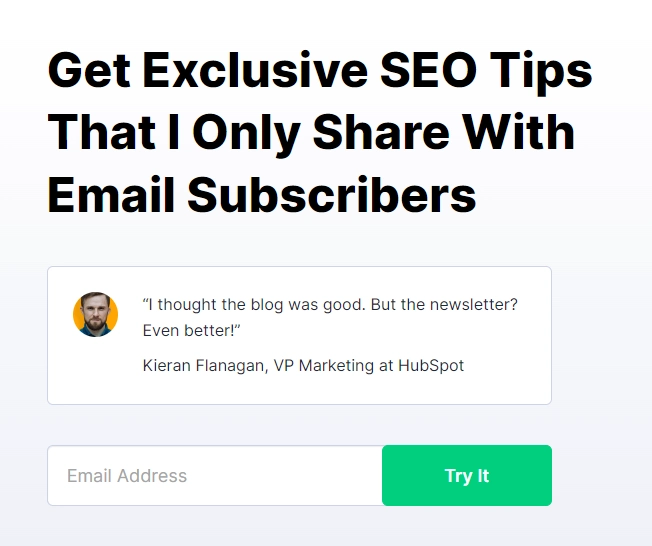
Image : Backlinko
8. Ensure Responsiveness :
It’s important to ensure that your signup form appears well on all types of screens. A common issue is having pop-ups that are too large for mobile devices. This can irritate users instead of convincing them to subscribe to your list.
Before making your form live, make sure to test how it appears on both mobile and desktop devices.
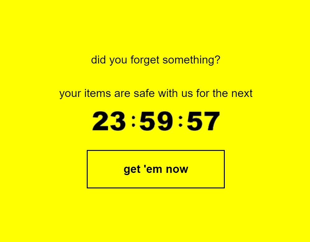
9. Utilize Countdown Timers :
Countdown timers create a sense of urgency and scarcity, encouraging visitors to sign up before a perceived deadline. This can be particularly effective for promotions or limited-time offers.
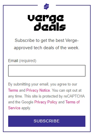
10. Reassure Subscriber :
In order to address any worries that visitors may have about signing up for your list, it’s important to reassure them that they can easily choose to stop receiving your emails.
The Verge does a good job of this by informing their website visitors that they can unsubscribe whenever they want. They also provide links to the terms and privacy policy, so potential subscribers can learn more about how their information will be used by the company.
11. Implement Double Opt-in :
The double opt-in method includes an additional step during the sign-up process. It asks users who want to subscribe to your newsletter to click on a link that will be sent to their email address. Only after they click on the link will they be added to your list.
The disadvantage of using double opt-in is that you will end up with a smaller number of emails on your list. But, this is because you will filter out spam email addresses, addresses with typos, and people who are not very engaged.
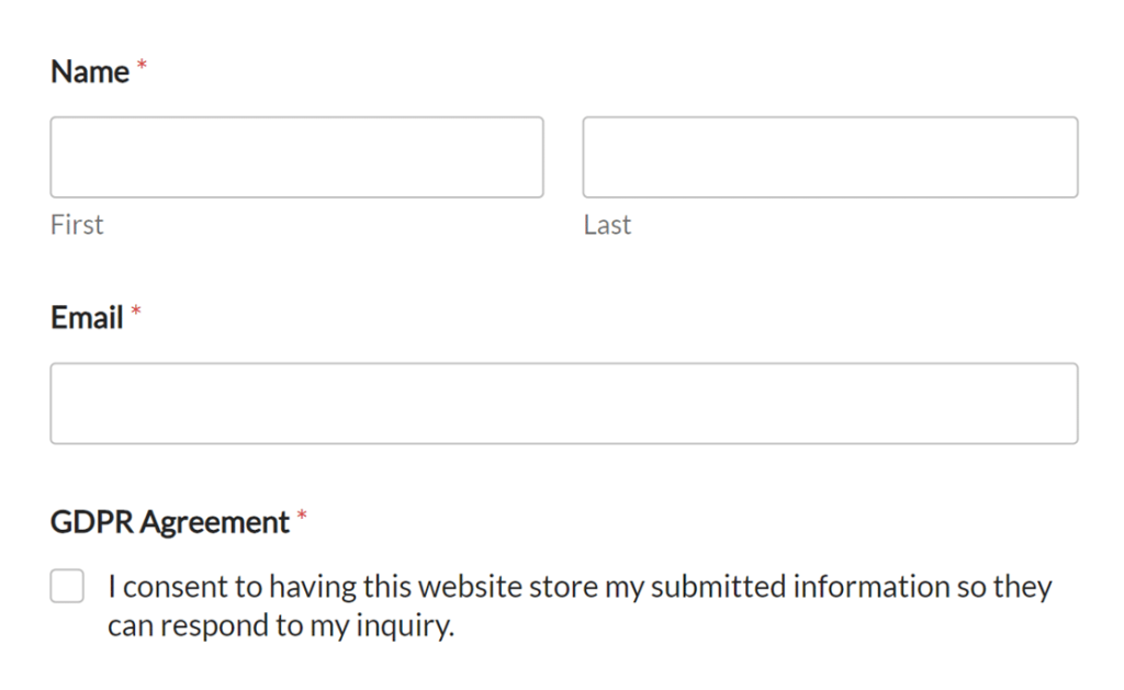
12. Ensure GDPR Compliance :
To make your email signup form trustworthy and legally compliant, it’s important to ensure that it aligns with GDPR regulations. This means being open and honest about the information you collect, such as email addresses and names, and how you plan to use it, such as for newsletters or promotions.
Obtaining explicit permission from users before adding them to your list is also crucial, often done through a checkbox.
Lastly, it’s essential to include a visible and easy-to-find unsubscribe link in every email you send, so users can easily opt-out whenever they wish.
13. Establish a Welcome Series :
A welcome series is a sequence of automated emails sent to new subscribers immediately after they sign up for your email list. This series serves as an opportunity to engage with your new subscribers, introduce them to your brand, and nurture the relationship from the outset.
Creative newsletter signup examples
These examples will show you how different brands encourage people to subscribe to their newsletters. Take inspiration from some of the most effective signup forms :
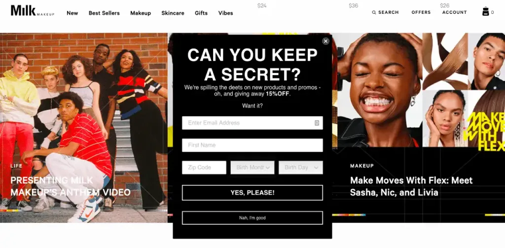
Milk Makeup
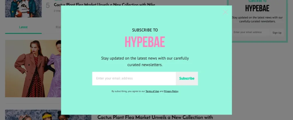
HYPEBAE
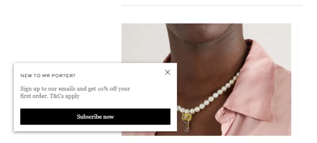
Mr Porter
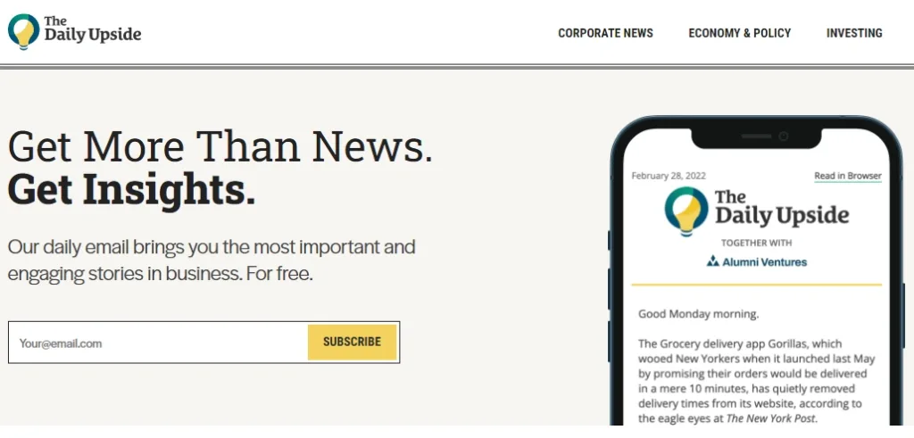
The Daily Upside