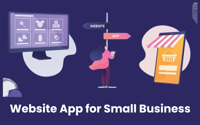
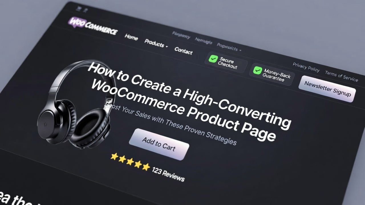
Website conversion is an important issue for almost every website owner. Effective UX (user experience) design is the key to improving those rates.
As UX has gone mainstream, companies now invest a lot of money to hire UX teams and build design centers.
According to Forrester, better UX design can increase conversion rates by up to 400%.
In this article, we will discuss 11 best practices to optimize your UX and increase your conversion rates.
What is UX Conversion Optimization?
UX Conversion Optimization is a method that brings together UX design and conversion rate optimization (CRO) to increase conversion rates and business ROI(return on investment).
Conversion rate optimization (CRO) is a digital marketing strategy designed to increase the number of website visitors who complete a specific action. These actions include making a purchase, clicking “add to cart,” or filling out a form.
Have you ever thought about why some websites are performing so well? The secret lies in UX CRO.
It means that these websites focus on designing every element that users interact with to be optimized for the best possible experience.
11 Best Practices for UX Conversion Rate Optimization
Here are 11 actionable tips to improve your website’s user experience and increase conversions.
Note: Remember UX CRO optimization is not one size fits all method. It requires knowing your target audience, their actions, and what they like.
1. Examine Your Conversion Funnel & Identify Errors
Let’s start with your conversion funnel. This is a model that shows the different steps a user goes through, from first hearing about a product or service to finally making a purchase.
When you properly analyze your marketing funnel, you can spot any obstacles that might be stopping users from completing their purchase.
Doing a thorough analysis involves the following steps:
- Identifying the different stages of the funnel
- Mapping out users journey
- Measuring important metrics
- Finding areas that need improvement
You can use tools like Google Analytics 4, Hotjar, and ClickFunnels to gain useful information about how users behave. These tools can help you make decisions based on data, which is important for improving your sales funnel.
2. Define Goals for Conversion Rate
Setting goals for your conversion rate is an important part of improving how well your business converts visitors into customers. These goals can be specific and can change depending on what your business needs.
For example, you might aim to:
- Increase the percentage of website visitors who make a purchase by 15% in the next three months.
- Raise the number of people signing up for your newsletter by 20% in the next two months.
- Get 25% more attendees for your next online webinar.
- Increase the number of visitors who become users of your app by 10% in the next two months.
To set these goals, you need to look at how users behave, conduct tests on their experience, and figure out how to gather and analyze their feedback.
It’s important to make sure these goals match your overall business objectives and to set key user experience (UX) metrics that relate to what you want to achieve with your campaigns.
3. Collect, Segment, and Analyze Visitor Data
This process, along with user research, gives you a lot of information about what users like and how they behave. These important insights help you make better choices to improve the user experience and increase conversion rates.
For example, if your data reveals that many of your visitors are interested in a certain type of product, you can feature that category on your homepage.
4. Make a Strong and Clear Value Proposition
In UX CRO, having a convincing value proposition is essential. This means explaining what makes your business valuable and trustworthy, addressing the problems your customers face, and clearly showing the benefits of what you’re offering.
Write a strong value proposition that tells buyers why they should pick your product or service instead of what your competitors offer.
A great value proposition should be clear, short, attention-grabbing
5. Use Conversion Copywriting
Copywriting is all about convincing someone to take a specific action, like buying a product or service.
On the other hand microcopy writing involves creating short pieces of text that guide users on your website. This includes things like menu labels, call-to-action (CTA) buttons, form labels, and messages that help users when they complete steps or face problems.
All these types of writing are important for getting people to convert, or take action.
Your writing should be clear and to the point, focusing on one simple goal.
Using customer-focused messages is the best way to build trust and create excitement to complete a purchase.
It’s important to understand where the customer is in the buying process so you can tailor your message effectively:
– Awareness: Help potential buyers recognize their problems.
– Consideration: Highlight the benefits of your product or service.
– Decision: Show that you are the right choice and use social proof to build trust.
Make sure to use clear headlines and subheadings, include helpful FAQs, and focus on making your content easy to read.
6. Create Attention-grabbing CTA’s
Call-to-action buttons are really important for your website, especially when it comes to increasing conversions. How they look, what they say, and where they are on the page are all key decisions that affect user experience and how many visitors take action.
Improving your CTAs is a simple and effective way to boost your conversion rate.
Be careful with using pop-ups and videos, and make sure your CTAs are clear, appealing, and feel like a natural next step for visitors.
When considering how people think and feel, color plays a big role. If used correctly, color can help increase conversions on your website.
There are different theories about which colors work best for different types of businesses or customers, but the best choices really depend on your brand and audience.

For example, MailChimp uses yellow for their CTA buttons to make them really noticeable, and their ‘Sign Up’ button is placed right in the center so it’s hard to miss.
When it comes to placing your CTA button, you should have at least one button ‘above the fold.’
Above the fold means it should be at the top of the webpage, visible without scrolling down.
7. Provide Various Forms of Social Proof
People often follow the crowd, and the numbers show it. On average, a person checks at least 10 online reviews before making a purchase.
Additionally, 57% of customers will only buy from a business that has a rating of 4 stars or higher. It’s reliable, helpful, and doesn’t cost anything.
Different ways to show social proof include:
- Customer testimonials
- Trust badges
- Reviews and ratings
- Social media presence
- Case studies
Make sure to highlight your best reviews so that your audience notices them.
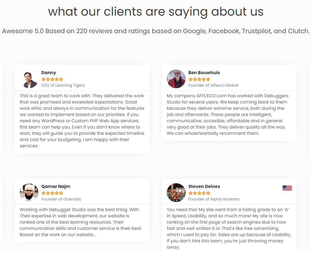
Of course, you need to earn those reviews first. If you’re just starting out, there are many ways to encourage customers to leave reviews and testimonials.
The easier it is for someone to give you a review, the more likely they will do it. You can reach out to satisfied customers directly.
You can also offer rewards, like a free trial of a new feature or discounts, in exchange for honest reviews. Just remember, you should never pay for a positive review or try to convince someone who gave a bad review to change it. This goes against Google’s rules.
8. Perform Competitor Analysis
You can break down the process of analyzing your competition into a few important steps. First, you need to figure out who your main competitors are.
These could be companies that sell similar products or services, or ones that go after the same customers you do. After you make a list of your competitors, you can start looking at their websites.
Check out how their site looks, how easy it is for users to navigate, the content they share, and how they interact with their audience.
9. Run User Experience Tests
These tests give important information about how users feel about a website and how easy it is to use, which helps improve the website’s performance.
A/B testing: is one of the most common ways to test user experience. It involves making two versions of a webpage, each with a different element, and then seeing which one performs better. This method is great for figuring out which design, headline, or feature appeals more to your audience.
Usability testing: is another key type of user experience testing. It involves watching how users interact with the website and gathering their opinions about their experience.
Besides these, there are other testing methods that can help improve user experience.
Multivariate testing: is like A/B testing but tests several elements at the same time.
Eye-tracking: studies are also helpful because they show how users move around your site and what catches their attention.
10. Use a Dedicated Landing Page for Ads
Even though 77% of top advertising landing pages are homepages, using home pages as landing page might be hurting your chances of getting leads and lowering conversion rates.
Here’s why:
Homepages come with a lot of distractions, such as menus, social media links, and pop-up ads.
On the other hand, a dedicated landing page focuses on one main goal guiding visitors to complete a specific action.
When you use a homepage as a landing page, all visitors from different sources end up in the same place. This means you miss out on understanding what each group of potential customers needs or wants.
It can also make it hard for visitors to find what they’re looking for, which might cause them to leave without taking action. It’s much better to create separate landing pages for different customer groups and specific goals.
11. Ensure Your Website is Accessible
Make sure your website is easy to use for everyone, including people with disabilities. This should be an important part of your design plan.
If part of your audience can’t access your website, it can really hurt your website traffic and how many visitors turn into customers.
To improve your website’s accessibility, you should follow some key rules, such as:
- Making sure there’s enough contrast between colors and textures
- Organizing and limiting the amount of content
- Using clear descriptions (alt text) for images
- Adding transcripts or captions for audio and video
- Ensuring it works well with screen readers and other assistive tools
For people who have trouble hearing, providing transcripts for all audio content, like videos and podcasts, can make it much easier for them to access your site.
Wrap Up
In conclusion, improving the user experience is really important for getting more people to take action on a website. By following the tips mentioned in this blog post, businesses can make their websites better for users and also boost their conversion rates. If you find these steps overwhelming, consider hiring an experienced UX team to assist you.

