The internet has become the primary source of information for people around the world. This means that a website is often the first point of contact a potential patient has with a chiropractic practice. In recent times, chiropractic treatment has gained immense popularity worldwide, particularly in the USA. The chiropractic business market is also substantial, with studies indicating that
 Chiropractors provide treatment to over 35 million individuals in the USA alone.
This statistic underscores the challenges in generating leads within this competitive industry. However, the solution lies in a meticulously designed and seamlessly functioning website, capable of boosting your success within the chiropractic field.
Within this guide, I present to you 10 compelling examples of the best chiropractic website designs that are already achieving remarkable results.
Why Your Chiropractic Website Needs a Visually Stunning Website
As the world becomes increasingly digitized, it’s becoming more important than ever for chiropractors to establish a strong online presence. One of the most essential elements of a successful online presence is a visually stunning website.
Here are six valid reasons why your chiropractic website needs a visually stunning website
Attract and retain patients

One of the primary goals of any chiropractic practice is to attract and retain patients.
A well-designed chiropractic website can showcase your practice, services, and expertise in a effective way that resonates with potential patients. Nowadays, most patients rely on the internet to find information about healthcare providers.
To succeed in this competitive industry an attractive website is no longer a luxury, but a necessity for any chiropractic practice.
Fosters Trust and Establishes Credibility
A well-designed website establishes credibility and trust. When visitors see a modern and polished design, they are more likely to consider your practice reliable and trustworthy, which means they might decide to become your clients.
Showcases Your Expertise
An impressive website provides an opportunity to showcase your chiropractic expertise. Through well-designed pages, informative content, and visual presentations, you can educate visitors about your approach, techniques, and the benefits of chiropractic care.
Boosts Online Visibility and Growth

An attractive looking website is more likely to be shared on social media and recommended by satisfied patients. This can help to increase your online visibility, drive more traffic to your site and potentially convert those visitors into loyal clients.
SEO Benefits
Search engines like Google, favor visually appealing and user-friendly websites. When you incorporate relevant images, videos, and well-structured content to your website, these can improve your website’s search engine ranking and visibility.
Best Practices for Chiropractor Website Design
Creating an effective website is more than just gathering some information and pictures and putting them together. To truly stand out from the competition, chiropractors must employ best practices for website design.
Here are six highly effective best practices for crafting your chiropractor website design that will truly set you apart.
1. Clear Navigation and Informative Service Section
Design your website with a user-friendly navigation structure. Visitors should be able to easily find essential information like services, contact details, and appointment booking. Use clear labels and a logical menu layout to guide them seamlessly through your site.
2. Mobile-Friendly Design
As many peoples use mobile devices to search their query, make sure your website is responsive and looks great on various screen sizes. A mobile-friendly design enhances user experience and helps retain visitors who visit your site from smartphones and tablets.
3. High-Quality Imagery
Incorporate high-resolution images that reflect your chiropractic practice and create a welcoming atmosphere. Use images of your clinic, staff, and patients to build a connection and convey a sense of trust. Avoid using stock photos that may feel impersonal.
4. Engaging Content
Provide informative and engaging content that educates visitors about chiropractic care.
Blog posts, articles, and videos about various treatments, wellness tips, and patient success stories can keep visitors interested and informed.
5. Clear Calls to Action (CTAs)
Strategically place clear and compelling calls to action throughout your website. Whether it’s “Schedule an Appointment,” “Contact Us,” or “Learn More,” these CTAs guide visitors toward taking the desired actions.
6. Choosing the Right Color Palette
Apply minimalist design principles into your website’s color palette. Color psychology plays an important role in website design. Select a color palette that aligns with your brand identity and evokes the desired emotions.
For a chiropractic website, consider soothing colors like blues and greens that promote a sense of calm and well-being.

Successful chiropractic website design goes beyond aesthetics – it’s about providing a user-centric experience that informs, engages, and converts visitors into loyal patients.
How To Design A Chiropractor Website?
Crafting an Exceptional Chiropractic Website: A Step-by-Step Guide
Build a Strong Brand Identity
Lay the foundation for your chiropractor website by establishing a brand identity.
This includes :
- Choosing a memorable logo
- Defining your practice’s values
- And maintaining a consistent visual language that resonates with your target audience.
Highlight Your Unique Specialty
Elevate your website’s impact by highlighting your unique chiropractic specialty. Whether it’s sports injury rehabilitation, pediatric care, or wellness-focused treatments, make sure your website prominently showcases your expertise and the services that set you apart.
Use Customized High-Resolution Imagery
Highlight the essence of your practice through high-quality, customized images. Showcase your clinic’s interior, friendly staff, and the welcoming environment that patients will experience. This personal touch builds a connection with potential patients before they even step through your doors.
Curate an Original Content Hub
Fuel your website with informative and engaging content that educates visitors about chiropractic care and related health topics. Share articles, blog posts, and FAQs that address common concerns. This valuable resource demonstrates your expertise and keeps visitors coming back for more.
Enlist Professional Designers and Developers
Ensure your website’s functionality and aesthetics by enlisting the expertise of professional designers and developers. Their skillset ensures a visually stunning, user-friendly, and responsive website that reflects your practice’s professionalism and dedication to patient care.
Explore Debuggers Studio, your ultimate web solution partner for crafting your ideal chiropractor website. Our team of experienced developers is dedicated to creating captivating and responsive websites that seamlessly adapt to various devices.
Must Have Design Features in your Chiropractor Website
Set the foundation for a successful website by incorporating essential design elements. Here’s a table outlining the key features you must include for an effective online presence:
| Design Feature | How It Helps |
|---|---|
| User-Friendly Layout | Ensures easy navigation and accessibility for all visitors. |
| High-Quality Imagery | Showcases your clinic, staff, and treatments professionally. |
| Clear Call-to-Actions | Guides visitors to schedule appointments or inquire easily. |
| Patient Testimonials | Builds trust through real-life success stories. |
| Informative Content | Educates visitors about chiropractic care and its benefits. |
| Mobile Responsiveness | Offers a seamless experience on smartphones and tablets. |
| Contact Information | Makes it effortless for potential patients to reach out. |
| Online Booking System | Enables patients to schedule appointments conveniently. |
| FAQ Section | Addresses common queries, enhancing user experience. |
| Social Media Links | Connects your website to your social media presence. |
| Transparent Pricing | Establishes trust by providing clear and upfront costs. |
10 Best Chiropractor Websites Design Inspiration
Here, I’ve gathered 10 outstanding website examples that can serve as inspiration for creating your very own professional chiropractic website.
 Pi- Chiropractor (Recommended Template )

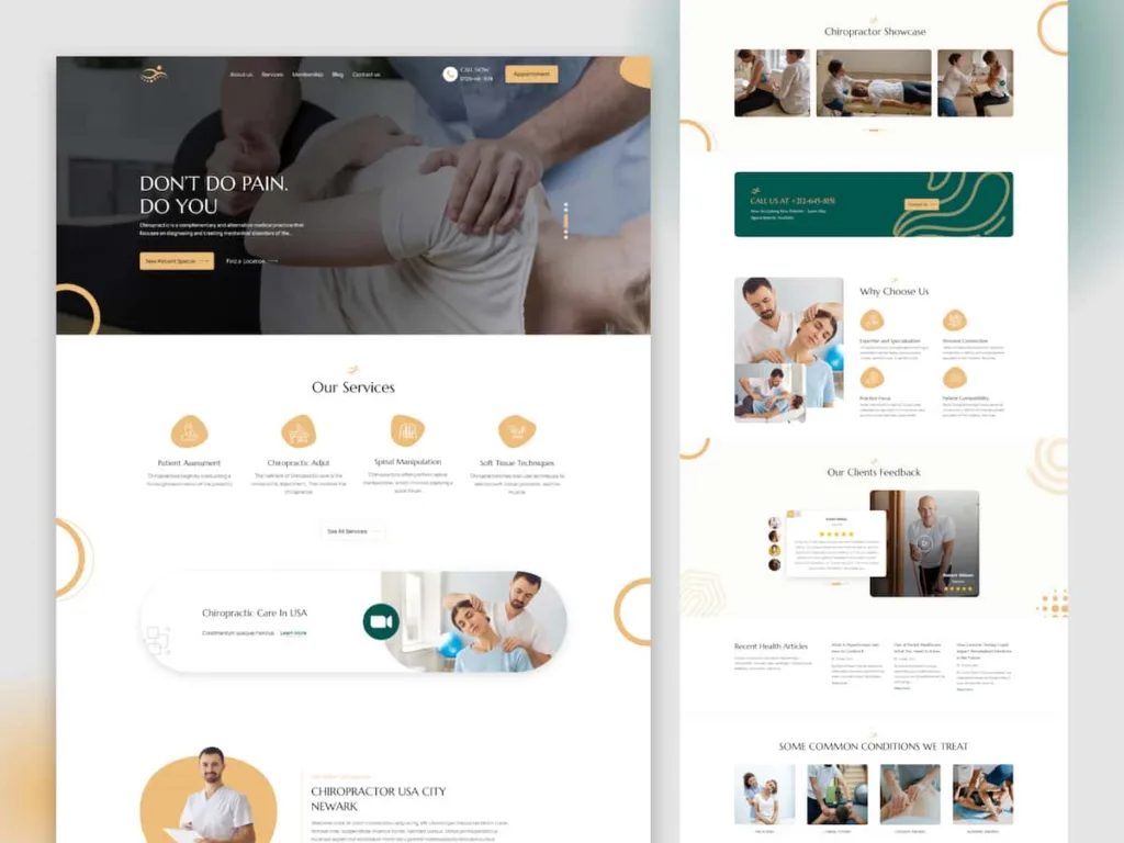
This Figma template for Chiropractic Care, designed by Debuggers Studio, showcases a well-thought-out approach to presenting chiropractic services online. Several design features contribute to its effectiveness:
Key Features Liked:
Intuitive Design: The template exhibits an intuitive design that combines a calm and professional aesthetic. The color scheme and layout contribute to a visually pleasing and trustworthy online presence.
Services Highlight: The template emphasizes the importance of highlighting chiropractic services. It helps potential patients quickly understand what the clinic offers.
Testimonials Section: The inclusion of a testimonials section is crucial for building trust. The template allows chiropractors to display patient success stories.
Schedule Appointment : This template offers a section “Schedule Appointment ” that helps visitors to make appointment easily . It can help to improve conversion rate.
Call to Action (CTA): The Call to action button “SCHEDULE NOW” stands out prominently on the landing page. This helps to guide visitors to take action .
Contact Information: The template provides easily accessible contact information. The contact information section such as clinic’s email address and website adds credibility, and helps potential patients to quickly reach out for inquiries or appointments.
Footer Navigation: The footer navigation includes standard elements like terms, privacy, blogs, , feedback, why choose us, and places. These provide additional information and resources, contributing to a comprehensive user experience.
 MVP Chiro

This website, MVP Chiro, serves as a great example for designing a great chiropractic website due to its user-friendly layout, comprehensive information, and effective communication of services.
Key Features Liked:
Clear Navigation: Easy-to-find menu options for services, locations, and contact details enhance user experience.
Patient Success Story: The testimonial by Tyler E. establishes trust and demonstrates the clinic’s ability to alleviate chronic pain.
Focused Call to Action: The “SCHEDULE NOW” button stands out, guiding potential patients to take action.
Location Details: Detailed addresses and contact numbers for both Chicago and New Lenox locations offer convenience.
Treatment Approach: Clear articulation of the clinic’s holistic approach assures visitors of comprehensive care.
 The Joint Chiropractic

This website, “The Joint Chiropractic,” offers an excellent model for designing chiropractic websites due to its compelling content and user-friendly interface.
Features I Liked:
Clear Mission Statement: The website effectively communicates its mission of affordable chiropractic therapy, building trust and connection with visitors.
Location Finder: The zip code-based locator on top of the page simplifies finding nearby chiropractic offices, enhancing user experience and convenience.
Testimonials: Real patient stories lend authenticity and emotional resonance, showcasing the tangible benefits of chiropractic treatment.
Health Resources: Regularly updated articles offer added value, positioning the brand as a reliable source for wellness information.
Responsive Design: The website adapts seamlessly to various devices, ensuring a consistent experience for users.
 Australian Chiropractors Association (ACA)

The website of Australian Chiropractors Association (ACA) serves as an excellent example for designing a chiropractic website due to its comprehensive content and user-friendly interface. It provides valuable information and resources for both chiropractors and the public.
Features:
Comprehensive Information: The website offers a wide range of information about chiropractic method, ensuring that visitors can access valuable resources.
Engagement through Blogs: The blog section provides timely and relevant content, fostering engagement and establishing the ACA as a trusted source of information.
Event Promotion: Initiatives like WorkSpace Week are prominently displayed, showcasing the organization’s commitment to community wellness.
Resource Center: The mention of the dedicated industry site, chiropractors.org.au, demonstrates a commitment to professional development and knowledge sharing.
Cultural Acknowledgment: The recognition of Indigenous contributions highlights the ACA’s commitment to diversity and respect.
 Mountain View Pain Center(MVPC)

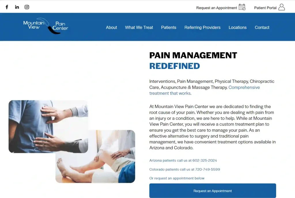
This website for Mountain View Pain Center is a compelling example for designing a chiropractic website due to its patient-centered focus, and informative content. The site effectively communicates its expertise in pain management and chiropractic therapy while offering various treatment options.
Features Liked:
Comprehensive Treatment Information: Detailed service descriptions and explanations help visitors understand the offered treatments and their benefits.
Patient Testimonials: The inclusion of success stories adds credibility and builds trust, helping potential patients feel more confident about the center’s services.
Appointment Scheduling: The “Request an Appointment” feature provides a convenient way for visitors to initiate contact and express interest in services.
Interactive Map: The map displaying clinic locations improves user experience. It helps visitors to quickly locate the nearest center.
Multidisciplinary Approach: Highlighting a wide range of pain management techniques illustrates the center’s expertise and fosters confidence among patients seeking holistic care.
 UTC Chiropractic in San Diego

UTC Chiropractic in San Diego, stands out as an exemplary design for chiropractic websites due to its user-friendly interface and informative content. It offers a range of chiropractic services and valuable information about the practice.
Five Liked Features:
Service Highlight: Concise service details showcase the clinic’s offerings.
Doctor’s Profile: Dr. Caldwell’s bio establishes credibility and connection.
Contact Form: A user-friendly form simplifies appointment scheduling and inquiries.
Location Information: Clear address, map, and contact details improve accessibility.
Educational Section: Information on pain areas exhibits the clinic’s expertise and educates visitors.
 Brooklyn Chiropractic Studio

This website, Brooklyn Chiropractic Studio, serves as an excellent example for designing a chiropractic website due to its user-friendly layout.
Five Liked Features:
Clear Service Descriptions: Services are explained comprehensively, showcasing expertise and addressing potential client concerns.
Personal Connection: Dr. Jess Driscoll’s story adds a personal touch, building rapport and trust with visitors.
Testimonials: Client reviews add credibility and build confidence in the practice’s effectiveness.
Modern Design: The website’s modern and responsive design ensures a visually appealing experience on various devices.
Comprehensive Service Coverage: The website covers a broad range of chiropractic services, from pediatrics to family care, providing a holistic approach.
 Modern Chiropractic Chicago

Modern Chiropractic Chicago’s website is a well-structured platform that offers valuable information and seamless navigation for potential patients seeking chiropractic service. The content is concise yet informative, conveying a patient-centered approach and a broad range of services. The scheduling information, patient testimonials, and contact details are prominently displayed, ensuring easy access to essential information.
Features Liked:
Detailed Office Hours: Clearly displayed office hours and appointment timings, aiding user convenience.
Patient Testimonial: Genuine patient testimonial adds credibility and establishes a positive rapport.
Service Variety: Listing various services, including chiropractic therapy, acupuncture, and massage therapy, showcases expertise.
Transparent Philosophy: The commitment to evidence-based care and avoiding unnecessary treatment plans instills trust.
Contact Information: Prominent contact details and a call-to-action for scheduling appointments ensure easy patient engagement.
 Chiropractic First

Chiropractic First, offers another compelling example for designing a chiropractic website due to its user-friendly interface and informative content. With a focus on health and family well-being, the site effectively communicates its services.
Five Liked Features:
Comprehensive Information: The website effectively communicates services, philosophy, and testimonials, that gives visitor a comprehensive understanding of the clinic’s offerings.
Global Presence: Highlighting clinics across six countries adds credibility and demonstrates the clinic’s reach.
Educational Content: The inclusion of health talks and a resource center showcases a commitment to patient education and wellness.
Clear Call to Action: The prominent “Book an Appointment” feature encourages visitors to take action, streamlining the conversion process.
Responsive Design: The site’s responsive layout ensures a seamless experience across various devices, catering to a wider audience.
 Largs Chiropractic

This website for Largs Chiropractic serves as an notable example for designing a chiropractic website due to its comprehensive content, user-friendly layout, and thoughtful features.
Five Liked Features:
Comprehensive Treatment Information: The “What we treat” section offers a detailed list of conditions treated, demonstrating expertise and catering to a wide range of potential patients.
Practitioner Profiles: Profiles of the practitioners enhance trust by showcasing their qualifications and experience.
COVID-19 Adaptation: Highlighting adaptations made during COVID-19 closure underscores the clinic’s commitment to safety.
Treatment Variety: The website features a range of treatment options, appealing to patients seeking diverse solutions beyond chiropractic treatment.
Referral Services: Offering X-ray & MRI referral, orthotic fitting, and posture & gait analysis demonstrates comprehensive care and expertise.
5 Typical Mistakes To Avoid In Chiropractic Web Design
Avoid These 5 Common Mistakes in Designing Your Website:
- Missing Landing Page Clarity: Ensure your website has a clear and engaging landing page that immediately communicates your chiropractic services and their benefits. Avoid confusing visitors with cluttered layouts or unclear messaging.
- Insufficient Visual Appeal: Incorporate high-quality images that resonate with your practice’s values. Avoid using generic or low-resolution pictures that may undermine the professionalism of your website.
- Say No to Generic Auto-Generated Descriptions: Craft unique and relevant meta descriptions for each page of your website. Avoid relying on auto-generated descriptions that can diminish the attractiveness of your site in search engine results.
- Regular Posting Schedule Matters: Establish a consistent posting schedule for your blog or news section. Avoid irregular updates, as they can give the impression that your practice is not actively engaged or up-to-date.
- Home Page Relevance is Key: Keep your home page focused on essential information, services, and patient benefits. Avoid cluttering it with irrelevant content that could confuse visitors or lead them away from your core offerings.
Incorporating the insights from these top 10 chiropractic websites can be your key to entering the field with confidence. The blend of innovative aesthetics and functional features showcased in these examples opens the door to effectively connect with clients and establishing a solid online presence.


