Acupuncture is becoming more popular day by day in today’s health-conscious world. With a growing demand for acupuncture services, the field has become more competitive. Since most of the people first look online for information, acupuncturists need to ensure their professional presence on the internet.
After conducting thorough research, we have created a list of exceptional websites. These websites have been chosen for their impressive design, optimal functionality, and exceptional user experience.
By checking out these examples, you can get ideas to make your own acupuncture website better.
11 Best Website Design Examples
Explore these website design examples from acupuncturists to find the perfect inspiration:
1. Pi Acupuncturist (Figma Template)

Our Acupuncturist Figma Template is a carefully designed solution made for acupuncture practitioners. Improve your online presence with this easy-to-use Figma template. It features a combination of soothing visuals and easy-to-use navigation. This template effectively showcases your skills, services, and holistic methods.
2. YINOVA

The Yinova Center’s website is a prime example of a well-designed acupuncturist website. This website effectively blends informative content, user-friendly navigation, and attractive design.
Here’s an analysis of the website’s key attributes:
1. Comprehensive Information: This website has lots of information about acupuncture and how it can be helpful. It explains how acupuncture works, how it can help with healing and reducing pain, and much more. This website has everything you need to know about acupuncture.
2. User-Friendly Design: The website’s menu is easy to understand, so visitors can easily explore different parts of the site like services, team profiles, and resources. It ensures better experience for the user.
3. Scientific Validation: One impressive aspect is how the “Yinova Center” uses scientific proof to back up their claims. They provide studies, ultrasound pictures, MRI results, and thermal images as evidence that acupuncture really works. This approach makes their services more trustworthy.
4. Modern Yet Traditional Aesthetics: The website combines modern design with traditional Chinese medicine concepts. This idea helps the website look welcoming and authentic.
5. Accessibility and Convenience: The clinic wants to make it easy for people to get appointments and reach them. You can book appointments online and they also have their contact information clearly listed on their website. They really care about being easy to reach and convenient for their patients.
6. Team Showcase: This website highlights the clinic’s board-certified acupuncturists and their specializations. This makes a personal connection with potential patients, and make them feel more confident.
7. Diverse Resources: This site offers a rich array of resources on acupuncture and Chinese medicine, including articles on various topics. These resources serve as valuable educational tools for visitors.
8. Newsletter Engagement: The newsletter sign-up option allows the clinic to engage with interested peoples and keep them informed about updates and offerings.
3. Alquimia Wellness

The Alquimia Wellness website is dedicated to promoting its services in acupuncture and massage therapy. Located in Brooklyn, NY. This website focuses on alternative medicine approaches to physical and emotional health.
Here’s a brief analysis of the website:
- Clear Focus: The main purpose of the website is to help people make appointments and learn about the services they offer. The big call-to-action button that say “Book Appointment” make it easy for visitors to take action.
- Services Offered: The website lists the various services provided, including acupuncture, dry needling, clinical massage, and prenatal massage. This helps visitors quickly understand the range of treatments available.
- Contact Information: The website provides essential contact information, including the clinic’s address and phone number. A note about contacting them for unavailable time slots adds a personal touch.
- Professionalism: This website shows how the staff are very professional. They want everyone to know that they are licensed professionals in New York State and have proper certifications. This helps people feel comfortable and trust them when considering their services.
- eGift Card Option: Offering an “eGift Card” shows that the company cares about making things easier for customers. It could be a unique selling point(USP) for the business.
- Responsive Design: This website have responsive design, so you can easily use it on different devices.
- Copyright Information: The copyright notice at the bottom of the page adds a sense of authenticity.
4. East Village Acupuncture & Massage

The website for East Village Acupuncture features a clean and organized design with a white background. The menu is prominently displayed at the top, that allows users to access essential sections quickly.
Here are the key attributes :
1. Content Presentation: The content is well-structured and provides valuable information about the clinic’s services, scheduling, and contact details.
2. Engaging Imagery: The website effectively uses images, including the clinic’s interior and staff. These images help build trust with potential clients and showcase how the clinic looks like.
3. Clear Call to Action: The “BOOK NOW” button is placed in a smart spot to make people want to schedule an appointment. The phone number is also prominently displayed.
4. Informative Content: The website has a lot of information about the different services they offer, like acupuncture, cupping therapy, and facial rejuvenation acupuncture. It also talks about common health issues, such as pain, anxiety, depression, and women’s health. This shows that the clinic knows a lot about these things.
5. Testimonials: Testimonials from satisfied clients adds credibility and reassures potential patients about the quality of service.
6. About Us: The “About Us” section provides insight into the clinic’s history, philosophy, and commitment to holistic healing. It helps to establish trust with visitors.
7. Practitioner Profiles: The “Meet Our Practitioners” section highlights the experience and expertise of the clinic’s staff.
8. Educational Content: The website offers resources about acupuncture and traditional Chinese medicine, such as explanations of TCM, acupuncture’s goals, and a free eBook on acupressure for stress and anxiety.
9. Contact Information: The website provides multiple contact options, including a phone number, email address, and a physical address, ensuring accessibility for all users.
5. Susy Qi Acupuncture
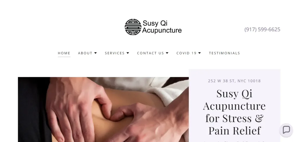
Susy Qi Acupuncture is a website for an acupuncture clinic located in Midtown West, New York City. The website provides information about their services, testimonials, and COVID-19 safety measures.
Why Suggest this Website Design as an Example of the Best Acupuncturist Website:
- Clear and Informative Navigation: The website has a simple and easily navigable menu with clear tabs for Home, About, Services, Contact Us, COVID-19, and Testimonials. This makes it easy for visitors to find the information they need quickly.
- Professional Presentation: The website looks really professional because it has a clean and modern design. It features a prominent phone number, clinic address, and a call-to-action for scheduling appointments or consultations. The use of high-quality images adds to its visual appeal.
- COVID-19 Information: In the wake of the COVID-19 pandemic, this website stands out because it gives lots of information about how Chinese medicine can help fight against COVID-19. It also tells you about the safety precautions the clinic takes. This shows their commitment to patient well-being and transparency.
- Testimonials: They highlights testimonials from satisfied patients builds trust and credibility. It demonstrates that the clinic has a track record of providing effective acupuncture services.
- Comprehensive Service Details: The website has lots of information about what licensed acupuncturists do. It tells you about their specialties and how they treat people. This helps you know what kinds of problems the clinic can help with.
- Contact Information Accessibility: You can easily find the contact information, like a phone number, email address, and location, on the website. This makes it simple for people who want to ask questions or schedule appointments to reach out.
- Responsive Design: This website is designed to be responsive, and we already discussed about importance of responsiveness .
- Newsletter Subscription: You can choose to get updates through email if you want. This helps the clinic connect directly with people who are interested and might become clients.
6. Kismet Acupuncture & Apothecary

The Kismet Acupuncture & Apothecary website is unique and looks really nice. It’s great for people who want to find natural healing services.
Here’s a brief analysis of the website:
- Distinct Branding: The website grabs your attention right away with its strong and unique branding. The bright pink colors and cool fonts match the owner’s style, making a really memorable first impression.
- Engaging Personal Touch: The introduction by the owner, Katie, adds a personal touch to the website. Her colorful description and sense of humor humanize the practice and make visitors feel welcome.
- Clear Navigation: The menu on the website is easy to use, so visitors can easily go to different parts of the site. It has sections like “Home,” “About,” “Services,” and “Shop” that are easy to find, which makes it user-friendly.
- Customer Testimonials: When a customer says good things about a service, it makes people trust it more. It also makes more people want to make appointments.
- Community Engagement: The website encourages people to get involved with the practice by using social media and signing up for emails. This helps create a feeling of belonging and staying connected with others.
- Contact Information: Critical information such as business hours and contact details are easily accessible, that helps potential clients reach out or plan their appointments efficiently.
7. Nan Yi Chun Acupuncture

This website, “Nan Yi Chun Acupuncture,” has a neat and easy-to-understand layout. It gives visitors important information about acupuncture services, the practitioner, and other related details.
Here’s a brief analysis of the website:
- Clear Mission Statement: The home page of Nan Yi Chun Acupuncture shows their main goal of helping people with pain, sickness, and staying healthy.
- Easy Navigation: The top menu bar offers straightforward navigation options, including Home, Meet Nan Yi, Services, FAQ, Pricing/Insurance, and Contact. This makes it simple for visitors to find the information they need.
- Professional Credentials: The “Meet Nan Yi” section introduces the practitioner, highlighting her background and education in acupuncture and Oriental medicine. This builds trust and credibility.
- Testimonials: Real customer testimonials add credibility and provide social proof of the effectiveness of the services offered.
- Services Overview: The website groups services by different health concerns, so visitors can easily find the specific area they need help with.
- Pricing and Insurance Information: They make sure to be transparent about how much things cost and what insurance will cover.
- Contact Information: A clear contact form, along with opening hours, phone number, and address, ensures visitors can easily get in touch or schedule appointments.
8. AB Acupuncture
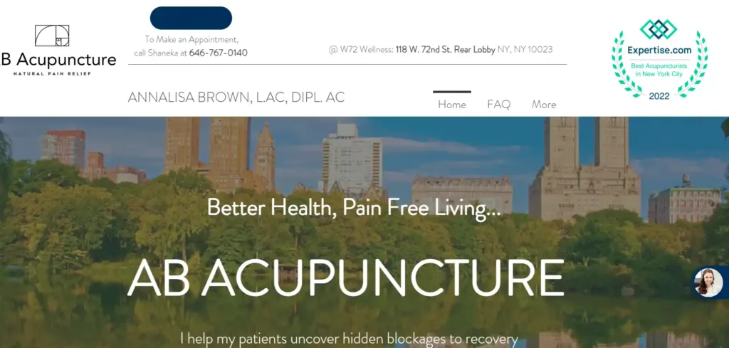
This website, AB Acupuncture, represents Annalisa Brown. She is a licensed acupuncturist who works in New York City. Her job is to help people feel better and relieve pain using natural methods like acupuncture.
Here’s a breakdown of the website’s design and content:
- Clear and Informative Navigation: This website has a simple menu that makes it easy for visitors to find important information like Home, FAQ, and Contact details. This improves the overall experience for users.
- Prominent Contact Information: The top of the page has easy-to-find contact information, like a phone number and address. This makes it simple for potential clients to get in touch.
- Engaging Video: The website includes a video titled “Why Acupuncture?”. This engages visitors and provides valuable information about the benefits of acupuncture. The use of video can be an effective way to explain complex information and capture the audience’s attention.
- Informative Content: The website has lots of information about what Annalisa Brown offers, like acupuncture for different health issues, orthopedic acupuncture, help for COVID-19, and a program for Lyme disease. If you visit the site, you can learn how acupuncture can help with different health problems.
- Personal Story: Annalisa Brown tells her own story and shares information about her background, which helps potential clients feel more connected to her. This personal touch helps visitors relate to her on a deeper level and trust her as a practitioner.
- Professional Credentials: On the website, it shows that Annalisa has done a lot of studying and has earned certificates. This proves that she knows a lot about acupuncture and other related things. This information helps people feel confident in her abilities as a practitioner.
- Client Testimonials
- Contact Form: Visitors can use a handy contact form to send messages directly to the practitioner. This makes it simple for them to ask about appointments or to get answers to any questions visitors may have.
- Newsletter Subscription: The website offers a newsletter subscription option for its visitors.
9. Sarah Biffen

This website, belongs to Sarah Biffen, a licensed Acupuncturist and Herbalist practicing in NoHo and Williamsburg, Brooklyn.
Here’s an analysis of the website:
- Simplicity and Clarity: The website’s layout is simple and well-organized. The main navigation menu is displayed at the top, which makes the website user friendly.
- Relevant Content: The content on the website is concise and directly related to the services. The homepage includes essential sections like “Home,” “About,” “Services,” “Media,” “Get in Touch,” and “Book Online,” . It ensures that visitors can quickly access the most critical information easily.
- Clear Contact Information: You can easily find the contact information on the website, which is important if you want to reach out to the practitioner.
- Educational Content: The website has info about Traditional Chinese Medicine. This helps visitors learn about the whole approach of Chinese Medicine, so they can understand the services offered.
- Professional Imagery: The use of professional photography by Kyrre Skjelby Kristoffersen adds a personal touch to the website and showcases the practitioner’s dedication to her work.
- Mobile Responsive
10. R. Phil Wellness

This website is for a clinic that provides acupuncture in New York City’s Upper West Side. It has details about the services offered, the clinic’s staff, and how to get in touch with them.
Here’s an analysis of the website:
- Clear Navigation: The website has a straightforward and easily navigable menu at the top.
- Contact Information: This website displays the clinic’s contact information, including phone number and address. It helps potential patients to reach out.
- About the Practitioner: Dr. Philip Trigiani, the main practitioner, is introduced with a photo and detailed credentials, establishing trust and expertise.
- Services: The website has a list of services that can help with many health problems. This services include : managing pain, taking care of mental health, and even doing acupuncture for kids.
- Trusted Partners: There’s a section mentioning trusted partners, which adds credibility to the clinic’s services.
- FAQs: Frequently asked questions are addressed, to offer transparency and helpful information to potential patients.
- Patient Reviews: The website highlights positive patient reviews. It helps to improve clinics reputation.
- Insurance Information: People who come to visit can easily find a list of insurance companies that will cover their medical expenses. This helps make it easier for more people to be able to get the healthcare they need.
- Blog: The website has a blog section where you can find articles about acupuncture and other related topics. These articles show that the website knows a lot about acupuncture and they give helpful information to people who visit.
- Appointment Request: A form allows visitors to request appointments directly through the website.
- Social Media Links: You can find links to the clinic’s social media profiles, which invite you to interact with and connect to the clinic.
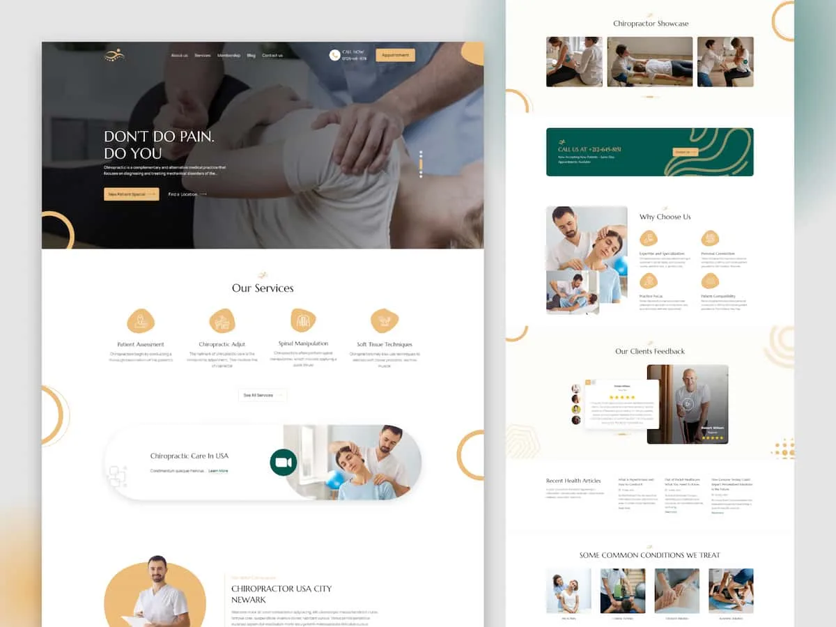
11. Rockefeller Health Medical

The website “Rockefeller Health Medical” appears to be a professional and informative platform for a chiropractic and healthcare. It offers several key components:
- Clear Branding: The website clearly shows the name of the center and how to contact them
- Navigation: The navigation menu at the top provides easy access to various sections of the website.
- Services Overview: The homepage features a brief overview of the services offered, which include chiropractic, physical therapy, massage therapy, sports medicine, and acupuncture.
- Professional Credentials: This website introduces Dr. Anthony Conte, the chiropractor, and highlights his qualifications and experience, which helps build trust and credibility.
- Location and Contact Information: This website provides the service location and their contact information as well. This information helps people to reach out them easily.
- Insurance Information: The site mentions the accepted insurance providers, which is essential information for prospective patients.
- Office Hours: It provides the office’s working hours to make it convenient for visitors to plan their appointments.
- Patient Reviews: Testimonials from satisfied patients are also featured on the site.
- Featured Articles: The articles related to chiropractic care and health topics adds value to the website.
Our collection of acupuncturist website designs can provide great ideas for acupuncturists who want to improve their online presence. These websites were chosen because they demonstrate the importance of having a professional and user-friendly design, as well as elements that build trust. Remember, a well-designed website is more than just about looking good – it can be a strong tool for success in the field of acupuncture.