The roofing industry has a Outstanding worth of $100 billion worldwide. If you find your business lacking quality leads, the issue is not with the demand but with the absence of a well-designed website.
A successful roofing company website excels in two important aspects: Design and Functionality. By prioritizing this two aspect roofing business can improve their conversion rate.
A visually appealing website holds great significance in the roofer industry, as people are naturally attracted to visually pleasing things.
In this article, I will present you with 10 best roofing web design examples that are effectively driving sales and attracting customers.
1. Coast 2 Country Roofing
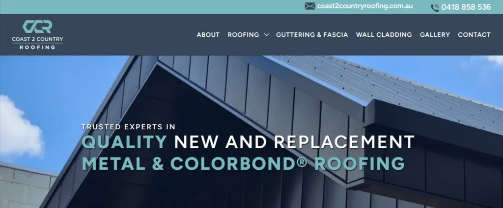
Coast 2 Country Roofing website exhibits several design and features that make it a good example of a top roofing website.
Here’s why I considered to recommend it as an example:
- Clear and Relevant Content Hierarchy: The website follows a clear content hierarchy, with a navigation bar at the top. It categorizes services like “ABOUT,” “ROOFING,” “GUTTERING & FASCIA,” “WALL CLADDING,” “GALLERY,” and “CONTACT.”
- Visible Contact Information: This website provides a visible and easily accessible phone number at the top. The contact information is also repeated in the footer.
- Strong Call to Action: The “CALL COAST TO COUNTRY ROOFING” and “FREE QUOTE” buttons stand out prominently on the page. These CTAs encourage visitors to take action.
- Client Testimonials: The website features testimonial from satisfied customers. Testimonials like these can influence visitors to choose the services of the company.
- Professional Imagery: It includes a “GALLERY” section, that showcases examples of their previous roofing work.
- Clear Services Overview: Under the “OUR SERVICES” section, different services are listed and explained concisely. This makes it easy for visitors to understand the range of services the company offer.
- Warranty and Reliability: This website mentions a 6-year warranty, which highlights the company’s commitment to customer satisfaction and reliable services. This can be a significant selling point for potential clients.
- Company Information: The “ABOUT” section provides insights into the company’s experience and qualifications.
- Responsive Design: This website is easily accessible through different devices.
- Branding and Copyright: The copyright notice at the bottom (©2023 Coast 2 Country Roofing. All Rights Reserved) adds a professional touch.
- Contact Information: The website provides multiple ways to contact the company, including a phone number, email address, and physical address.
- Location Information: The physical address of the company is mentioned, along with a map location, which helps potential clients know where the company is located.
Roofing companies often pair professional websites with SEO packages for local businesses to generate leads.
2. Vincent Roofing
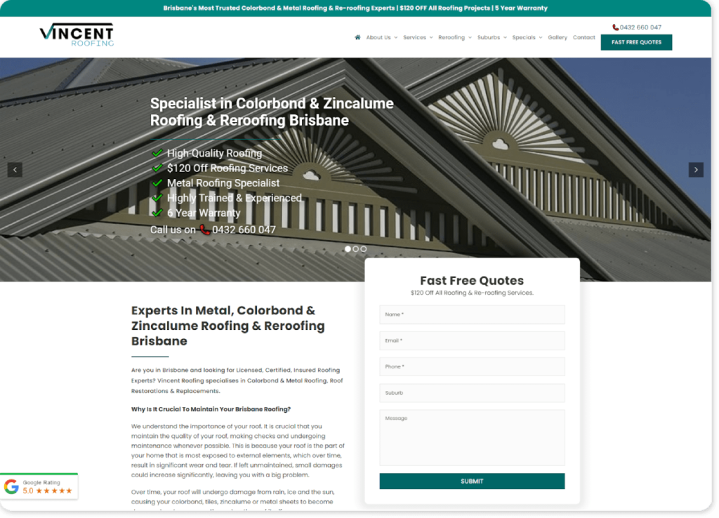
Vincent Roofing site designed with a focus on clarity, professionalism, and user-friendliness. Here are the reasons to recommend this website as an example of good roofer web design:
- Clear and Relevant Content: The website’s homepage presents clear and concise information about the services. It provides an overview of the company’s expertise in metal roofing, re-roofing, color bond roofing, and related services. This ensures that visitors quickly understand the core offerings.
- Visible Contact Information: The contact details, including the phone number and a call-to-action for “Fast Free Quotes,” are displayed at the top of the webpage. This makes it easy for potential customers to get in touch.
- Responsive Design: This website have a responsive design that adapts well to different screen sizes and devices. It ensures a consistent user experience across desktops, tablets, and smartphones.
- Prominent Calls-to-Action: Throughout the page, there are clear calls-to-action (CTAs) that encourage visitors to contact the company for quotes, information, or assistance. These CTAs are placed strategically to guide users toward taking action.
- High-Quality Imagery: Images used on the website are relevant to the roofer industry and showcase the company’s work. The before-after imagery can build trust and provide a visual representation of the company’s capabilities.
- About Us Section: This section gives visitors a glimpse into the company’s values and approach.
- Services and Specializations: This website has separate sections dedicated to various services , such as re-roofing, roof restoration, and roof replacement.
- Testimonials : Customer testimonials or ratings (like the 5.0 Google Rating mentioned) on this website can further establish the company’s credibility and trustworthiness.
- Easy Navigation: The navigation menu at the top of the site provides clear links to important sections of the website.
- Contact Form: The presence of a contact form allows visitors to provide their details and ask for specific inquiries.
- Focus on Benefits: The content highlights the benefits of the company’s services, such as affordable prices, high-quality materials, a 7-year warranty, and more.
Overall, the website appears to be well-designed for its intended purpose.
3. NY Roofing
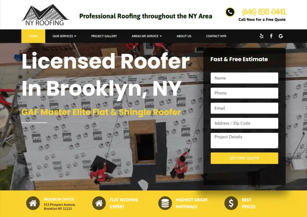
Ny roofing website has several design and content features that make it a good example of effective roofing site design.
Here’s why you might consider this website as an example:
- Clear and Relevant Messaging: Website’s main message is clear – it’s about roofing services in the NY area.
- Prominent Contact Information: Phone number for inquiries is displayed in the header, that ensure visitors can easily reach out for information or quotes.
- Simple Navigation: The navigation menu is straightforward. It provides clear links to essential sections such as “Home,” “Our Services,” “Project Gallery,” “Areas We Service,” “About Us,” and “Contact NYR.” This structure helps visitors find the information they need quickly and efficiently.
- Call-to-Action Buttons: Throughout the page, there are strategically placed call-to-action buttons that encourage users to take action, such as getting a free quote.
- Professional Imagery: “Project Gallery” section displays images of completed roofing jobs, showcasing the quality of work. This highlight company’s capabilities and builds trust.
- About Us Section: This website includes a “About Us” section that provides insights into the company’s experience, expertise, and commitment to quality.
- Responsive Design: Their website adapts well to various screen sizes and devices, which is important for user experience.
- Service Details: The “Our Services” section is well-organized and provides information about the different types of roofing services.
- Contact Information: The footer contains the company’s address, phone number, and email address, providing multiple ways for visitors to get in touch.
- Blog Section: This website features a blog with informative articles about roofing-related topics. This can establish the company as an authority in the industry and help to improve their roofing seo.
- Consistent Branding: This site maintains consistent branding through color schemes, fonts, and design elements. This consistency enhances the professional appearance of the website.
4. Houston Roofing and Construction
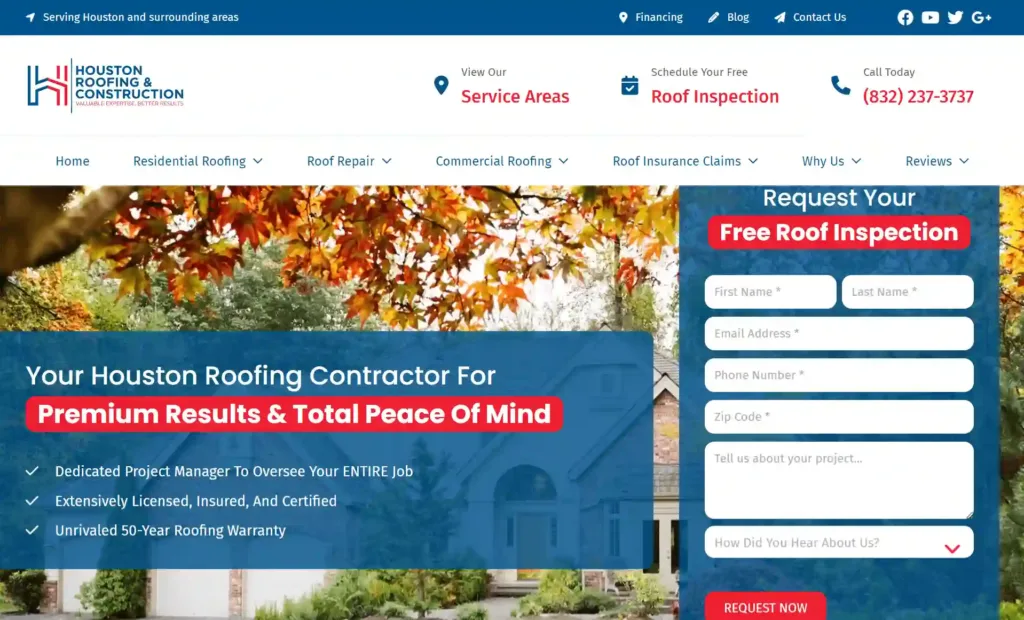
Houston Roofing & Construction website have several design and feature elements that make it a strong example of a roofing contractor website.
- Clear and Relevant Content: The website is easy to understand and well-organized. It gives important information about what the company does, including services for homes and businesses, fixing roofs, and dealing with insurance claims. Each section of the website has short heading that make it simple for visitors to find what they’re looking for.
- Trustworthy Branding: The website wants people to know that they can trust and rely on it. It talks about concerns that people often worry about when it comes to roofing contractors. This can help make people feel more confident if they are thinking about becoming customers.
- Strong Call to Action (CTA): The website has a call to action button that says “Request Your Free Inspection.” It’s right at the top and you can see it again as you scroll. They put it there to make it easy for people to contact with the company.
- Client Testimonials: The website includes testimonials from previous clients. This testimonials show that they had good experiences and satisfied with the service. Having these testimonial makes the company seem more trustworthy .
- Visual Appeal: The website uses high-quality images of completed roofing projects, providing visual evidence of the company’s work.
- Transparent Information: The website provides transparent information about the company’s qualifications, licenses, and certifications. This transparency can help to showcase company’s legitimacy and expertise.
- Easy Contact Options: The website provides multiple ways for visitors to get in touch, including a phone number, email address, and a contact form.
- Educational Blog: If a company has a blog, it means they are dedicated to giving their customers more than just their services. The blog might have helpful information, like articles about fixing roofs, dealing with insurance claims, and choosing roofing materials. This shows that the company knows a lot about the roofing industry and can be trusted.
- Financing Information: The website offers detailed information about financing options, including affordable monthly payment plans. This can attract potential customers who might be concerned about the financial aspect of roofing projects.
- Responsive Design: The website looks like it can change and fit nicely on different screens and devices. This makes sure that people who visit the site on things like phones and tablets have a good experience.
- Awards: This website displays the company’s A+ rating with the Better Business Bureau and mentions its GAF Master Elite Certified status. These certifications and awards demonstrate the company’s dedication to providing good quality and being professional.
5. Cristian Roofing and Remodeling
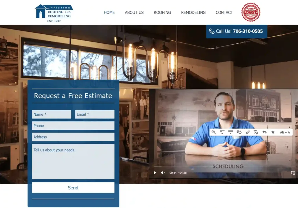
Here are some reasons why you might choose Christian Roofing & Remodeling website as an example:
- Clear and Concise Navigation: The website has a straightforward navigation menu at the top.
- Prominent Contact Information: The phone number is prominently displayed at the top of the page.
- Strong Call-to-Action: The “Request a Free Estimate” button is a clear and effective call-to-action that stands out on the page.
- Customer Testimonials: The website features testimonials from satisfied clients, giving credibility to the quality of their services.
- Services and Expertise: The content on the website is organized into sections that highlight their services – Roofing and Remodeling. Each service section is accompanied by a “See Gallery” link, that allows visitors to view their work examples.
- Company Certifications and Experience: The website highlights the company’s certifications, such as being a GAF Master Elite Roofing Contractor and having 80 years of service history.
- Responsive Design : This website has responsive design.
- Easy-to-Find Contact Information: The footer of the website contains the contact phone number, office hours, and copyright information.
- Visual Galleries: The “See Gallery” links associated with the roofing and remodeling sections provide visual evidence of their work.
- Brand Identity: The branding elements, such as the logo, company name, and tagline, are consistent and visible throughout the website.
6. Quantum Roofing
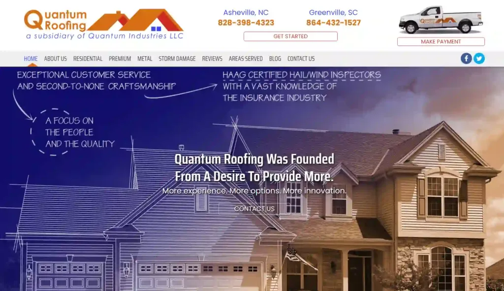
Quantum Roofing design is not the most modern but has a clear and straightforward layout. Their SEO is also top-notch.
Here are some reasons why you might consider this website as an example :
- Clear and Focused Layout: The website has a clear and straightforward layout with a navigation menu at the top.
- Contact Information: The contact information, including phone numbers and physical address, displayed at the top of the page.
- Call-to-Action Buttons: The website includes call-to-action buttons such as “GET STARTED” and “MAKE PAYMENT,” guiding visitors to take specific actions.
- Comprehensive Services: The website provides comprehensive information about the different roofing services they offer.
- Service Details: Each service category is explained in detail, outlining the specific benefits and solutions offered.
- Expertise and Experience: The website highlights the expertise and experience of the roofing contractors.
- Service Areas: The website clearly states the areas served by the roofing company.
- Clear Branding: The company’s branding is consistent throughout the website, with a logo and color scheme that match the roofing industry’s aesthetics.
- Privacy and Policies: The website includes privacy and cookie policies, which are important for legal compliance and visitor transparency.
7. Force Field Roofing
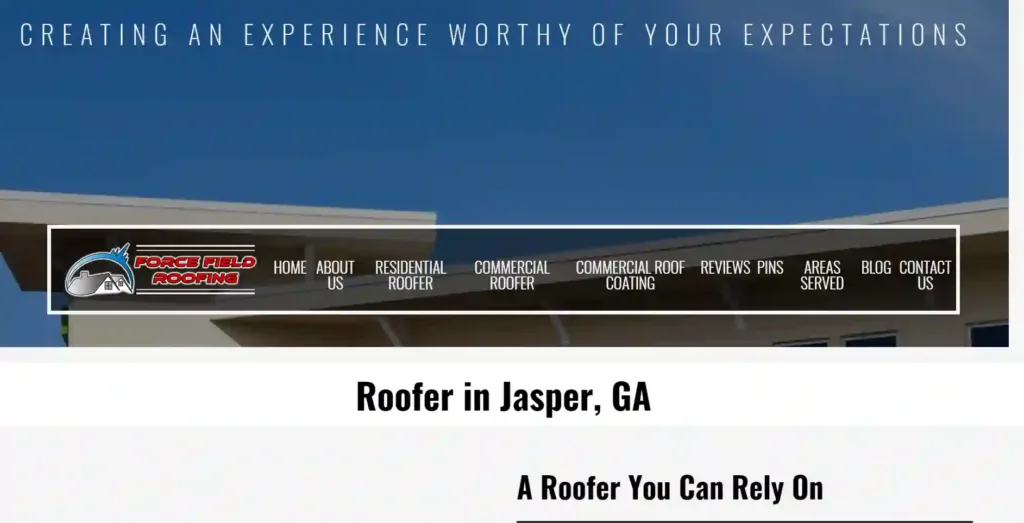
Force Field Roofing website is simple and easy to navigate, with a focus on clear and concise information.
Here are some other reasons why you might consider it as an example of a well-designed roofing website:
- Clear and Accessible Contact Information
- Focused Call-to-Action
- Professional Imagery
- Clear Menu Navigation
- Emphasis on Expertise: The website effectively highlights the company’s expertise and professionalism in roofing services. It mentions that the roofers are fully qualified and manufacturer-approved applicators for top-quality roofing materials.
- Service Overview: The homepage offers a brief overview of the services provided, including residential and commercial roofing, storm damage repair, and commercial roof coating.
- Customer Reviews: This website features a positive customer review section.
- Simple Three-Step Process: This website outlines a straightforward three-step process for customers: contact, evaluate/repair/replace, and enjoy the protected result. This breakdown simplifies the roofing process for potential clients.
- Responsive Design
- Clear Contact Form
- Reinforcement of Reliability: The website wants you to know that they are trustworthy. They promise to provide services that work well and won’t cost too much.
8. Findlay Roofing
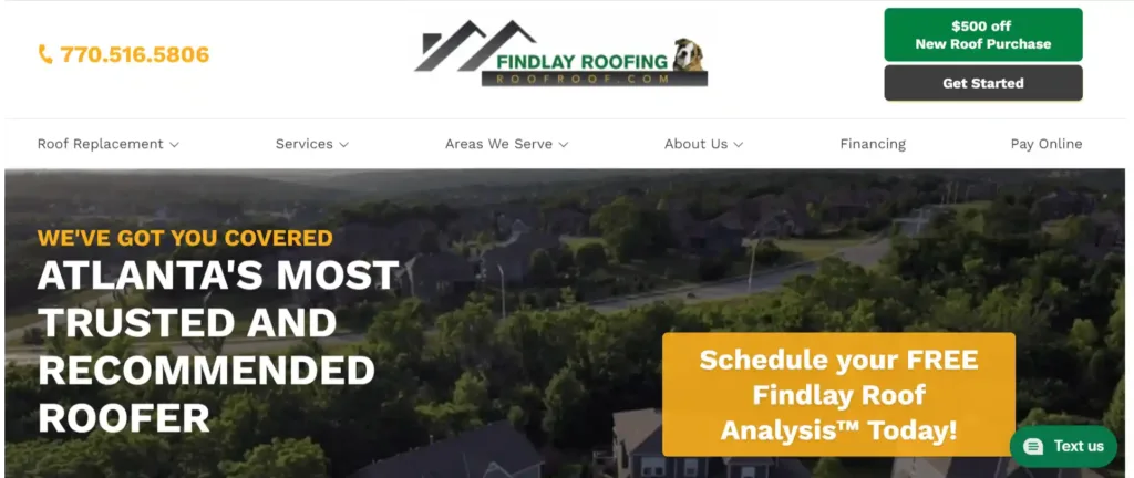
Design and feature elements that Findlay Roofing website provides:
- Clear and Focused Messaging
- Prominent Contact Information
- Call-to-Action (CTA) Buttons
- Special Offer Highlight: The offer of getting “$500 off when you buy a new roof” is easy to see right away. This makes it feel like you need to act fast and could make more people decide to buy.
- Visual Content
- Service Information
- About Us Section
- Client Numbers: The website displays impressive statistics (“581,862,151 NAILS IN 66,223 ROOFS”), indicating the company’s extensive experience and the volume of work completed. This can reassure visitors about the company’s competence.
- Contact Information in Footer
- Responsive Design
- Trust Indicators: The website includes logos of well-known platforms such as Facebook, Google, YouTube, LinkedIn, and Angie’s List. These logos serve as trust indicators and can increase the company’s credibility.
- Consistent Branding
- Minimal Navigation
- Focused Landing Page
9. Chicago Flat Roof Company
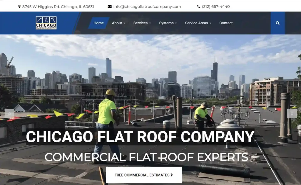
Chicago flat roof company website is refreshingly simple, with a focus on functionality and information over flashiness.
Here are some reasons to consider Chicago flat roof company as an example:
- Clear and Direct Information
- Strategic Use of White Space: The website employs a good amount of white space, which improves readability and prevents the design from feeling cluttered.
- Prominent Contact Information
- Responsive Design
- Strong Visual Elements
- Clear Navigation
- Customer Testimonials
- Featured Work and Latest News: The “Featured Work” section highlights completed projects, and the “Latest News” section provides valuable information and updates to visitors, demonstrating the company’s expertise and dedication.
- Service Offerings
- Call to Action (CTA)
- Service Areas: The website clearly lists the areas the company serves, showing visitors whether they’re within the service coverage. This minimizes confusion and filters out irrelevant inquiries.
- Subscription Option: The subscription option allows visitors to receive updates and offers via email, helping the company build and maintain a client base.
- Emergency Services: The website emphasizes 24/7 emergency services, which can be a critical factor for customers in need of immediate assistance.
- Transparent Pricing: The website provides pricing information for various roofing services. This transparency can build trust with potential customers.
- Branding and Trust Signals
- Footer Information: Essential contact details, operating hours, and links to important pages are available in the footer.
10. North American Roofing
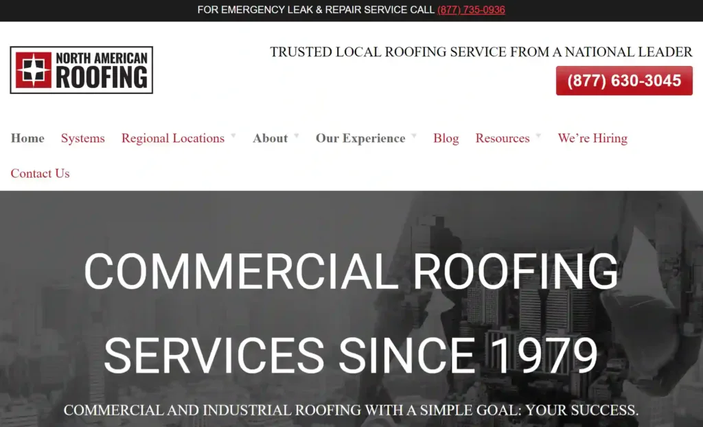
North American Roofing’s official website exhibits several design elements and features that make it a recommendable example of a well-designed roofing website. Here are the reasons why:
- Clear and Concise Navigation
- Prominent Contact Information
- Strong Call-to-Action
- Engaging Visuals
- Clear Messaging
- Strong Branding
- Responsive Design
- Testimonials and Credentials
- Service Descriptions
- Educational Resources
- Contact Form
- Service Locations
Best Practices for your Roofing web design
Standing out your website among the competitors is not easy task. The success of roofing websites is not a matter of luck; it is a result of thorough research and understanding of effective strategies. These roofing professionals have invested time and effort into identifying what works and what doesn’t.
1. Prioritize user experience and navigation
When designing your roofing website, it’s important to prioritize user experience and navigation. A well-designed website not only attracts potential customers, but also makes it easy for them to find the information they need.
Creating a clear and concise structure for your website, with a menu that highlights key pages such as services, testimonials, and contact information.
Use descriptive labeling for your menu items and make sure they are easy to locate.
Ensure that your website is mobile-friendly and optimized for smaller screens.
2. Use high-quality images and videos
Using high-quality images and videos is paramount. These visual elements can greatly enhance the look and feel of your website.
When your business uses low-quality images and videos, it might make people think that you don’t pay attention to details or that you don’t meet the standards of the industry.
To ensure that your website is visually appealing and effective, invest in high-quality images and videos that showcase your roofing expertise and the quality of your work.
Utilize professional-grade cameras and editing software to capture and showcase your work in the best possible light.
Optimize the size and resolution of your images and videos to ensure fast loading times and a seamless user experience.
3. Include customer testimonials and reviews
One of the best practices for your roofing site is to include customer testimonials and reviews. These can help build trust with potential customers and provide social proof of the quality of your services.
When including testimonials, it’s important to make sure they are authentic and include the customer’s full name and location. You can also include photos or videos of satisfied customers alongside their testimonials.
Reviews from third-party sites like Google My Business or Yelp can also be incorporated into your website using widgets or plugins.
4. Optimize for search engines
Optimizing your website for search engines involves various techniques, including keyword research, on-page optimization, and link building.
By implementing these techniques, you can improve your website’s visibility in search engine results pages, driving more organic traffic to your website.
Remember, search engine optimization is an ongoing process, and it requires continuous monitoring and optimization.
5. Ensure mobile responsiveness and speed
This involves designing a website that is easily navigable and aesthetically pleasing on mobile devices, with appropriately sized images and text for smaller screens.
Here is a quick recap of the must have roofing website functionalities :
![]() Easy Navigation
Easy Navigation
![]() Clear Call-to-action
Clear Call-to-action
![]() Free Quote
Free Quote
![]() Engaging Visual
Engaging Visual
![]() Service Offerings
Service Offerings
![]() Contact information
Contact information
![]() Customer Testimonial
Customer Testimonial
![]() Guarantee Badges
Guarantee Badges
![]() Educational Blog
Educational Blog
![]() FAQ Section
FAQ Section
![]() Before-after Image Gallery
Before-after Image Gallery
![]() Deal & Promotions
Deal & Promotions
![]() Partnerships (Big brands)
Partnerships (Big brands)
![]() Responsive Design
Responsive Design
A Comprehensive Guide for Small Business website You may find Useful
Roofing Website Design Cost
The price may differ based on various factors, including the complexity of the design, the number of pages, the desired functionality, and the extent of customization needed. Additionally, the cost may also depend on whether you hire a professional web designer or use a website builder platform.
 Book a call for cost-effective and custom-made website solution for your roofing business. |
On average, a basic roof repair website design services can cost anywhere from $500 to $2,000. However, if you require more advanced features, such as e-commerce integration, customer portals, or custom animations, the cost can range from $2,000 to $10,000 or more. It’s important to discuss your specific requirements with a web designer or agency to get an accurate estimate for your roofing web site design template.
The roofing industry is a competitive one, so it’s important to have a modern and trendy website. By taking inspiration from the best roofing company web designs, you can create a site that is both visually appealing and informative. This will help you attract new customers and grow your business.


