Ecommerce conversion rate optimization (CRO) is very important for the success of any online business.
As more companies enter the digital market, it’s essential for businesses to focus on strategies to turn website visitors into paying customers. User experience (UX) is a key part of this process.
When you understand how UX affects CRO, you can make specific changes to increase your ecommerce sales and growth.
This article looks at the important connection between UX/UI and CRO and provides actionable tips for succeeding in ecommerce.
The Fundamentals of Ecommerce Conversion Rate Optimization
CRO, which stands for Conversion Rate Optimization, is the method of improving the percentage of visitors to a website who take a desired action, like buying a product, signing up for a newsletter, or filling out a contact form.
For better CRO you have to understand the users journey. CRO metrics can provide an overview of this journey and help you to optimize it.
Key CRO Metrics :
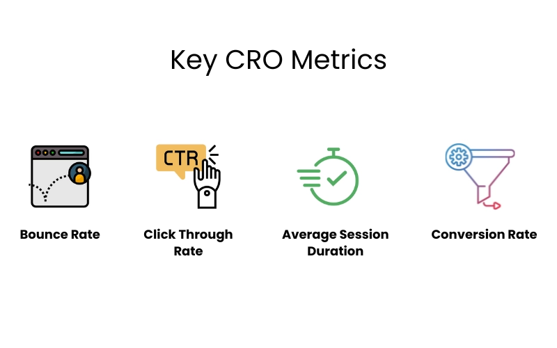
Conversion Rate: This is the percentage of people who visit your website and take a specific action.
Bounce Rate: This is the percentage of visitors who leave your website after only looking at one page.
Average Session Duration: This refers to the average amount of time that visitors spend on your website.
Click-Through Rate (CTR): This is the percentage of users who click on a particular link.
The Psychology Behind Ecommerce Conversions
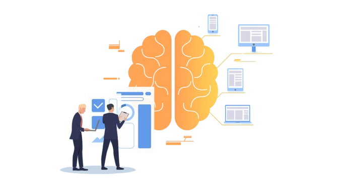
When you are running an eCommerce business, understanding the psychology behind customer behavior is crucial for driving conversions.
Imagine some people visit your website, look around, and then leave without adding anything to their cart. Others might get to the checkout but decide not to complete the purchase. This is a common challenge in eCommerce.
To maximize conversions, it’s important to focus on how you can influence your customers’ decisions.
One key factor is how customers feel when they browse your site.
Emotions like excitement, satisfaction, and trust can lead to a purchase, while frustration or confusion can push customers away.
This is why the user experience (UX) is so important. A well-designed website that’s easy to navigate and looks good can create positive feelings, encouraging customers to complete their purchases.
Trust is another major factor in online shopping.
Since customers can’t physically interact with your products or meet you in person, they rely on the professionalism and reliability of your website.
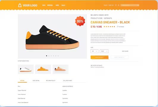
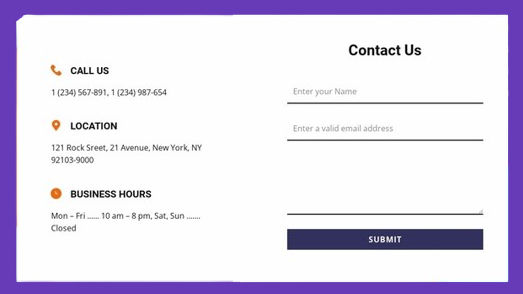
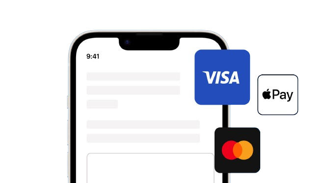
Clear product descriptions, visible contact information, secure payment options, and customer reviews all help build credibility and make shoppers feel confident buying from you.
Interestingly, new data shows that most customers don’t even land on your homepage anymore. Instead, about 60% of them arrive directly on a product page, and 20% on other pages.
This means that every page on your site needs to be optimized for conversion, not just the homepage.
If you focus on getting the basics right—like ensuring your product pages are attractive and easy to navigate—you’re more likely to see improvements in your conversion rates.
UX/UI in Ecommerce
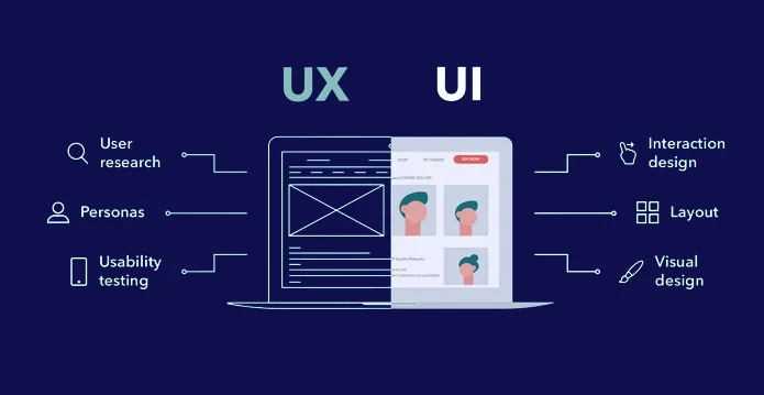
UX/UI is basically how a customer experiences your online store.
UX, or user experience, is all about how a person feels when using your website. Is it easy to navigate? Can they find what they want quickly?
UI, or user interface, is the look and feel of your store. It’s about how things look and how they work together.
Think of it like this: UX is how a store makes you feel, while UI is how the store looks. Both are super important for getting people to buy things.
UX Example : An online clothing store with a clear navigation menu, easy product filtering options, and quick checkout process provides a great user experience.
UI Example : The same clothing store, with a modern, minimalist design, high-quality product images, and consistent button styles, offers a visually appealing user interface.
The Relationship Between UX/UI and CRO
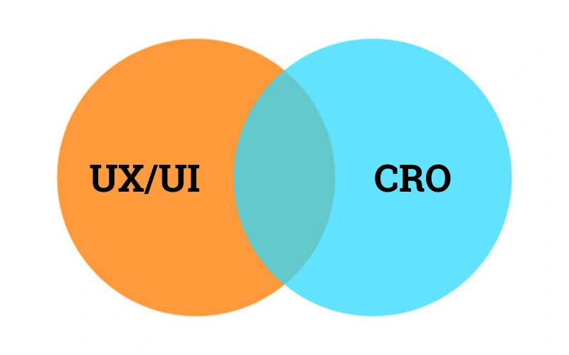
UX/UI and CRO are like two sides of the same coin when it comes to online success.
UX, or user experience, focuses on how people feel when using your website. It’s about making things easy and enjoyable.
UI, or user interface, is the look and feel of your site. It’s about making it visually appealing and easy to navigate.
CRO, or conversion rate optimization, is all about getting people to take a specific action, like buying something.
When UX and UI are great, people are happier and more likely to complete their goals, which means higher conversions for your business.
For example, a website with a clear layout, fast loading times, and a simple checkout process (good UX/UI) will likely have more customers completing purchases (high CRO) than a site that’s confusing and slow.
Key UX/UI Factors Impacting Ecommerce CRO
Here’s 7 key UX factors that impact on ecommerce conversion :
1. Information Architecture and Site Navigation
Architecture of your ecommerce website is super important for conversions. Imagine a store where you can’t find what you’re looking for. Frustrating, right?
Your online store needs a clear roadmap. This means having menus that are easy to understand, categories that make sense, and a search bar that actually works.
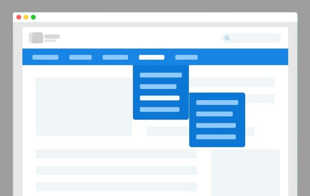
For example, an online clothing store should have clear categories like “Men’s”, “Women’s”, and “Kids”, with further breakdowns like “Shirts”, “Pants”, and “Accessories”.
2. Visual Design
How your website looks can make a huge difference in sales. People are visual creatures. Attractive designs grab attention and make people want to stay on your site.
Good use of colors, images, and fonts can create a positive impression.
For instance, a luxury fashion brand might use elegant fonts and high-quality product images to create a premium feel.
3. The Power of Storytelling
Every product has a story. Sharing that story can connect with customers on a deeper level. It’s about creating an emotional connection.

For example, a coffee shop website might tell the story of the beans, where they come from, and how they’re roasted. This can make customers feel more invested in the product.
4. Mobile Optimization and Responsive Design
With more people shopping on their phones, having a mobile-friendly website is essential. It means your site looks good and works well on different screen sizes.
Imagine trying to buy something on a tiny screen that’s hard to read or navigate. Frustrating, right?
A responsive design ensures a smooth shopping experience no matter what device people use.
5. Clear Call-to-Action (CTA) Buttons
These are the “buy now” or “add to cart” buttons. They need to stand out and be clear. Think of them as the final push for customers to make a purchase.
A strong CTA button should be visually distinct, use persuasive language, and be strategically placed.
6. Trust Signals

Build trust with elements like customer reviews, security badges, and return policies. These help customers feel confident about making a purchase.
7. Search Functionality
A good search bar makes it easy for customers to find what they’re looking for. Ensure it’s prominently displayed and provides relevant search results.
Auto-suggest options can also help guide customers towards what they want.
Measuring and Optimizing for Success
To make sure your website is working as well as it can, you need to keep track of how people use it. You can also run different tests to measure your websites performance.
Usability Testing:
This method involves keeping eye on how users use a website or app in different situations, like on different devices and screen sizes.
By doing this, businesses can find and fix problems that might make it hard for users to have a good experience, such as slow-loading pages, broken links, or confusing menus.
A/B Testing:
Imagine having two different versions of a page and seeing which one works better. That’s A/B testing. It’s like a science experiment for your website. You try different things to see what makes people more likely to buy.
Analytic Tools:
Tools like Google Analytics, Google Search Console, Hotjar, SurveyMonkey can help you to find in-depth insights into user behavior.
By tracking website traffic, user interactions, and conversion funnels, you can identify areas for improvement.
Wrap Up
Understanding the psychology behind how people shop online is crucial for boosting your ecommerce sales. By focusing on creating a great user experience (UX) and making your website look good (UI), you can significantly improve your conversion rates.
Remember, it’s not about trying to do everything at once. Start with the basics, like understanding your customers and making your website easy to use. Then, keep testing and improving.
