If you start to see that it’s getting harder to attract new users, your app feels disorganized, and you’re getting more support requests from customers, it means that your product has some issues with its user experience (UX).
In this blog post, I am going to share with you a UX design audit checklist based on 10 usability principles created by Jakob Nielsen.
Also, I’ll provide you a downloadable version of the checklist for your convenience.
10 Usability Heuristics By Jakob Nielsen

Jakob Nielsen, a distinguished expert in web usability and a prominent researcher in human-computer interaction. He is also a co-founder of the Nielsen Norman Group.
Here are the Principles/Heuristics :
1: Visibility of System Status
2: Match Between the System and the Real World
3: User Control and Freedom
4: Consistency and Standards
5: Error Prevention
6: Recognition Rather than Recall
7: Flexibility and Efficiency of Use
8: Aesthetic and Minimalist Design
9: Help Users Recognize, Diagnose, and Recover from Errors
10: Help and Documentation
You can learn about each principle in detail at the Nielsen Norman Group website.
A Checklist for UX Design Audit
Guide to Use This Checklist : When you use a design audit checklist to evaluate a product, you need one or more people to look at the interface and see how well it follows the usability tips in the checklist.
As you check out the app from a regular user’s perspective, take notes and screenshots of any problems you notice. Don’t get discouraged if you find a lot of issues; each usability problem is a chance to make your product better.
Once you finish this process, put all your observations together in a UX audit report.
1. Keep Users Updated About their Interaction with Quick and Appropriate Feedback
The design should always keep users updated about what is happening by providing feedback in a timely manner.
This feedback could include things like a color change when a user clicks a button, a progress bar for tasks that take a little longer, a pop-up notification, or a simple “thank you” message.
These elements help users know that the system is working and reassure them that their action was successful.
For instance, the web app TinyPNG, which is often used to compress images, shows users clearly whether their image is still being processed, ready to download, or cannot be compressed at all by using a progress indicator.
2. The Design Must Communicate in A Way That Resonates with the Users
The design should communicate in a way that users understand. Use words and ideas that they are familiar with instead of technical language. Organize the information in a way that feels natural and makes sense in real life.
When the design controls match how things work in real life and lead to expected results (known as natural mapping), users find it easier to learn and remember how to use the interface. This creates a more natural and easy-to-use experience.
3. Always Include ‘Return,’ ‘Undo,’ and ‘Cancel.’ Options in Your Design
Users sometimes perform actions unintentionally. They need an obvious “emergency exit” to quickly cancel an unwanted action.
When it’s simple for people to back out of a situation or reverse an action, it helps them feel more in control and confident.

The “undo” feature in Gmail lets users call off their most recently sent message.
The absence of a “return” or “undo” button causes people to work more slowly and carefully to avoid making mistakes. This leads to a noticeable drop in productivity.
When user can reverse any action, they feel free to explore the app and make mistakes without worrying about facing negative outcomes.
Also, include a “Save and Exit” button so that users can leave whenever they want. Just make sure to inform them that they can finish the task later.
4. Try to Use Design Patterns Whenever You Can
Design patterns are common solutions to problems that often come up in UI/UX design. When you use any design pattern users are familiar with, they can navigate your digital product with ease.

Instagram’s “Double Tap” feature to like a photo or video
Some examples of UX patterns include :
-pulling down to refresh a page,
-having the menu at the top of a website,
-double-tapping the screen to like a photo or video, and similar actions.
Most people recognize these design solutions, which makes the software easier to use.
5. Make Sure that Your Design is Consistent Across Your Product or A Collection of Products
When related elements look the same and work in similar ways, it makes your product easier to learn and use. Users become familiar with certain parts of the interface, like where things are located on the screen.
This familiarity makes the experience more comfortable, and your product becomes simpler to use.
To keep things consistent, companies often create design systems as they grow.

6. Make Sure Error Messages are Helpful
When users make mistakes, it’s usually due to poor design rather than the users themselves.
For example, an error message like “Error -641” doesn’t provide any helpful information for fixing the problem. To help your audience avoid mistakes, take the time to create clear error messages that:
1. Clearly explain what the problem is.
2. Tell the user what they need to do to fix it.
3. Use visuals that help users notice and understand the error message.

7. Include Hints in the Context to Make the User Interface Easier to Understand through Recognition
Don’t make users recall information from their memory; instead, provide them with recognizable hints to improve usability. When users have extra context, it helps them understand the information they see more easily.

For example, instead of expecting users to remember what each button does, you should label each button to explain its function.
8. Offer Different Ways to Interact for Both Beginners and Advanced Users
Your app should have features that work well for both experts and beginners since users with different skill levels have different needs.
Experienced users might use shortcuts to make common tasks faster, while new users may need help to complete their tasks.

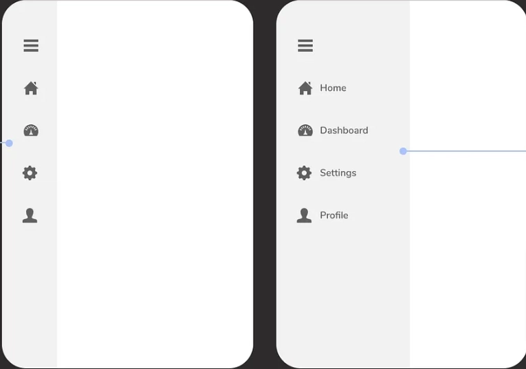
Image Credit: reddit.com
For instance, in the WhatsApp app, if you swipe a chat to the left, you’ll see a shortcut that lets you quickly archive it. If you tap for more options, you can also delete the chat. While you can still do these actions directly from each message.
9. Remove Unnecessary Elements from the Application
Only include the interface elements in your app that have a clear purpose to help users interact with the product more effectively.
This rule is especially important when you create a dashboard, as it should display only the essential information to be helpful for the user.
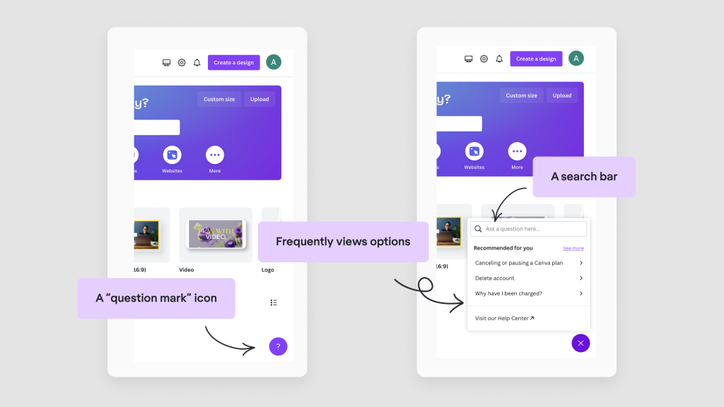
10.Make Sure Your Users can Ask for Additional Help and it’s Easy for Them to Find It
We should aim to create a product design that is so easy to use that users won’t have to look for extra help or solutions.

Image source Canva
However, it’s impossible to foresee every problem users might encounter, which is why it’s important to provide onboarding, tooltips, chatbots, documentation, videos, or tutorials.


