The field of dermatology is really big and always changing. Dermatologists need to be up to date and communicate effectively with their patients. A well designed website can solve those issues.
A good website not only looks professional, but also serves as an informative hub for patients.
It’s the digital gateway through which dermatologists can :
- Offer their expertise
- Provide educational resources
- And build a sense of trust and credibility
In this article, we’ll present 10 stellar examples of dermatologist websites that excel in design, functionality, and user experience.
1. INSTITUTE OF DERMATOLOGISTS
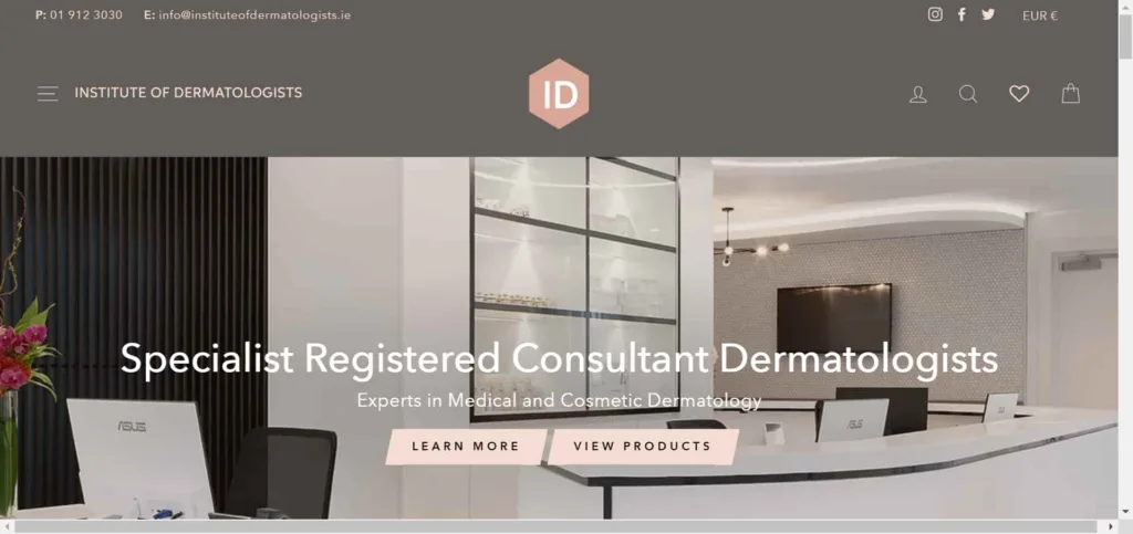
The Institute of Dermatologists Ireland’s website sets a remarkable standard for dermatologist website design. Here are five reasons why this website serves as an exemplary model in the field of dermatology:
1. Patient-Centric Focus: This website is focused on putting patients first. It shows important contact information so that visitors can easily get in touch with any questions or to make appointments. You can easily find the services and information you need because the layout of this place is made to help patients.
2. Comprehensive Service Presentation: The website for the Institute of Dermatologists is really good at showing lots of different medical and cosmetic skin care services. Each service category is neatly organized, providing concise descriptions and encouraging visitors to “learn more” or “view products.”
3. Engaging Multimedia Content: Another standout feature of this website is dermatology podcast. It offers expert advice on various skin-related topics. This multimedia element adds a dynamic and educational dimension to the website. It’s an excellent example of using multimedia to connect with the audience.
4. Skin Care Product Showcase: This website has a lot of different skin care products all in one place, so you can find solutions for your skin problems. This website is designed for people who want to buy popular brands of skincare products. It is great for both people who want treatments at a clinic and those who prefer to take care of their skin at home.
5. Clean and Modern Design: The website of the Dermatologists Institute has a nice and modern design that makes it easy for users to use. The way it is organized and the fonts used make it easy to read, and the pictures are attractive. This helps make the website look professional and reliable. The overall aesthetics reflect the high standards and professionalism associated with dermatological care.
2. Brilliance dermatology

Brilliance Dermatology’s website, is an outstanding example of a dermatologist’s website design. Here are five key reasons why Brilliance Dermatology’s website is a noteworthy example:
1. User-Friendly Interface: The website of Brilliance Dermatology is designed to be easy to use and understand. It has menus that are easy to navigate and buttons that help visitors take action, like making an appointment or sending a message.
2. Comprehensive Service Information: The website provides detailed information about the clinic’s services, covering medical, cosmetic, and pediatric dermatology. Each service is explained in detail, to ensure visitors have a thorough understanding of the treatments offered.
3. Expertise Highlight: The website does a good job of showing how skilled Dr. Hal Weitzbuch is. He is a specialist in Mohs micrographic surgery and dermatology, and has two certifications.
Dr. Weitzbuch has also been recognized by L.A. Magazine and L.A. Times SuperDoctors, which makes potential patients trust him and feel confident in his abilities.
4. Visual Appeal: The website has lots of pictures and videos that show the clinic’s facilities, procedures, and results before and after. This makes the website look nice and helps people understand what the clinic does.
5. Patient Testimonials: The clinic shares stories from real patients who have had success, which shows that the clinic works well and makes patients happy. This feedback can help people who are thinking about going to the clinic decide if it’s a good choice for them.
3. New York Dermatology Group
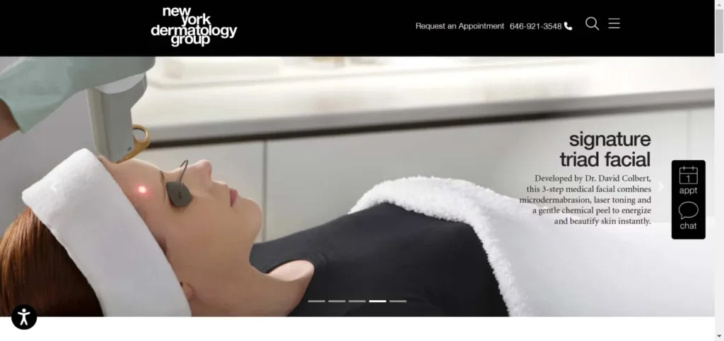
The New York Dermatology Group (NYDG) is a really great example of how a dermatologist can have a fantastic website. NYDG is a famous place in the middle of Manhattan that specializes in helping people with their skin, appearance, and overall health. Here are five really good reasons why this website is so impressive and can be a great example for other dermatologists’ websites:
1. Sleek and Professional Design: The NYDG website looks really professional with its sleek and modern design. It’s organized really well, with nice-looking typography and pictures that make it look trustworthy. This shows that the clinic is all about being really good at what they do.
2. Clear and Accessible Contact Information: NYDG makes it really easy for users to contact them by putting their contact information right at the top of the page. They have a dedicated phone number and email address, and they also provide details like their office hours and location. This way, visitors can easily get in touch and set up appointments.
3. Comprehensive Service Categories: The website puts its services into different categories like medical skin care, beauty skin care, overall health, and basic medical care. This makes it easier for people to find the specific treatment or information they need when they visit the site, which makes it more user-friendly for everyone.
4. Patient Testimonials: NYDG smartly puts a story from a patient on their page, showing that people trust and like the clinic. By doing this, it makes the practice feel more relatable and makes people who might want to go there feel more confident and secure.
5. Telemedicine Option: NYDG now offers telemedicine appointments as a convenient way to receive healthcare. You can find more information about this feature on their website.
4. City Derm NYC

City Derm NYC, the website of Dr. Catherine Y. Ding, MD FAAD, is an example of a well-designed dermatologist’s website. Located in Chinatown, New York City. This website is easy to use and has everything you need if you are a patient or thinking about becoming one. There are five really good reasons why City Derm NYC is a great example of how to design a dermatologist’s website.
1. Clear and Informative Content: The website provides clear and concise information about Dr. Catherine Ding and her team, what they aim to do, and the services they provide.
2. User-Friendly Navigation: The website is easy to use because the menu is well-organized and important sections like “About,” “Services,” and “Contact” are easy to find.
3. Patient-Centric Approach: City Derm NYC focuses on making sure patients have a good experience and feel involved. Testimonials from real patients make the practice seem reliable and trustworthy. The website wants patients to feel comfortable talking to them and they really care about what patients worry about.
4. Detailed Service Offerings: The “Services” section provides in-depth information on a wide range of dermatological treatments, including medical, surgical, and cosmetic services. Each service is accompanied by “Learn More” links for further details.
5. Contact and Accessibility: The website offers multiple contact options, including a prominent phone number, a “Book Online” feature, and detailed office hours. Accessibility information, including a wheelchair-accessible entrance, is also highlighted for the convenience of all patients.
5. Washington Square Dermatology
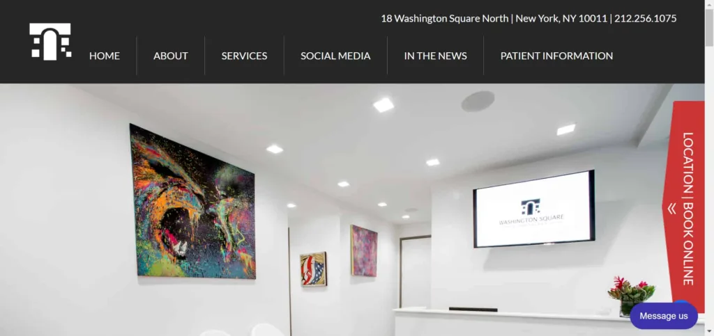
This website, Washington Square Dermatology, serves as another excellent example of an effective dermatologist’s website design. Here are five compelling reasons why I recommend it:
1. Clean and User-Friendly Layout:
The website is designed in a neat and simple way, so it’s easy for people to move around and find what they’re looking for. The important sections like “Home,” “About,” and “Services” are right there on the main menu, so you can get to them quickly and easily.
2. Professional Branding: The website looks really professional and shows that the dermatology practice cares a lot about their work. They use the consistent colors scheme and pictures that look really nice and make the website seem trustworthy.
3. Comprehensive Information:
Washington Square Dermatology offers a lot of helpful information about its services. They have medical, cosmetic, and laser dermatology options. On their website, you can find detailed explanations of the treatments they provide. This will help you understand what they specialize in.
4. Patient Testimonials: This website has real testimonials from patients who have had a good experience. This makes the website more trustworthy and helps people feel comfortable choosing them. When happy clients leave positive reviews, it can convince others to become new clients too.
5. Easy Appointment Booking: This site has a handy way to book appointments online. This makes it easy for visitors to schedule appointments. This feature is great for people who like quick and easy ways to interact with healthcare providers.
6. Dr. Dennis Gross

Dr. Dennis Gross website, is a great example of how a dermatologist’s website should be designed. It has a good mix of useful features, nice looks, and helpful information. Here are five reasons why this website is an excellent example for other dermatologists to follow:
1. User-Friendly Navigation: The website is designed to be really easy to use and find what you’re looking for. It has clear sections for services, the doctor’s profile, patient testimonials, and more, so it’s simple to find what you need.
2. Comprehensive Information: Dr. Dennis Gross MD’s website has lots of useful information about the services they offer, like medical and cosmetic skin care, ways to shape your body without surgery, fillers, and injections. They explain each service in detail, so people can learn about the different treatments that are available.
3. Trust and Credibility: The website does a good job of earning people’s trust and showing that Dr. Gross is very experienced. Visitors can feel confident in his skills because he has been practicing for over 25 years and has been on TV shows that people trust.
4. Patient Testimonials: Real stories from patients makes the clinic more trust-worthy and shows that they care about making patients happy. When people hear good things from past patients, it makes them feel more confident and trusting in choosing this clinic.
5. Accessibility and Contact Information: The website makes sure that everyone can use it by following rules for accessible web content. It also shows contact information like a phone number, office hours, and where it is located so visitors can easily get in touch and make appointments.
7. DocBright
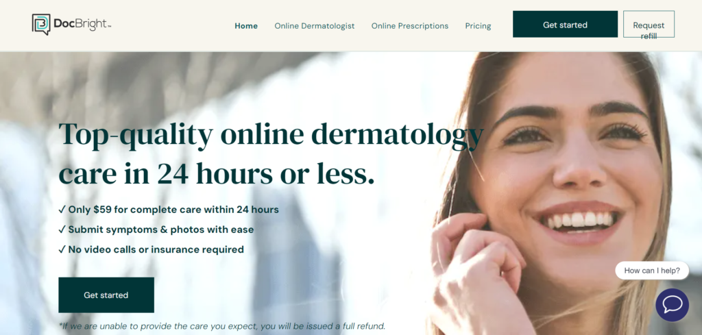
DocBright is an awesome website for dermatology that is changing the way we take care of our skin. Here are five cool reasons why DocBright is a great example of a well-designed dermatologist website.
1. Speedy and Convenient Care: DocBright guarantees that you will receive a complete skin doctor’s diagnosis, treatment plan, and medicine within 24 hours or less. No more waiting for a long time, now you can get quick and effective healthcare.
2. Affordable Pricing: You can get complete care from DocBright for just $59 per visit. This means that everyone can easily afford it, and you won’t have to deal with complicated insurance stuff.
3. Simplified Process: DocBright makes it easy for patients to get help. You can tell them your symptoms and send pictures using a safe online form. This means you don’t have to worry about video calls or filling out complicated paperwork.
4. No-Risk Assurance: DocBright always wants their patients to be happy. If, for any reason, you’re not happy with your visit and you haven’t gotten your prescriptions, they will give you all your money back within 7 days. They want you to feel calm and not worry.
5. Expert Dermatology Care: At DocBright, a group of nice skin doctors are ready to take care of you and make sure you get the best treatment. They work really hard to give you good healthcare, and you can see how much their patients like them from their reviews and stories.
8. The Dermatology and Laser Group
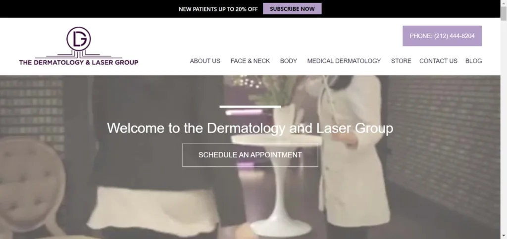
The Dermatology and Laser Group is a really good dermatology clinic in the middle of New York City. This website is a great example of how a dermatologist’s website should look. It has lots of helpful information and cool features for people who are new to the clinic or who have been there before. Here are five reasons why we think this website is a good example for other dermatologist websites:
1. Clear and Engaging Content: The website has short and helpful information that quickly gets the visitor’s attention. It tells you about the clinic’s different services, like medical skin care and beauty treatments.
2. User-Friendly Navigation: The website has an easy-to-use menu so visitors can find the information they want. They have sections like “Face & Neck Procedures” and “Body Procedures” that are clearly labeled, so it’s easy to look around the website.
3. Compelling Visuals: The website has lots of really good pictures and graphics that show off the clinic’s really fancy facilities, staff, and pictures that show people before and after they got treatments. These pictures make the website more enjoyable to use and show that the clinic is really professional.
4. Patient Testimonials and Reviews: Putting patient testimonials and reviews in the clinic’s services makes it more believable and trustworthy. People thinking about going to the clinic can read about real stories and results, which helps them feel more confident.
5. Accessibility and Contact Information: The website shows the contact details clearly, so visitors can easily book appointments or ask about procedures. It also has a map to help find the location easily.
9. Dr. Ariel Ostad
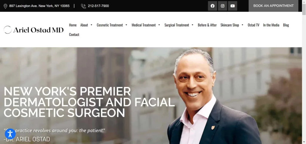
Dr. Ariel Ostad’s website is a great example of how a dermatologist’s website should look. It puts patients first and has lots of helpful information and services. Here are five reasons why I think it’s really good:
1. Patient-Centric Focus: Dr. Ariel Ostad’s website focuses on what the patient needs and wants. There is a big “BOOK AN APPOINTMENT” button that makes it simple for people to schedule a visit. This shows that the doctor cares about making it easy and convenient for everyone.
2. Comprehensive Services: The website groups services into different categories like Cosmetic Treatment, Medical Treatment, and Surgical Treatment. This makes it simple for people to find information about the specific treatments they need. The way the website is organized makes it easier to navigate and helps patients understand what kind of services are available.
3. Engaging Multimedia Content: Dr. Ostad does more than just provide information. He has a special section called “Ostad TV” where you can watch videos about cosmetic and medical procedures. These videos are educational and helpful for people who are thinking about getting these procedures done.
4. E-commerce Integration: The “Skincare Shop” part of the website is really cool because it lets you buy really good skincare products right there. This not only helps the website make more money but also makes it more fun for people who want to take care of their skin.
5. Trustworthiness and Transparency: The website has patient reviews that show a high rating and positive things people have said. This makes potential patients feel more confident and trusting. They also have a “Privacy Policy” and “Terms and Conditions” that show they follow important rules and are committed to being ethical and professional.
10. DorisDayMD
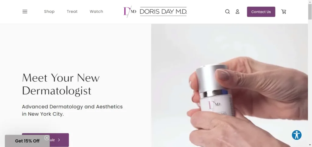
DorisDayMD is a website created by Dr. Doris Day, a top dermatologist who focuses on making people look better in New York City. On this site, you can learn all about her impressive skills and how she takes care of people’s skin. Here are five reasons why DorisDayMD.com is a great example of how a dermatologist’s website should look:
1. Professional Presentation: DorisDayMD.com has a really nice and professional look that makes visitors feel confident. The website is well-organized and has cool pictures that show how professional Dr. Doris Day’s practice is.
2. User-Friendly Navigation: The website is easy to use, with a simple menu that helps visitors find information easily. The labels like “Shop,” “Treat,” “Watch,” and “Contact Us” make it clear and easy to navigate the website.
3. Educational Content: Dr. Doris Day’s website has a lot of useful stuff to learn from, like articles, videos, and tips for taking care of your skin. By sharing this knowledge, Dr. Day helps people understand what their skin needs and shows that she knows a lot about dermatology.
4. E-commerce Integration: The “Shop” section lets people visit and buy skincare products that Dr. Day suggests. It’s easy to use and lets patients get the same great products their dermatologist recommends.
5. Engagement and Contact Options: The website has different things you can do, like a quiz about your skin and signing up for a newsletter. This helps you get involved with the practice and know what’s going on. It also has contact info right there, like a phone number and email.
The “10 Best Dermatologist Website Examples & Inspiration” showed how important a good website is for dermatologists today. These examples showed how a well-designed website can help dermatologists connect with patients, share their knowledge, and give useful resources.
As technology keeps changing, dermatologists need to use the internet to reach patients and stay up-to-date. These great websites can guide dermatologists in creating websites that are easy for patients to use and make dermatology care better for everyone.


