If you’re looking for ideas to create your own lawn care website, you’ve come to the right place. A well-crafted website can make a big difference for your lawn care business.
But, how do you make an effective website that generate leads ? or what type of features and functionality you should include?
To find out the answers , you can checkout these 9 lawncare website examples.
Key Elements of effective lawn Care service Website
Before we look at the examples, let’s check out what makes a website really effective.
Let’s break it down into simple elements:
High-Quality Relevant Pictures: One of the important element is attractive and high-quality pictures.
Think about a landscape website that displays “before-and-after” pictures of a boring backyard turning into a stunning outdoor space. This images immediately grab attention and show how well they can make a lawn look beautiful.
Clear and Concise Information: A good lawn wellness website should be easy to use, and people should find important details easily without feeling confused. They should have sections like “Services,” “Pricing,” “About Us,” and “Contact,” where visitors can quickly find what they need.
Testimonials and Reviews: Gaining trust is very important for a lawn maintenance business, and stories from happy customers can help with that.
When you share real reviews with names and locations, it makes your services more reliable.
Positive feedback from previous customers highlights your expertise , and it helps visitors feel confident about hiring them.
Call to Action: To turn website visitors into customers, it’s important to have a clear and simple call-to-action (CTA).
It should be easy for people to take the next step, like requesting a quote, scheduling a service, or reaching out for help.
A noticeable button that says “Contact Us” or “Get a Quote” encourages visitors to get in touch with them.
Lawn Care and Landscaping Website Templates
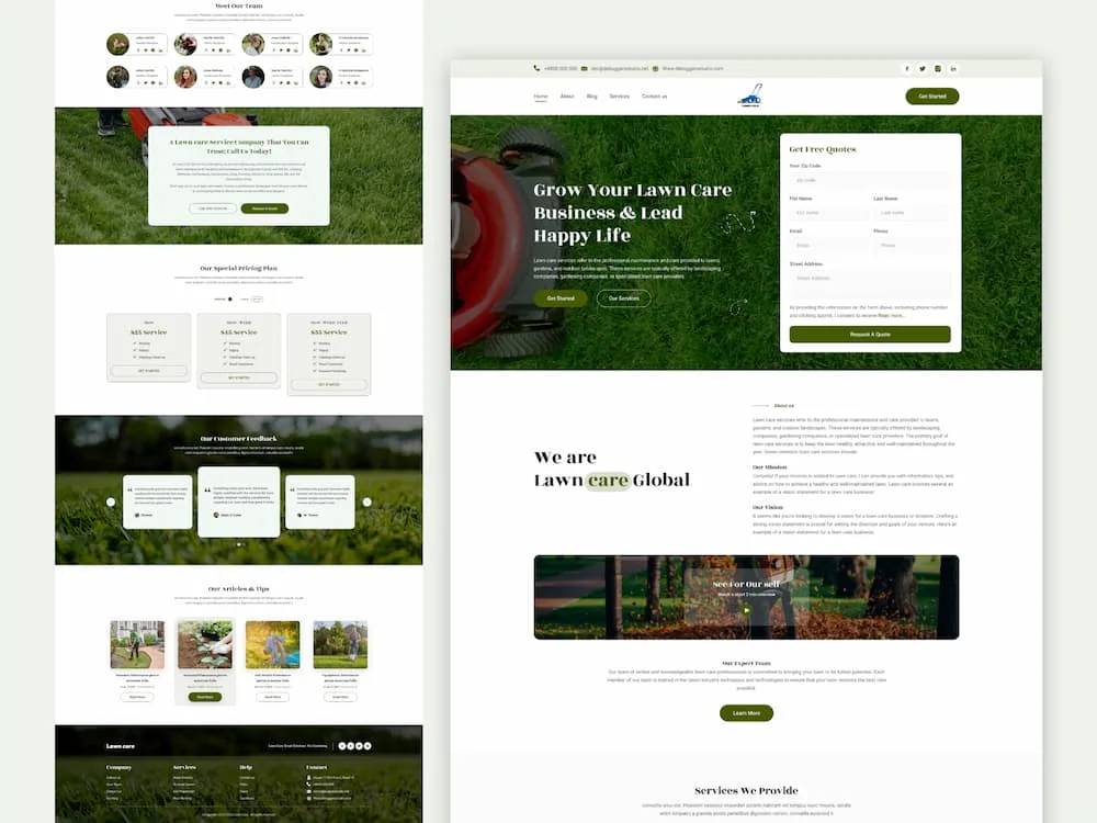
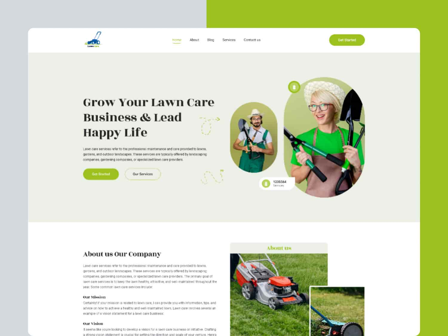
Check out our carefully designed templates to make your lawn care business look more attractive.
Vibrant Landscaping Figma Template
LawnMaster | Landscaping and Garden Design Template
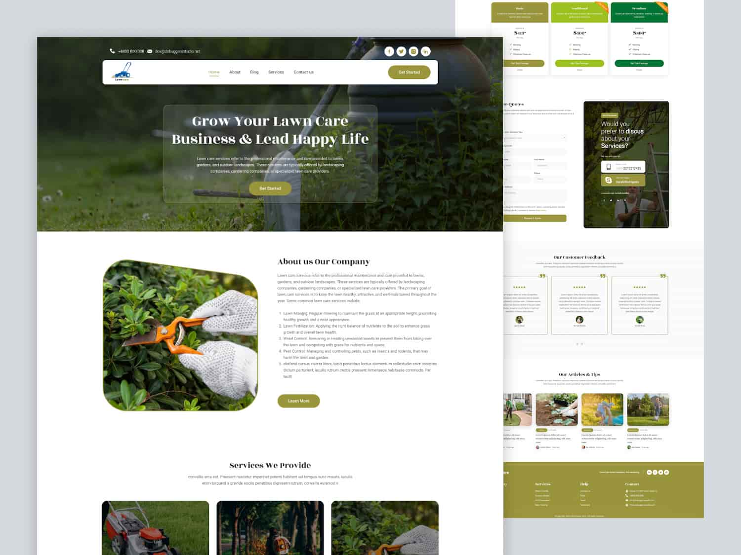
Green Scape | Landscaping, Gardening Figma Template
9 Best Lawn Care Website Examples
Explore the websites listed below and closely examine each section or feature they provide.
Horse Creek Lawn Care
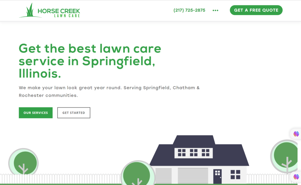
The website design of Horse and Creek is sleek and modern, with a clean layout that is easy to navigate. The color scheme is visually appealing, and the use of white space creates a sense of simplicity and elegance. Overall, the website design is professional and user-friendly.
Pros
Color Scheme: This website uses a combination of green and white colors, which are commonly associated with nature and grass. It creates a relevant color scheme for a lawn maintenance website.
Clear and Concise Navigation: The navigation menu is placed at the top of the website, so that visitors can easily find the information they need.
High-quality Imagery: This website incorporates high-resolution images of well-maintained lawns and gardens. These images showcase the company’s expertise and the end result of its services.
CTA Buttons: The website includes strategically placed CTA buttons that encourage visitors to take specific actions, such as “Get a Quote” or “Schedule a Service.”
Testimonials and Reviews: This website features a section dedicated to customer stories and reviews. This social proof helps to build credibility and trust.
Mobile Responsiveness: The website is created to be responsive, ensuring it adjusts to various screen sizes and devices.
Areas for Improvement
While the Horse and Creek website has several positive elements, there are a few areas that could be improved:
- Font Readability: A font with better legibility
- More Detailed Service Descriptions
- Enhanced Contact Information Visibility (e.g. Email address, Contact no.)
- Additional Visual Elements (e.g. Infographics or before-and-after images)
Dunner’s Lawn Service
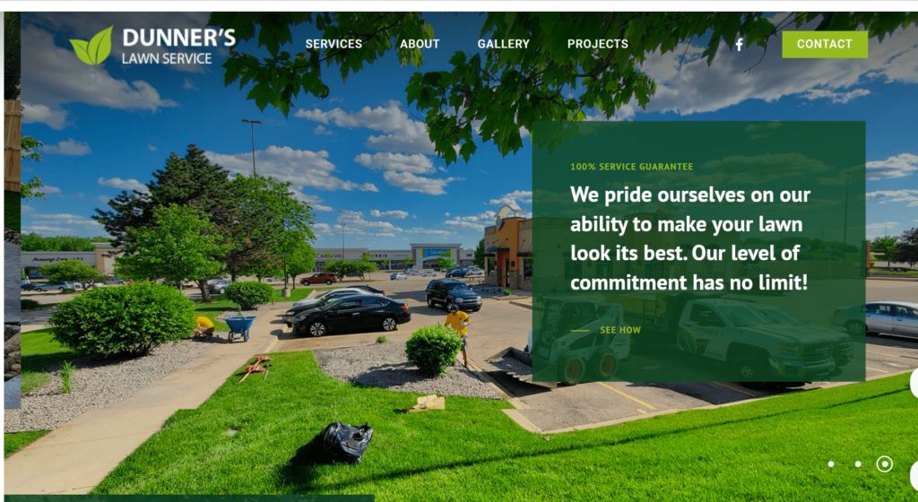
This website is an excellent example of a lawn service website. It offers a range of services to maintain and improve outdoor spaces.
Pros
User Friendly Navigation: One of the main reasons to check out this website is its user-friendly interface and easy navigation.
Dedicated About Us Page: It includes a dedicated “About Us” page, detailing the company’s history, mission, and values.
Portfolio or Gallery: Another key feature of this website is portfolio or gallery section.
Contact Us page: This website offers a contact page with multiple ways to get in touch with the company. It includes a contact form, phone number, email address, and even a physical address.
Feedback and Reviews: This website provides Feedback and reviews of their clients that help to build trust among new visitors.
Areas for Improvement
- Placement of CTA button is not good enough.
- FAQ or Blog Section: The website is very light on content, there is no FAQ or blog section.
- Mobile Responsiveness: This site is not well-optimized for mobile devices.
Green Beard Lawn Care
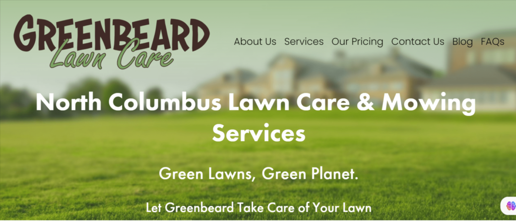
I would suggest this website as an example to follow. It effectively showcases the necessary elements for a successful online presence in the lawn care industry.
Pros
Attractive Design: The website has an attractive and professional design that immediately captures the attention of visitors. The use of high-quality images of well-maintained lawns and gardens creates a visually appealing experience.
Easy Navigation: The website utilizes a user-friendly layout that is easy to navigate. The main menu is prominently displayed at the top of the page. It provides quick access to important sections such as services, pricing, reviews, and contact information.
Detailed Service Section: One of the standout features of this website is the comprehensive services section. It provides detailed descriptions of the various lawn care services.
Client stories from Satisfied Customers: The use of real customer reviews with names and locations helps establish a sense of authenticity.
Blog and FAQ: Another notable aspect of this website is the integration of a blog or resource section. This section provides valuable information and tips on lawn care maintenance, seasonal gardening, and other related topics.
Contact Info: The website includes clear and easily accessible contact information, such as phone number, email address, and a contact form.
Areas for Improvement
- Placement of Call-to-Action Button
- The contact information, such as the contact number and email address, is not hyperlinked.
- Inconsistent design: The text style on the website seems inconsistent.
- Lack of Local SEO implementation
GrassPerson
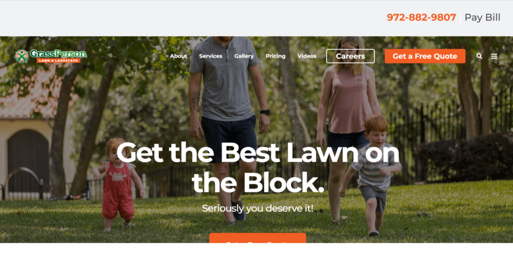
This website has a clean and visually appealing design, it can create a positive impression and convey professionalism. I really like this website because it includes almost everything a lawn maintenance website should have.
Pros
Clear Navigation: The website’s navigation is straightforward, allowing users to swiftly locate the information they require.
Portfolio or Gallery: The website showcases a portfolio or gallery of previous work; it can give visitors a sense of the quality of the services provided.
Contact information: This website clearly displays contact information, such as a phone number or email address, it can facilitate communication .
Feedback or Reviews: It includes positive feedbacks or reviews from previous clients, it can build trust and credibility.
Mobile Responsiveness: Grassperson website is optimized for mobile devices, it allows users to access the content easily on different screen sizes.
Online Quote or Booking System: This website offers an online quote or booking system. It can provide convenience for customers and streamline the process.
Social Media Integration: This website integrates with social media platforms for users to share content or follow the business on social media.
Areas for Improvement
- The website could use more images
Lawn Palms
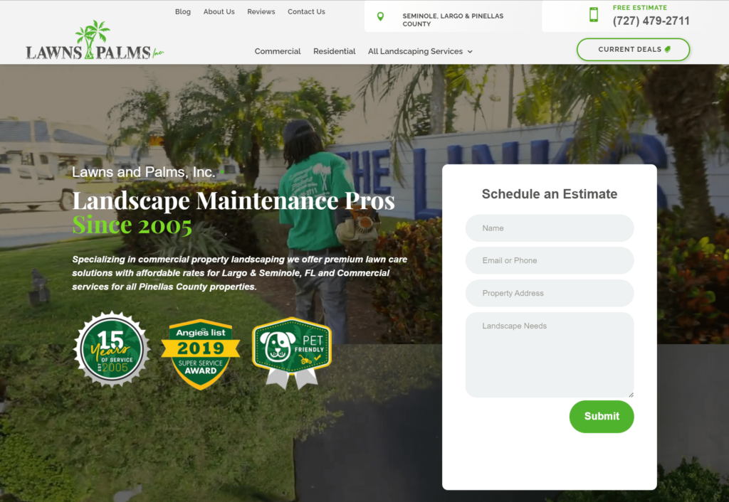
This website is well-built with important information and clear call to action buttons that tell you what to do next. We’ll talk more about the details of this website bellow
Pros
Clean and Professional Design: The website has a clean and professional design, which is helpful for users to navigate and find the information they need.
Contact Information Easily Accessible: The phone number and email address are prominently displayed on the top of the page.
Clear C-T-A: The website includes clear calls-to-action (CTAs) throughout the pages. It encourage users to request a free quote and schedule an estimate.
Customer Reviews: Customer reviews are prominently highlighted. It provides social proof of the company’s expertise and quality of service.
Mobile-Friendly: The website appears to be responsive and mobile-friendly, that ensures a seamless user experience on different devices.
Services Highlighted: The website clearly highlights the different services it offer, including lawn care, tree trimming, irrigation, and more.
Special Offers: The current deals and special offers are listed on the website, attracting potential customers with discounts and incentives.
Areas for Improvement
- The website lacks visual elements such as images or videos.
- The website hasn’t been regularly updated with fresh content.
- Missing Testimonial Attribution.
H&M Landscaping
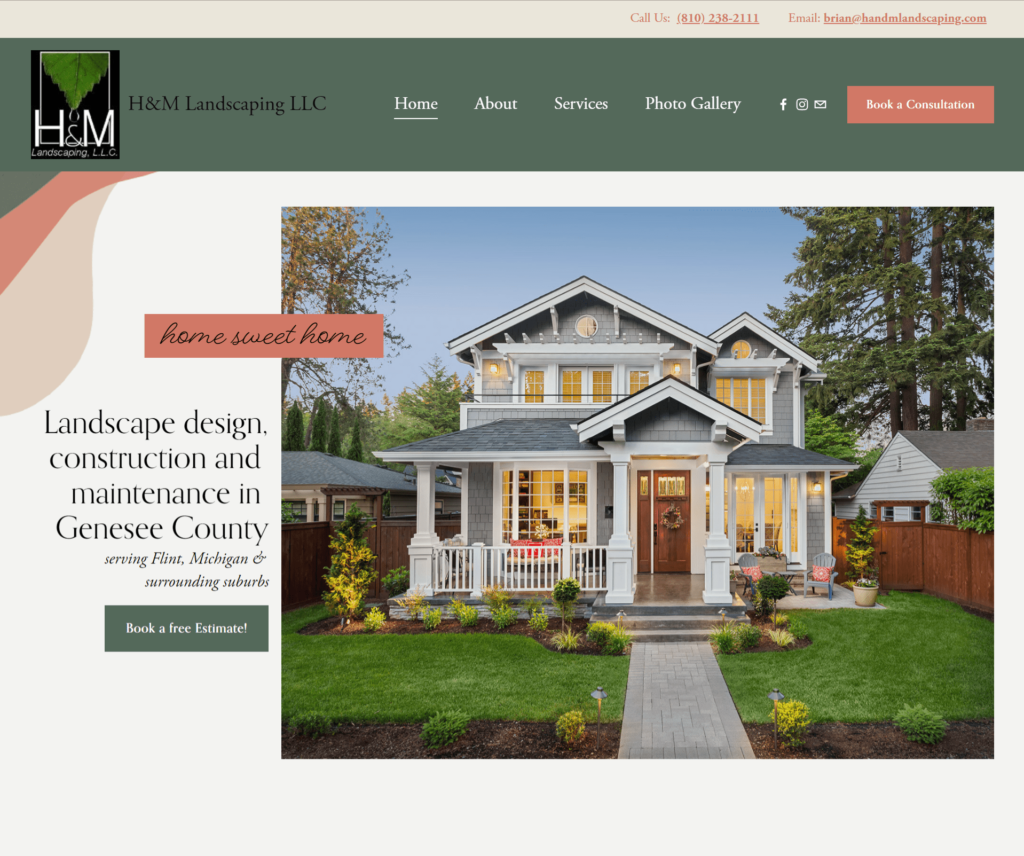
The H&M website effectively presents the landscaping services they provide. But there are opportunities for improvement to enhance user experience and showcase the company’s expertise.
Pros
Clear and Concise Information: The website provides a clear and concise overview of the services offered. Visitors can quickly understand that H&M provides outdoor design, construction, maintenance, and snow removal services .
Professional Appearance: The website has a professional and clean design. The layout is well-organized, and easy to navigate or find relevant information.
Customer Reviews: Displaying customer reviews and ratings adds credibility and shows that they have a track record of satisfied customers.
Contact Information: Contact information, including a phone number and email address, is readily available on the homepage. It makes easy for potential clients to get in touch with the company.
Services and Benefits: The website highlights the various services offered, along with their benefits.
Call to Action: The prominent “Book a Free Estimate!” button encourages visitors to take action and request a consultation, which can lead to potential business opportunities.
Photo Gallery: The photo gallery showcasing recent work helps visitors visualize the quality of the services provided by H&M.
Customer-focused Approach: The website highlights how the company is dedicated to supporting the local community. It emphasizes that they are a family-owned business that deeply cares about helping their neighbors.
Areas for Improvement
- Limited Information about the Company
- Although the website is functional, it could benefit from more visually appealing elements, such as before and after comparison images of their work.
EarthBound
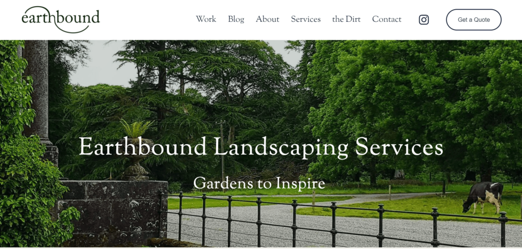
The website looks fantastic with interesting pictures and messages that catch your attention. Now, let’s explore it more and examine both the good and not-so-good aspects of the site.
Pros
Clear and Engaging Design: The website has a visually appealing and user-friendly design. The combination of earthy colors and nature-related images align well with the exterior design theme.
Focused Messaging: The words at the top of the website and the introduction clearly tell us what the company is all about. They want to create beautiful lawn that make their customers happy and excited.
Easy Navigation: The top navigation bar provides clear links to essential sections such as “Work,” “Blog,” “About,” “Services,” “The Dirt,” “Contact,” and “Get a Quote.” This makes it easy for visitors to find relevant information quickly.
Descriptive Services Section: The “Services” section appears to provide detailed information about the various lawn maintenance services offered.
Contact Form: The presence of a contact form makes it convenient for visitors to inquire about the services or request quotes directly through the website.
Responsive Design: The website appears to be responsive and adjusts well to different screen sizes including mobile phones and tablets.
Areas for Improvement
- The website mentions a “Blog” section, but if there is no active or frequently updated blog, it could leave visitors disappointed or wondering about the credibility and engagement level of the site.
- The content on the landing page seems concise, which can be positive for some users, but it may not provide enough in-depth information for those seeking more details about the company’s history, projects, or approach to mowing.
- The purpose or content of the “the Dirt” section is not apparent from the information provided. It may be beneficial to include a brief description or rename the section for better clarity.
Denmark Lawn
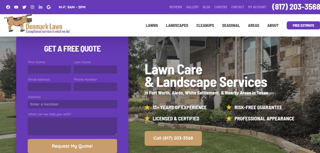
This website effectively conveys essential information about the business and its services, but there is room for improvement.
Pros
Clear Contact Information: The website prominently displays the contact number for visitors to get in touch with the business directly.
Service Details: The website provides comprehensive information about the services offered, including lawn care, landscaping, aeration, and holiday lighting. This helps potential customers understand the range of services available.
Customer Reviews: The inclusion of customer reviews adds credibility to the services offered.
Service Areas: The website lists specific service areas for visitors to determine if their location is covered by the company.
Easy Navigation: The website has a simple and organized layout, with clearly labeled sections, making it easy for users to find the information they need.
Prominent Call-to-Action: The “Request My Quote!” button stands out, encouraging visitors to take action and request a free estimate.
Blog Section: The blog section demonstrates the company’s expertise by providing helpful articles related to lawn care.
Mobile-Friendly: The website appears to be mobile-friendly, that ensure a good user experience across various devices.
Areas for Improvement
- Social media links or buttons are not visible, which may hinder users from engaging with the company on social platforms.
- The contact form has only a few fields, which might not capture all necessary information from potential customers.
- Incorporating live chat or instant support features could improve customer engagement and support.
Westedge Grounds Care
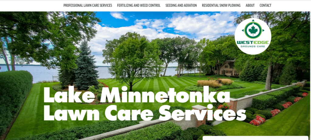
Westedge Grounds Care website effectively presents the company’s services and experience. But there are areas where improvements could enhance user experience, trustworthiness, and engagement.
Pros
Clear and Concise: The website’s content is straightforward and easy to understand.
Professional Design: The website is well-designed with a clean layout and easy-to-read fonts.
Mobile Responsiveness: The website seems to be mobile-friendly, ensuring that users can access and navigate it easily on various devices.
Appealing Visuals: The photo gallery and images used throughout the website add visual appeal.
Comprehensive Services: The website offers a wide range of lawn care and property maintenance services for both residential and commercial clients. This variety may attract a diverse customer base.
Experience and Trustworthiness: The mention of over 30 years of experience in the landscaping industry builds credibility and trust.
Contact Information: The website prominently displays contact information.
Areas for Improvement
- While the website mentions a “Testimonials” section, it does not provide any actual customer reviews or feedback. Including real testimonials can build more trust and confidence in the company’s services.
- The website does not provide any pricing details for the services offered. Potential customers may prefer having a general idea of the cost before reaching out for a consultation.
- The website lacks links to the company’s social media profiles or any social proof of their work. Having social media presence and showcasing their projects on platforms like Instagram or Facebook can further validate their services.
In conclusion, a visually appealing design, clear and concise information, and strategically placed call-to-action buttons are essential elements for an awesome lawn care website.


