Choosing the right font for your website is a big deal. It’s not just about making things look pretty; it’s about setting the right tone and making sure your visitors get what you’re saying, loud and clear.
With so many options out there, picking the perfect one can be overwhelming. We’ve narrowed down the sea of choices to a list of fonts that will work effectively for almost any site. Plus, we’ll give you tips on how to pick the right one for your specific needs.
Let’s simplify this choice together and make your website not only look good but communicate effectively too.
website font Basics
Typography is more than just choosing fancy fonts; it involves everything from how letters look together to the space between them. Before we explore our top 20 picks, let’s break down font basics.
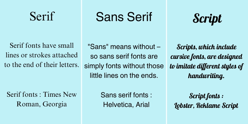
There are three key types you should know about: serif, sans serif, and script.
Knowing these will make it easier for you to decide which fonts align best with your website’s design.
Here’s a brief overview:
Serif
Serif fonts have small lines or strokes attached to the end of their letters. They’re traditional, easy to read, and often found in more formal or established settings.
Sans Serif
“Sans” means without – so sans serif fonts are simply fonts without those little lines on the ends. These fonts are sleek, modern, and offer a clean look. They’re perfect for websites looking to convey a straightforward and contemporary vibe.
Script
Scripts, which include cursive fonts, are designed to imitate different styles of handwriting. It is best to use this type of font only for titles, as it can be difficult for readers to read body text written in a script font.
20 Ideal Fonts for Your Website
Take a look at these 20 fonts that are great for designing websites. They are easy to read and work well with different styles of websites. Some of them are part of font families, meaning they have different versions that can make your website’s text look even better.
1. Poppins
Poppins is a modern font style that is easy to read and can be used for many different design projects. Its simple lines and balanced proportions make it a great choice for various types of designs.

Download Poppins via Google Fonts.
Designed by: Indian Type Foundry
2. Lato
Lato is a humanist sans-serif font known for its friendly and approachable appearance. With its balanced letterforms and wide range of weights and styles, Lato is suitable for both body text and headlines.

Download Lato via Google Fonts.
Designed by: Łukasz Dziedzic
3. CoFo Sans
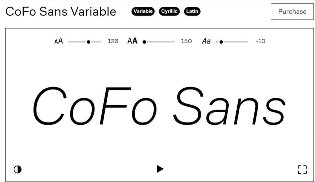
CoFo Sans is a modern sans-serif font with subtle Cyrillic influences, giving it a unique and contemporary aesthetic. Its simplicity and clarity make it perfect for various design applications.
Download CoFo Sans via Contrast Foundry.
Designed by: Maria Doreuli
4. Abolition
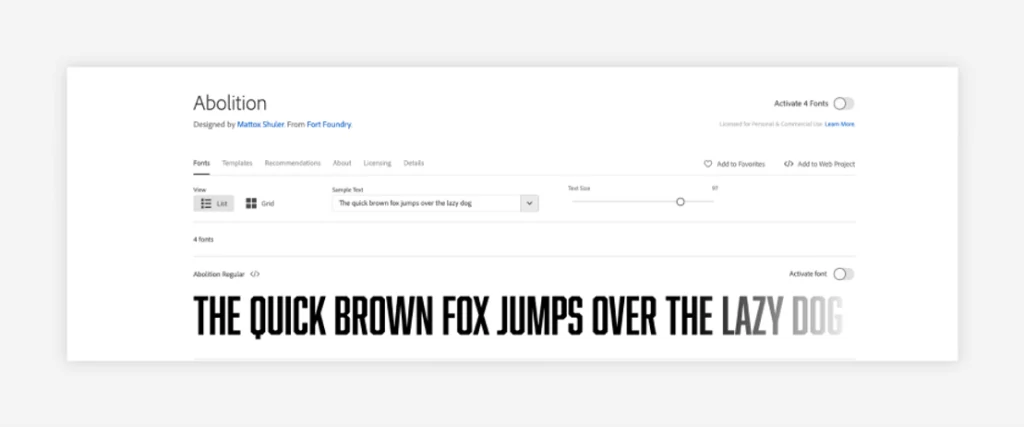
Abolition is a striking serif font that combines classic elegance with modern flair. Its distinctive letterforms and subtle details make it ideal for adding sophistication to headlines and body text alike.
Download Abolition via Jeremy Mickel Typography.
Designed by: Jeremy Mickel
5. Barlow
Barlow is a versatile sans-serif font known for its clean lines and geometric shapes. With a modern appearance and multiple weights and styles, Barlow is suitable for a wide range of design projects, from websites to printed materials.

Download Barlow via Google Fonts.
Designed by: Jeremy Tribby and Girogio Olivato
6. BD Supper
BD Supper is a contemporary sans-serif font with a unique and playful personality. Its rounded edges and friendly appearance make it perfect for adding warmth and character to headings, logos, and branding materials.

Download BD Supper via Fontspring.
Designed by: Gustavo Dipre and Brayan González
7. Caponi
Caponi is an elegant serif font inspired by classic typography styles. With its refined letterforms and graceful curves, Caponi exudes sophistication and timeless charm, making it perfect for high-end branding and editorial design projects.
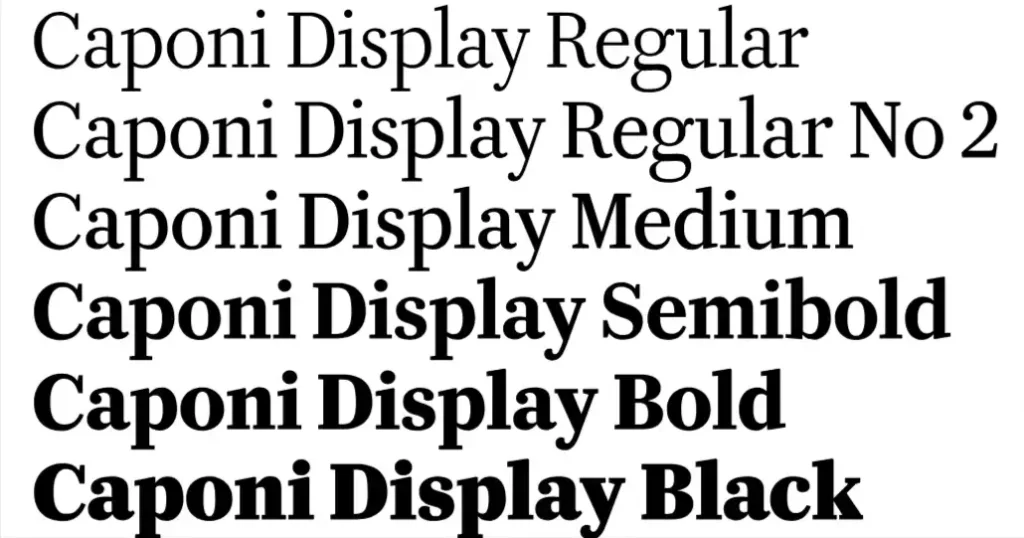
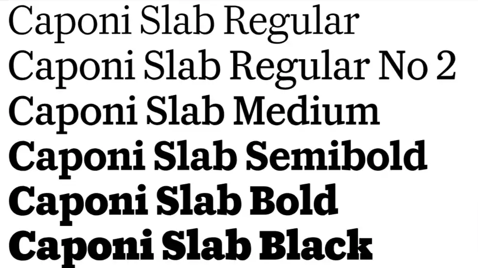
Download Caponi via Carl Enlund Typography.
Designed by: Carl Enlund
8. Caudex
Caudex is a versatile serif font with a modern twist. Its clean lines and subtle details make it suitable for both formal and informal designs, while its excellent readability ensures clarity in any context.

Download Caudex via Google Fonts.
Designed by: Nidud
9. Diastema
The Diastema font has a contemporary and playful design that includes long and occasionally connected ligatures. It has a sophisticated and stylish vibe that complements sleek and modern images.
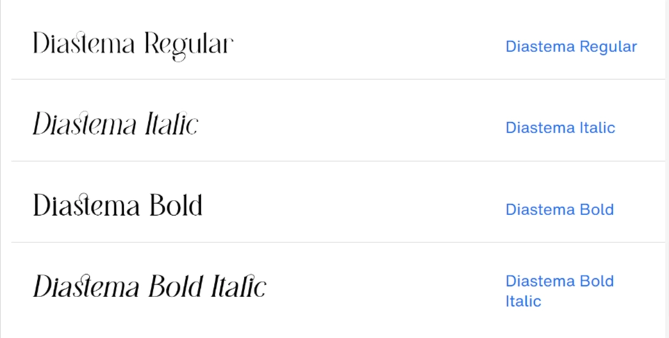
Download Diastema via MyFonts.
Designed by: Issam Boufelja
10. Eleven Twenty
Eleven Twenty is a modern sans-serif font with a clean and minimalist design. Its sleek lines and balanced proportions make it suitable for a variety of design projects, from websites to print materials.

Download Eleven Twenty via Font Meme.
Designed by: Fenotype
11. Forum
Forum is a sophisticated serif font with a timeless elegance. Its classic letterforms and refined details exude professionalism and style, making it perfect for branding, editorial, and display purposes.

Download Forum via Google Fonts.
Designed by: Denis Masharov
12. FS Me
This font was made to help people with learning disabilities read more easily. It has bigger dots on the “i” letters and longer lines on some of the other letters. These special features make the font great for improving how accessible websites are.

Download FS Me via Fontsmith.
Designed by: Fontsmith
13. FS Ostro
This type of font has a graceful and elegant appearance. Its calm and charming design makes it easy to read and very adaptable.
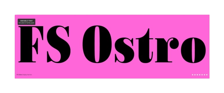
Download FS Ostro via Fontsmith.
Designed by: Monotype
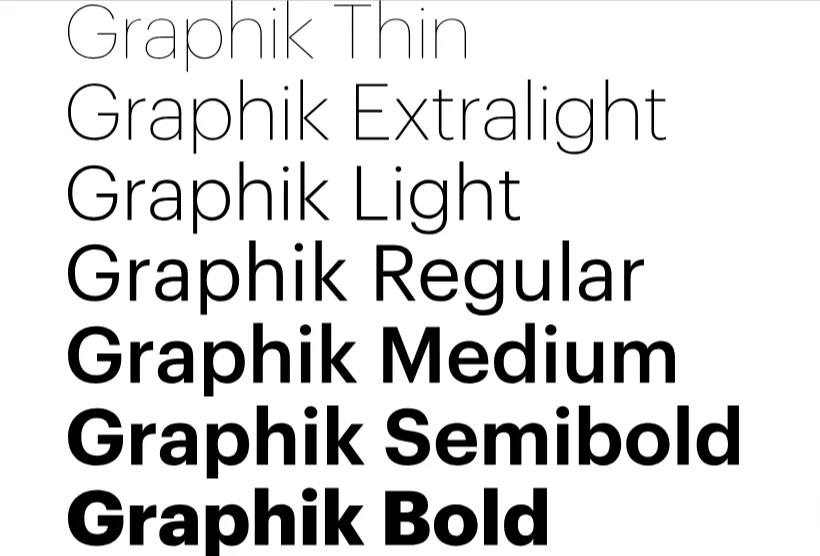
14. Graphik
Graphik offers more than 18 different styles to choose from. It has neat and graceful lines, and comes in various widths for its letters. It is suitable not just for web design, but also for marketing materials like newsletters, logos, and ads.
Download Graphik via Commercial.
Designed by: Christian Schwartz
15. Lil Grotesk
This font does not have any fancy decorations and has a simple, block-like style with smooth edges around the letters. Lil Grotesk looks very neat and is very simple to read.

Download Lil Grotesk via Font Meme.
Designed by: Bastien Sozeau
16. Sofia Pro
Sofia Pro is a modern sans-serif font known for its versatility and clean, geometric shapes. With a wide range of weights and styles, Sofia Pro is suitable for various design applications, from digital to print.

Download Sofia Pro via MyFonts.
Designed by: Olivier Gourvat
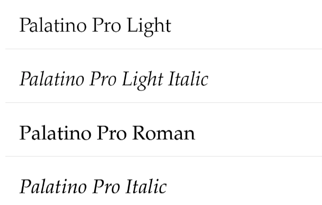
17. Palatino
Palatino is a classic serif font designed for optimal readability and elegance. Its timeless letterforms and balanced proportions make it suitable for a wide range of applications, from body text to headlines.
Download Palatino via MyFonts.
Designed by: Hermann Zapf
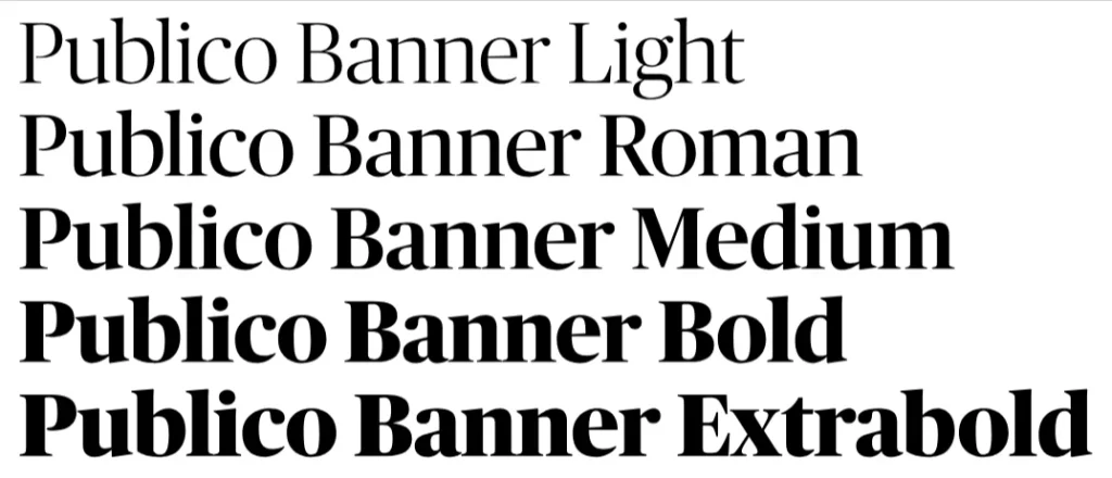
18. Publico
This kind of font has a classic newspaper style that still looks good for modern designs. It comes with different text options and has a sharp and expressive appearance, with a noticeable difference between thick and thin lines.
Download Publico via Commercial.
Designed by: Christian Schwartz and Paul Barnes
19. Ratio Modern
This typeface has thin and thick lines that are combined to form each letter, giving a touch of elegance to a traditional design.

Download Ratio Modern via Adobe Fonts.
Designed by: Kevin King and Patrick Griffin
20. Magnific Caos
This traditional gothic font has fancy designs on the capital letters. It looks dark and strong, with a touch of white in each letter to make them slightly brighter and more three-dimensional.

Download Magnific Caos via Fontspace.
Designed by: Billy Argel
How to Choose the Best Fonts for Your Website
Here’s a guide to help you choose the right fonts for your website:
Pick Fonts That Go Well With Your Brand and Design Style
When selecting fonts for your website, it’s essential to choose ones that complement your brand and the overall design style of your site. Think about what you want your brand to represent and pick fonts that convey those qualities.
For example, if you’re aiming for a professional and trustworthy image, classic serif fonts might be a good choice. On the other hand, if your brand is more modern and innovative, sleek sans serif fonts can help convey that message.
The key is to ensure the fonts align with the vibe you want your website to project and enhance your design rather than detract from it.
Make Sure the Fonts Are Easy to Read
Choosing fonts that are easy to read is crucial for your website’s usability and visitor experience. Fonts that are too decorative or have unusual shapes may look interesting, but they can be challenging to read, especially in long texts or on small screens. To ensure readability:
- Opt for clean, simple fonts for body text.
- Test the fonts on different devices and screen sizes.
- Avoid using too many font styles on the same page, as it can make the content hard to follow.
- Pay attention to contrast between the text and the background to make sure that your content is easily legible under various lighting conditions.
Use Fonts That Complement Each Other
When selecting fonts for your website, it’s essential to choose ones that complement each other. This helps create a visually cohesive and harmonious design, enhancing the overall aesthetic of your site. Here are some tips to achieve this:
- Stick with a limited font palette, usually no more than three fonts: one for headings, another for body text, and possibly a third for accents.
- Combine fonts with contrasting styles (e.g., a serif font for headings and a sans-serif font for body text) to create visual interest and hierarchy.
- Ensure the fonts share a similar mood or theme that aligns with your brand identity. For example, pairing a formal serif font with a casual script font might clash unless done very thoughtfully.
- Use font pairing tools or consult design resources to find combinations that designers recommend. These tools often provide tested pairings that can help eliminate guesswork.
Think About How the Fonts Might Affect Your Website’s Speed and Performance
When choosing fonts for your website, it’s also vital to consider how they might affect your site’s loading speed and overall performance. Here’s why this matters:
- Web fonts can slow down your site: Every time a visitor accesses your site, their browser needs to download the font files you’re using. This can add extra load time, especially if you’re using multiple or heavy font files.
- Optimize for speed: To minimize impact, select fonts that are optimized for web use. Web-optimized fonts are typically smaller file sizes and designed to load faster.
- Limit font usage: Try to limit the number of different font styles (including weights and variations) you use. More styles mean more files for browsers to download, which can slow things down.
- Use modern formats: File formats like WOFF2 offer high-quality typography at smaller file sizes compared to older formats, making them faster to load without sacrificing visual appeal.
Remember to Consider How Accessible Your Website is for All Users
Considering the accessibility of your website for all users, especially when selecting fonts, is essential for creating an inclusive digital environment. Here’s why and how you can achieve it:
- Legibility and readability: Fonts that are easy to read not only improve the user experience for everyone but are particularly crucial for individuals with visual impairments or dyslexia. Choose fonts with clear distinctions between similar letters (like ‘b’ and ‘d’), avoid overly decorative fonts for body text, and ensure adequate contrast between text and background colors.
- Customization capabilities: Ensure that your website design allows users to modify font size and spacing according to their needs without breaking the site’s layout. This flexibility can significantly enhance accessibility for users with visual impairments.
- Screen reader compatibility: Consider how your chosen fonts interact with screen readers used by visually impaired visitors. Screen readers analyze text content rather than font styles, but complex layouts or inserting text within images (without alt-text) can hinder a screen reader’s ability to interpret the information accurately.
Decide on the Size and Visual Impact of the Fonts
Deciding on the size and visual impact of the fonts you use on your website is crucial in creating an engaging and effective design. Could you please provide me with more details about the overall style and tone you’re aiming for with your website? This will help me give a more tailored response that aligns with your branding goals.


