Fitness is more than just physical exercise and diet – it’s a lifestyle. And with the rise of technology, a well-designed website is essential for any wellness professional or gym owner looking to grow their business.
No worries! We’ll help you out. In this article, we’ll cover everything you need to know as a beginner and share effective design tips. Keep reading to learn more.
Why does your fitness training business need a Outstanding website
Your wellness’s businesses require a web design with an outstanding design for many reasons.
Build a good first impression
Your website is usually the first thing people see about your business. It’s important to make it look good, or people might think your business isn’t good either. So, make sure your website looks great and makes a good impression.
Stand out from the competition
A website that looks good can help you stand out from other fitness businesses online. There are many similar businesses, so it’s important to do what you can to be different. Having a great website is one way to do that.
Assist in customer retention
A good-looking website can help you get new customers for your gym and keep them coming back. When a business has a professional-looking website, people are more likely to trust it.
Search engine optimization
Implementing SEO strategies to a website can make it easier for people to find it on search engines like Google. This can bring more people to the website and increase the chances of getting new customers.
SEO can also help the website to show up for specific keywords or terms that people use to search on google. This means that the website can target the right people with the right content.
Present 24/7
If you have a web page, you may have the advantage of having the ability to remain available 24/7 online. This gives you the liberty to address all of your customer’s queries if you are not there physically.
Showcase your Accolades
Websites are the optimum medium to showcase compelling reviews and testimonials to your customers. It increases the viability of your service. People care for the brand which has a good reputation in their respective field.
So, websites can be a great medium to display your recognition in an orderly to attract new potential customers.
Statistics to prove the importance of Fitness training website:
- 90% of consumers go through the reviews first before visiting a business.
- Now the valuation of the gyms industry is more than $96.2 billion. So standing out from the competitors and presenting yourself differently is essential to having the best-designed website.
- From a commercial perspective, the fitness and healthcare industries are growing at a rate of 8.7% a year. So, to take full advantage of this growing industry you require to have a creative, the best in class and modern website.
15 Fitness Website Example That Will Help You Get in
Explore the websites below for inspiration in crafting your own compelling site. Get ready to ignite your creativity and build something extraordinary!
#1. Trainer Hub (Gym Template):

Trainer Hub, a dynamic Fitness Complex Gym Template designed for modern fitness enthusiasts. Elevate your gym’s online presence with this sleek, user-friendly template.
#2. MODE

Mode is an excellent fitness platform you need to examine. It has all the elements to be considered modern.
It has an assorted class section to guide its potential user. And the most fascinating part is it has a virtual tour system of its gym for its user so that users can decide on their amenities.
It has some astonishing resources which make it unique from the rest. Plus, it has bright colors (black and white) and easy-to-read fonts making this website’s UI easy to view.
It has displayed the company’s recognition in the right place which can contribute to attracting potential customers.
Overall, this design is a good example of how a modern website can be. You should study them.
#3. Energy6
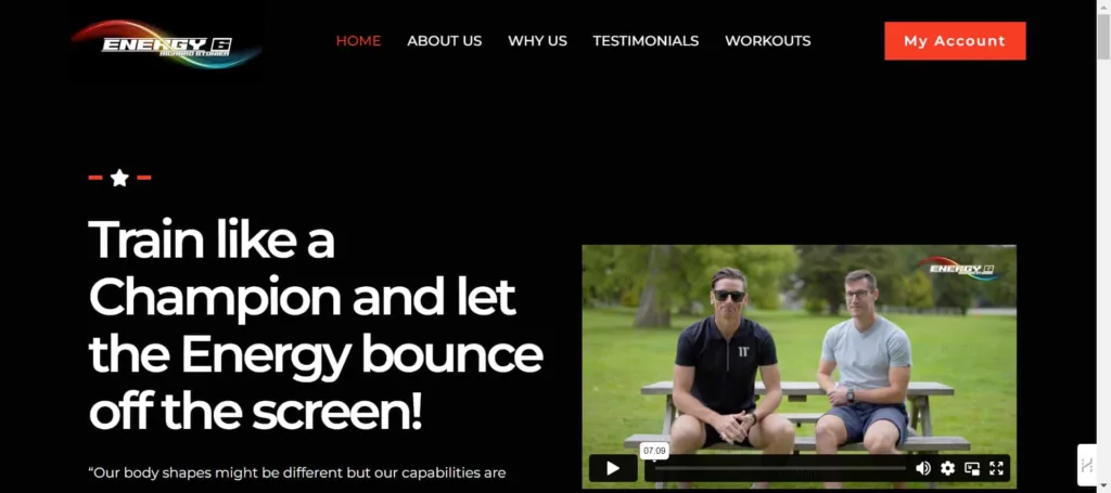
Energy6 is a personal training site for gym enthusiasts providing a variety of workouts for you. it’s providing quality personal training to its potential users. They are also prioritizing physical and mental well-being through their services.
This site is made with a WordPress theme. and this is the most popular one for wellness (the most efficient) websites. This is why we felt compelled to include it in this article.
It’s a simple yet modern website. It has all the features and CTAs necessary, the images, and the brand-specific color theme that it needs, which entails a good WordPress theme.
Another attraction of this website is that they have highlighted its success stories in a way to attracts its potential prospects. They have attached their social platform accounts so that visitors can find them easily on other social platforms.
#4. SWEAT Fitness Studio
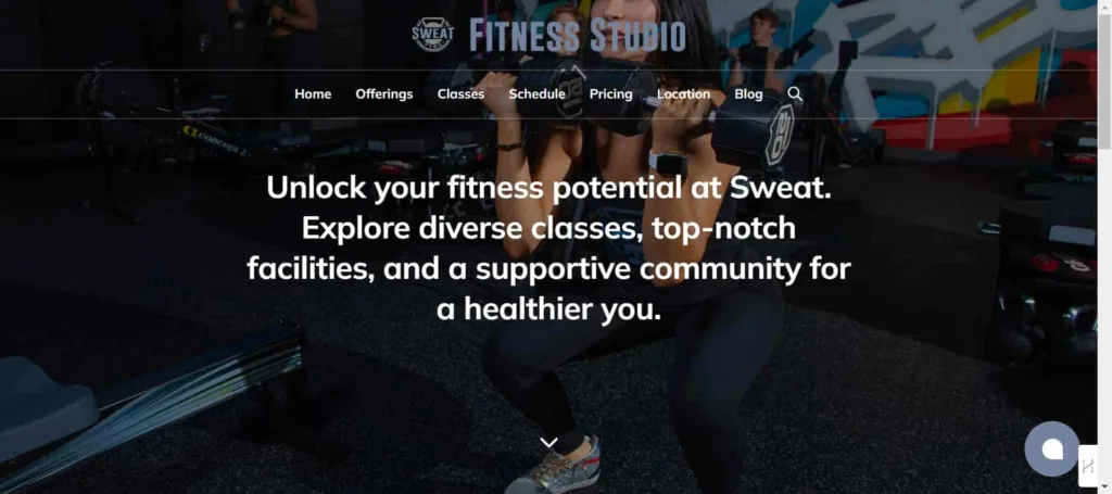
They have designed a website completed with murals and instructors to beget a cohesive brand experience for their users. The interface color of the website creates an atmosphere where users don’t get irritated while searching.
They have designed their group sessions, personal training, custom training, and other related facilities consecutively so that users don’t get lost while scrolling through the website.
In a word, it’s a great website with a great user experience, clear CTA buttons, and simple navigation.
#5. FORGE

Forge Fitness & Nutrition Coaching’s website exemplifies a well-designed online fitness platform with a focus on user engagement and functionality.
The site’s clean layout and intuitive navigation immediately guide visitors to essential sections like programs, coaching details, and client testimonials.
The strategic use of compelling visuals, such as vibrant images and graphics, enhances the overall aesthetic appeal, creating an inviting and motivating atmosphere. Moreover, Forge prioritizes transparency by addressing frequently asked questions and featuring authentic client stories
#6. LiveFitGym

Many businesses wish to have a website like LiveFitGym. Modern, unique, and well-sorted. The easy navigation of the website enables the users to get to all the essential content quickly.
And the free pass opportunities to its user give them a different dimension to connect with its users. People who visit the site find useful information in the footer.
In this way, customers can easily get in touch with the business. Also included are social media links, accessibility, a dropdown menu, etc.
#7. Muscle & Fitness

Muscle & Fitness is aimed at working out, building muscle strength, and developing physical endurance.
It contains info on the best ways to build muscle, such as the types of exercises that are ideal for those purposes. When individuals visit the site, they get useful information in the footer regarding their facilities and different features.
Overall the website is very user-centric in its design feature. Customers can easily reach the organization. It also includes social media hyperlinks, accessibility, a drop-down menu, and more.
#8. T Nation

The best strength of this website are training and bodybuilding articles and resources.
T Nation’s website boasts an exemplary design for a fitness platform, seamlessly blending functionality with aesthetic appeal. Its intuitive navigation categorizes content into distinct sections such as “Store,” “Content,” and “Community,” ensuring easy access to diverse fitness resources.
The inclusion of T NATION+ highlights a commitment to a community-driven approach. The clean design, coupled with a responsive interface, facilitates effortless exploration of fitness insights.
#9. Phive

If you want to create a captivating gym site, this site can be the another perfect example. It has all the elements that an ideal website needs.
Its wide variety of videos, detailed HD images, special effects, scrolling sketches, and interactive elements provide a very exciting look.
The most interesting part of the website is the scrolling animation which presented the company’s logo. This can grab a lot of potential customers’ attention.
#10. Crunch Fitness
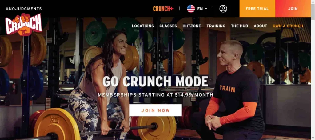
Crunch is another excellent website that you need to check out. In the header section, they have arranged their fitness center details consecutively and in the footer section, they have added the links to their other social media platform.
For visitors’ advantage, they have arranged a free trial session which you can see in the header section.
And the noteworthy part is they have 6 language versions which make it even more accessible to other continents. Last but not least the website has utilized the color theory so well that it can easily captivate visitors’ attention for a long time.
#11. Crossfit Trivium
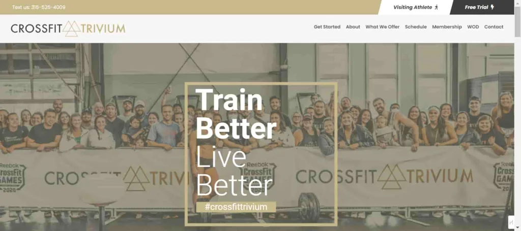
Crossfit Trivium is a very minimal website with exciting features for its targeted user. The website has a free trial option for the people who want their service to give a try.
They arranged a video introduction of their service to the user which makes them unique from others. Also showcases their client’s testimonials in a way that can easily grab attention. Additionally, the white and grayish color palette makes their website more soothing and attractive.
#12. Double Edge Fitness

It’s a simple website like any other wellness website-modern, chic yet elegant.
Designed mainly to focus on their service and the color theme used here is creative enough to catch visitors’ attention. The dedicated blog section is informational enough for visitors’ enthusiasm about the service.
They have added a location map of their center for viewers’ favor and added a quality adequate image to attract potential customer’s attention for a long time.
#13. Krav Maga Dallas
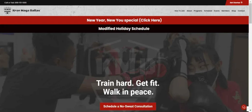
Krav Maga has designed the website with course details, testimonials, and a location map. The most fascinating part is they have kept a ‘live chat’ option for its users. Plus, it has arranged its service details, training sessions, and blog section beautifully for its user attraction.
Like all other websites, they have tried to keep it simple and elegant. You can check out the website for inspiration.
#14. All Level Crossfit

All-level CrossFit is the solution for the fitness-related problem in Canada. In the header section training sessions details, pricing, and blog, and the footer they have included their contact details. They have used eye-catching color palettes for attraction.
Go through the site to get a better view of the company.
#15. THE YARD

The Yard is a fitness training website providing quality personal fitness facilities related to its user. If you go through their site you will notice they have kept their site design very minimal and simple for its user.
They only kept the information that is crucial for their potential uses. They have opened a form to answer your queries or you can call them if you want. And the most interesting part is they have linked their social platform accounts to the website so that you can find them easily on other social platforms, not just the website, and connect with them.
So, if you wish to have a website for your fitness center that is simple yet unique then this website can be an ideal solution for you.
What makes a gym website design successful?
A good websites design is hard to find but it has the quality to make users feel good and engaged. There are some things you need to keep in mind to make your website a successful one in the fitness industry.
A good investment in a responsive web design
In the past, people used to focus on making websites that worked well on mobile devices. However, nowadays it’s important to make sure that your website works on all types of browsers, regardless of the version. By investing money in creating a great website design, you can ensure that your website looks and works great all the time.
Choose the right color palette
Choose the color accordingly because it has a significant impact on website design. Colors shouldn’t be irritating and tacky, they should be calm and soothing.
A top-notch blog section
An informative blog section that covers topics about fitness goals, best workout, healthy diet plan or anything that fitness community may care about, can be a great way to attract more customers. This will also help you rank higher in search engine results pages (SERPs).
Design the information in an accessible manner
It’s best to keep the customers well informed, so they aren’t required to guess what will maintain their interest. Hold opinions about the clients readily available and clarify the critical points.
Maintain minimalism and elegancy
Instead of squeezing too much information on fitness tutoring, and course descriptions on the website, try to keep it plain and minimal. Don’t overdo anything cause it hampers your site’s website design.
This essential information will keep your site an attractive and successful one. The members of staff at our firm will be happy to learn more about how we can help you with your project.
Reduce your worries about web design and start working with us today. We have a special team at Debugger Studio that can help you to build your fitness website design. Schedule a call.
How to design a gym website?
Establish your brand
An organization often reminds members of its brand in specific situations. That is why you should promote your brand to be the first association that comes to mind when people want to take fitness tutoring.
Select the specialty of your website
Your website ought to focus on resolving niche-specific problems. It is essential to promote not only physical fitness facilities but also related outcomes. Rationalize users about the plethora of fitness-related advantages and choices available.
Add high-resolution, customized pictures
Your website’s overall look can drive your target audience’s performance. Spend money on photography, imagery, and graphics to lend the user a more visually engaging event. Supplementary illustrations can be useful, too.
Have an original content library
Your website should mostly feature original, high-quality content with fitting key phrases, which could help you boost your search rankings. Compare the copywriters and SEO specialists who proffer original content and specimen take advantage of key phrases to one of your websites. Be sure to pay particular attention to significant descriptors, since we’ll be explaining them in the paragraph that is dedicated to typing errors.
Hire professional designers and developers
Devoted specialists to know exactly how to make a fitness trainer web page for you. Debuggers Studio makes such a team able to create your fitness tutoring website. We then incorporate your site’s wireframes into any style you wish.
We utilize our expert developers to design visually appealing and responsive sites that function perfectly on numerous devices.
We make certain that our site is optimized to run swiftly and provide a seamless user experience across all platforms. Check our website design packages today to get your project done!
Key design features you must have in your fitness website
Customers must be able to enjoy browsing used fitness websites. The design, style, and content have to conform to the customer’s preferences as the targeted traffic is made up of sophisticated people.
To attract clients’ interests, some fitness companies use applications that offer their visions, features, and courses for different walks of people. They attempt to develop a captivating connection, focusing on the ease of the user, accessibility, and subsequent usability.
To create the best fitness website, you must include the following features :
| Feature | Description |
| User Section | Here add your accounts. Be it through social platform accounts or email, let the user find out more about your facilities through the social platform. The one that has these features gain extra benefits. |
| Prompt Response | Nothing can beat the importance of prompt response for professionalism. Your prospective ones will feel ecstatic about your service if they see you are responding to their queries as fast as possible. Make sure your ‘contact us’ page is easy to find. It’s wise to add it in a header or footer area or you can initiate a ‘live chat’ option’ for better customer engagement. If any of your support staff has any freeloading, set a FAQs section or a Help desk to reduce those burdens. |
| Engaging Photos and videos | Maintaining an attractive fitness website entails creating highly visual content. Videos and images should motivate people to take the desired action, demonstrate the desired end goal, and provide hope. Choose high-quality, professional photos for your website. If you are on a budget, consider using free image banks.
Videos are a great medium to provide a positive image of sports and a healthy lifestyle to customers from the very first seconds after you add them to your site. |
| Class Timetable | When creating a fitness website, remember to add information concerning a class schedule.Your customers want to know what types of classes you offer, the schedules for classes, and who leads tutoring in a certain course.
You can use software or special tools like Picktime, SimplyBook.me, and ClassPass. to integrate a class schedule on your website for user management. |
| Free Evaluation | Offering free trials helps attain your digital marketing goals in the long term. When a client doesn’t sign up, you can put your marketing efforts to work to persuade them with discounts, a useful description of the new features, and gently educating them. Keep in mind the data protection laws in your particular country when collecting email addresses so as not to scare people away.You can present a free trial on a pop-up screen when the time comes for your webpage visitor to leave. This will catch their attention and distract them from the intended exit. |
| Transparent Pricing | Initially, you have to consider a Pricing page when developing a fitness-based site. Clients will value detailed comparisons of the facilities provided by your company along with those of your competitors. Instead of using the pricing info altogether, organize it easily through the table and make clear calls to action approaching users to buy tickets, purchase goods, or sign up. |
Typical mistakes to avoid in fitness website design
Missing Landing page
The lack of relevant landing pages is a very common challenge. If you’re developing a site with course details, and merchandise on display, a landing page is necessary to rank high on search engine pages.
Inadequate Pictures
Sometimes used fitness trainers think that adding 3 to 4 pictures of a fitness training are the only ones that can make it sell. Don’t make this mistake. You should create at least 35 images of your training channel to attract any potential buyer.
Terrible auto-generated description
Some websites prefer the auto-generated descriptions of the outcome or courses which are not compelling enough to attract potential customers and considered to be a bad practice. So, always try to post content with relevant keywords and search terms to easily rank on search engines.
Lack of posting schedule
If you update your social platform accounts, people will follow your posts and keep following you. Do not underestimate the importance of the social platform for your business. It is crucial to be in constant communication with the clients.
Irrelevant content on the home page
The website’s homepage is the face or front of your business. Perhaps you indicate how the company began, present the company’s goals, celebrate your vision, and express your goals. It’s the customer outreach for you to advertise your image as a suitable trainer. Choose the image and deal with the client with every encounter.
Website Design Cost
When you are looking for a website designer, price is an important consideration. However, it is not the only factor you should consider. The cost of designing a fitness website can vary depending on the designer’s experience and the features and functionality you want your site to have.
For a basic fitness design project, the cost varies from $150 to $300, and for the premium project, the cost can be around $1000 to $20000.
The pricing would be different If you hire a freelancer because freelancers charge hourly. Their charge varies from $80 to $200 depending on the project.
Before you begin shopping around for a designer, it is important to determine what features your website should have. If you are just starting, you may not need all the bells and whistles of a more sophisticated site.
But if you are already an experienced fitness instructor or personal trainer, your website will need to be more robust to support your business needs.
Be sure to ask potential designers about their experience with creating website you want and what types of features they can offer. Also, ask for references so you can see examples of their work.
Materialize your vision into reality. Hire fitness website design experts to make your website within 2 to 3 weeks.
How do fitness websites generate revenue through the website?
There are a few different ways that fitness websites can generate revenue.
- Websites can generate revenue by charging people to access workout videos or recipes or charging people to join a membership program that provides access to exclusive content or discounts on products and services.
- And also, some websites generate revenue by selling products or services directly through the website. This can include selling workout equipment, supplements, or memberships to a gym or health club.
- The most common way is through advertising. Fitness websites can partner with companies that sell health and fitness commodities or services to place ads on their website. In addition, many websites sell space on their website for other businesses to advertise their products or services.
A well-designed fitness website can be a powerful tool for marketing your business and attracting new customers. It can help you to showcase your products and services, share your unique philosophy, and connect with potential clients.
So if you’re looking to create or redesign a fitness website, be sure to keep these tips in mind. And remember, always test different designs and layouts to see what works best for your business.


